This plugin seems to be using the new attributes srcset and sizes of the element img. Here it is the specification, and the set of browsers who already support them.
On what to put in the fields, assuming that each field refers to the corresponding attribute, I would say the following:
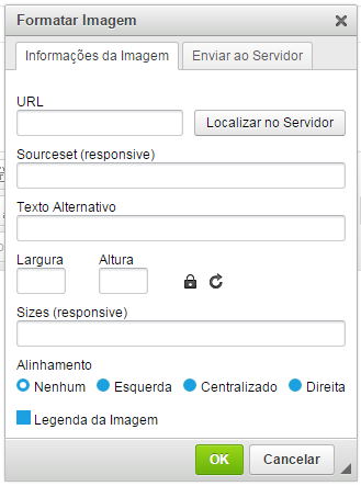
- URL: the URL of the "default" image, if the browser do not support the
srcset;
Sourceset: a list with two or more "candidate" images, each image accompanied by its pixel width or its device-pixel-ratio. Example:
imagem1.jpg 100w, imagem2.jpg 200w, imagem3.jpg 400w
or
imagemA.jpg 1x, imagemB.jpg 1.5x, imagemC.jpg 2x
Sizes: a list with zero or one media query and the width that the image should occupy in those conditions. Example:
(max-width: 500px) 95vw, (max-width: 1000px) 50vw, 500px
(Note: I don’t understand anything about the functioning of device-pixel-ratio, but I found an article detailing the concepts involved.)
A concrete example would be the following (see the example in "full page" and resize the browser window to notice the effect):
<img srcset="http://placehold.it/100x25 100w,
             http://placehold.it/400x100 400w,
             http://placehold.it/1600x400 1600w,
             http://placehold.it/6400x1600 6400w"
     sizes="(max-width: 768px) 96vw,
            (max-width: 1200px) 50vw,
            33vw"
     src="http://placehold.it/400x100"
>
Here I give a list of images and their original widths (each 4 times larger than the previous one) and let the browser decide which one is more appropriate to be shown. In addition, I establish the widths that these images will actually occupy on the page under various conditions (expressed as media queries). Finally, an alternative URL for the browser not support any of this.
What is the criterion that the browser will use to choose an image from the list, can’t say (in my test with Chrome and Firefox on a PC screen both displayed the 1600x400 no matter how much I resize the screen). By observing the example under various conditions I have come to the conclusion that it will choose the best image at the time of loading, and continue using it afterwards no matter what happens. I don’t know if this is by design or some limitation on implementation.
What plugin is this? Not knowing what the plugin is, or what code it generates, it is difficult to know what might be happening. The name "sourceset" refers me to element
picture(that is not standardized, and not all browser supports), but I don’t know if that’s what the plugin is using or if it’s something else. There’s nothing in the plugin’s documentation that says how to use it?– mgibsonbr
@mgibsonbr is this plugin, it requires other plugin to work... http://ckeditor.com/addon/imageresponsive
– user3402864
Apparently this
srcsethas nothing to do with thepicture, he is an attribute ofimgeven... The same goes forsizes. I’ve never seen these attributes before, so I’m still not sure what they do, but as soon as I can I’ll read more about it (I found an explanation - in English, and a bit long - then if no one gives a better answer I’ll try to summarize it here).– mgibsonbr