6
I’m fighting to make a website and present it on my TCC. I separated the sections of the site (body, head, header, footer...) into isolated files to be able to move more easily. I took great care to separate all the right elements in each file. They appear on the site because my page index php. has include_once() of those pages.
The problem starts here: My file menu-side.php It’s getting way out of whack in its mobile version. It contains the Facebook page like buttons, follow Twitter profile, link to Flickr and signup button on Youtube page.
Apparently, the problem is with the Like Facebook button. Whenever the site is in its desktop version, there is no problem, it is all right:
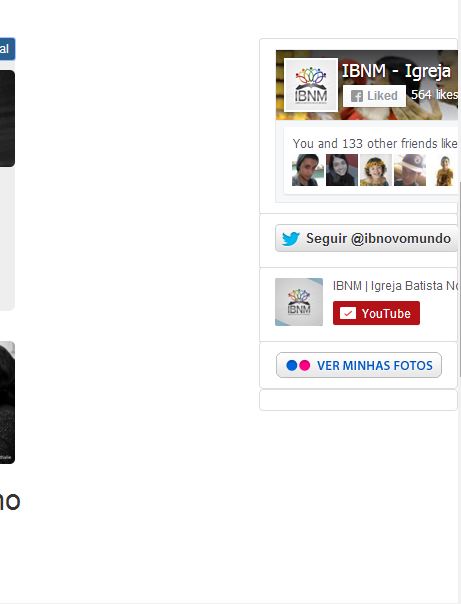
Now, in the mobile version, it looks like this (follows photo). The button is bigger than it should and passing the div from the E menu adding huge space to the page body.
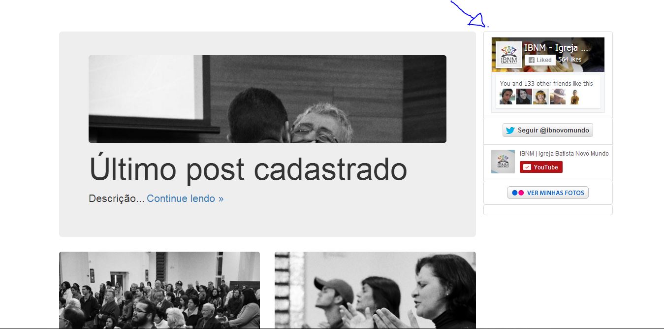
How it should look:
The other buttons will be replaced by images, however, I want to continue with the Facebook Like button. I want to know if it is possible: 1) fix the problem of space in the mobile version; 2) leave the size of the button responsive.
Follows the code of menu-side.php:
    <div class="col-xs-6 col-sm-3 sidebar-offcanvas" id="sidebar">
        <div class="list-group">

            <div class="list-group-item">

            <!-- Facebook -->
            <div class="fb-page jumbo-img" data-href="https://www.facebook.com/ibnovomundo" data-small-header="true" data-adapt-container-width="true" data-hide-cover="false" data-show-facepile="true" data-show-posts="false" data-layout="box_count">
                <div class="fb-xfbml-parse-ignore">
                    <blockquote cite="https://www.facebook.com/ibnovomundo">
                        <a href="https://www.facebook.com/ibnovomundo">IBNM - Igreja Batista Novo Mundo</a>
                    </blockquote>
                </div>
            </div>

            </div>

            <center>
            <div class="list-group-item">

            <!-- Twitter -->
            <a class="twitter-follow-button jumbo-img" data-size="large" data-show-count="false" href="https://twitter.com/ibnovomundo">Siga @ibnovomundo no Twitter</a>

            </div>
            <center>

            <div class="list-group-item">

            <!-- YouTube -->
            <div class="g-ytsubscribe list-group-item jumbo-img" data-channel="batistanovomundo2" data-layout="full" data-count="hidden"></div>

            </div>

            <center>
            <div class="list-group-item">
            <!-- Flickr -->
            <a href="http://www.flickr.com/photos/ibnovomundo2/" title="Veja nossas fotos no Flickr!"><img src="https://s.yimg.com/pw/images/goodies/white-see-my-photos_pt.png" class="jumbo-img" alt="Veja nossas fotos no Flickr!"></a>

            </div>
            </center>

            <center>
            <div class="list-group-item">
            <!-- App -->

            </div>
            </center>

        </div>
    </div>
See if you can help http://www.dummies.com/how-to/content/add-a-facebook-like-button-to-your-mobile-site.html
– Emir Marques
Summarizing the @Aloisogomes response, you just need to remove the class
col-xs-6of#sidebar.– Oeslei
Just noting that the @Aloisogomes solution is not exactly what you want, but I think you should follow it since displaying a menu next to the content on a mobile is extremely unpleasant.
– Oeslei
http://getbootstrap.com/css/#Responsive-Utilities
– Oeslei