2
Before you start cleaning my CSS and JS files, when you open one select on my mobile device (Windows Phone with IE) it opened the options on a black screen that overlapped the page, and only disappeared after the option be selected (or the operation be canceled by the back button).
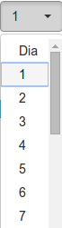
Something more or less like this:

But now it’s stopped working, and it’s opening in the normal (and unwanted) way, so:
During this process I removed all CSS that was not used from a page running in the browser, I stopped referencing Jquery Mobile (but already includes again and I’m pretty sure that was not it)...
The meta name "viewport" is like this:
<meta name='viewport' content='width=device-width, initial-scale=1.0'>
I’m using the selectpicker, and HTML is like this:
<label for="Cdiainicio">
                <select name="Tdiainicio" id="Cdiainicio" class="selectpicker" data-width="70px">
                    <?php include $_SERVER['DOCUMENT_ROOT'] . "/models/scripts/datas/combos/combodia.html"?>
                </select>
            </label>
(I’ve tried to remove the data-width but did not resolve)
In the archive combodia.html are the options:
<option value='dia'>Dia</option>
<option value='01'>1</option>
<option value='02'>2</option>
<option value='03'>3</option>
<option value='04'>4</option>
<option value='05'>5</option>
<option value='06'>6</option>
<option value='07'>7</option>
<option value='08'>8</option>
<option value='09'>9</option>
<option value='10'>10</option>
<option value='11'>11</option>
<option value='12'>12</option>
<option value='13'>13</option>
<option value='14'>14</option>
<option value='15'>15</option>
<option value='16'>16</option>
<option value='17'>17</option>
<option value='18'>18</option>
<option value='19'>19</option>
<option value='20'>20</option>
<option value='21'>21</option>
<option value='22'>22</option>
<option value='23'>23</option>
<option value='24'>24</option>
<option value='25'>25</option>
<option value='26'>26</option>
<option value='27'>27</option>
<option value='28'>28</option>
<option value='29'>29</option>
<option value='30'>30</option>
<option value='31'>31</option>
So what I’d like to know is how this behavior is changed? Does it have to do with jQuery Mobile? It might be something in CSS’s?
I don’t understand what the doubt is, if you want to use the dial default just remove the class
selectpicker, nay?!– Renan Gomes
No, in browsers I want it to appear with the selectpicker, and even on mobile devices, I want it to appear with select Picker. Only on mobile devices, when open
options, I want you to open the way I posted in the image (the images are opening there?) Thanks.– gustavox
Ah, so, you’re right, without the select Picker opened the desired way... Actually then I think it was not removing CSS, but include (the selectpicker)... But then, using the selctpicker there is no way to get this same behavior? @Renan
– gustavox
In all the browsers mobile Do you want it to look like Windows Phone? Or just Windows Phone?
– Renan Gomes
In all I wish it had the same type of behavior (if it is that other devices have this same type of behavior), IE, I used the cellular pattern, opening this screen that occupies the whole navigation area, appearing the big options and such... @Renan
– gustavox