1
How can I apply in my application to leave the width and/or height at 100% for iphone and ipad? have in my navbar application. textview, webview... thank you
1
How can I apply in my application to leave the width and/or height at 100% for iphone and ipad? have in my navbar application. textview, webview... thank you
2
To create a layout that is compatible with Iphone and Ipads is necessary to have the knowledge of Auto Layout.
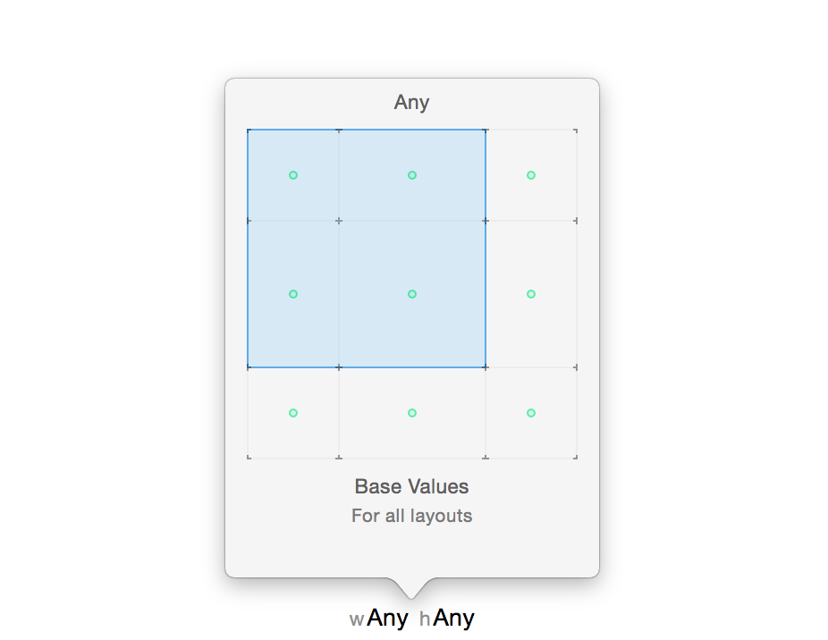
First thing to be defined in size class is the compatibility, in this image it would be for all devices.
In your storyboard it will be necessary to add Constraints for each component take its example height and width:
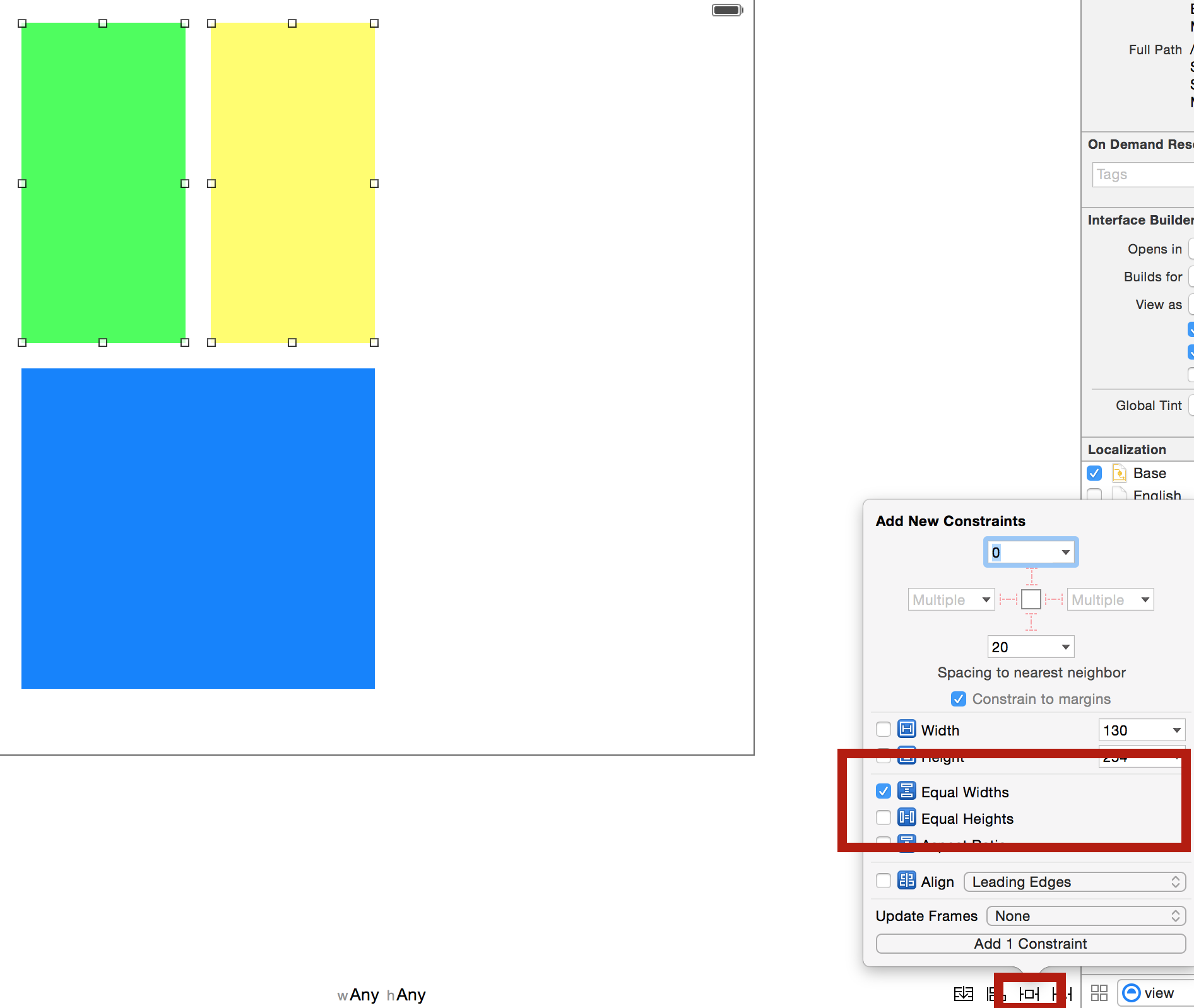 I selected the two green and Yellow views and added a Constraint that make the two have the same width, this way when the device is ipad it will adapt.
I advise to give a studied: Raywenderlich - Auto Layout
Browser other questions tagged ios swift layout
You are not signed in. Login or sign up in order to post.
Okay buddy, but I need it adjusted because when I put the size on the iPhone it’s not right, it cuts part....
– Augusto Furlan
@Augustofurlan read this part "this way when the device is ipad it will adapt." this is for any other device, do it that works... Valew
– FlipNovid