Vertical menu disappearing below the footer

Asked

Viewed 388 times

4

On screens where the height is less than 600px the menu disappears below the footer. I also tried to leave the position as fixed, relative and with nothing but the result was the same.

Follow the menu html:

<div class="container-fluid">
  <div class="hidden-xs hidden-sm " id="menuwraper">
    <div id="menu" class="hidden-xs ">
        <ul id="navegacao">
            <li>
                <a href="home"><img src="imagensite/logo.png" /></a>
            </li>
            <li class="efeito"><a href="sobre">SOBRE NÓS</a></li>
            <li class="efeito"><a href="projetos">PROJETOS</a></li>
            <li class="efeito"><a href="noticias">NOVIDADES</a></li>
            <li class="efeito"><a href="contato">CONTATO</a></li>
            <li class="efeito"><a href="parceiros">PARCEIROS</a></li>
        </ul>
    </div>
</div>

The css:

#menu {
  height: 400px;
  position:absolute;
  margin-top:31px;
  width: 15%;
  margin-bottom:140px;
}

A picture of what is happening:

imagem

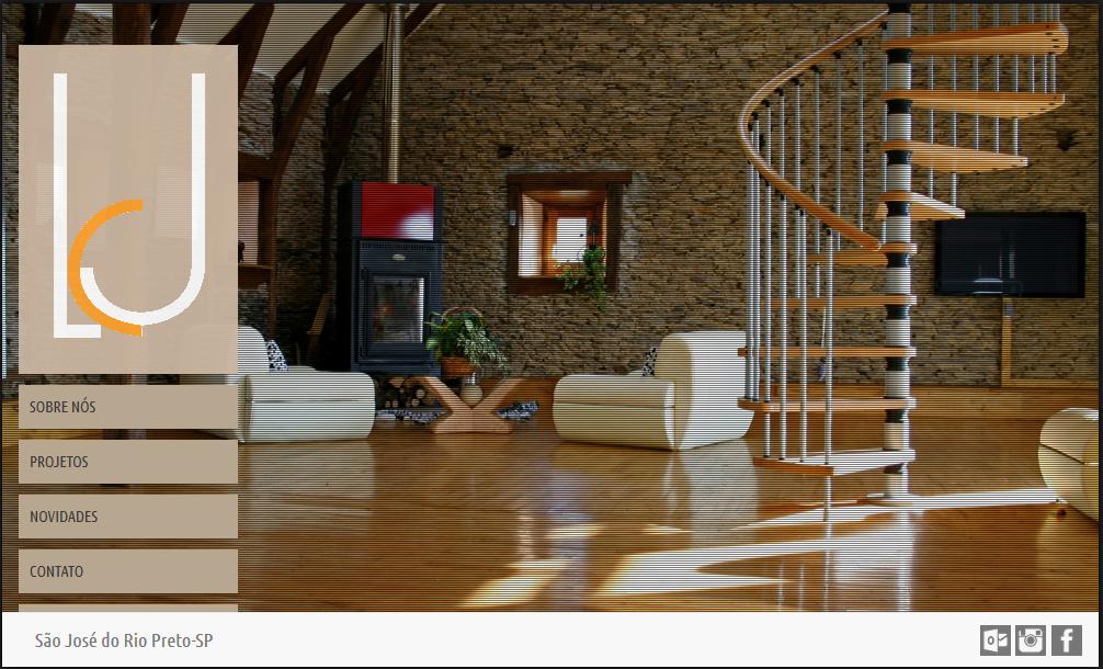
How can you see the "partners" is under the footer.

  • 1

    You are using pixels in commands they usually do not adapt to different resolutions, try to use percentage.

  • I tried this but it keeps happening the same,I wanted to leave the position as Fixed...

  • 1

    You just want to resize the menu or make it above the footer?

  • Resize..

  • 1

    Put to MENU z-index: 10.

3 answers

2

Leave the footer and the menu with height in percentage, this will make it work independent of screen resolution.

If the page will not have scroll, both elements may have position:absolute;, then just put one bottom:0; pro footer, otherwise you can keep the footer with position:fixed;, for that I put the z-index in the example, which will cause the menu to overlap with the footer.

Obs. The higher the value of z-index, the larger the "layer" the element will be.

#menu {
  height: 90%; /*Pode ser outro valor, esse é só um exemplo*/
  position:absolute;
  margin-top:31px;
  width: 15%;
  margin-bottom:140px;
  z-index:5000; /*Isso é para que ele se sobreponha ao rodape caso necessario*/
}

How I used height: 90%; on the menu, the footer should be height: 10%;, or less, so that everything works.

I hope I’ve helped.

  • I tried that way but even so it keeps disappearing, doesn’t have a way that a scroll bar appears on the side to show it? As with the contents...

  • Just one question, the page needs to be scrollless?

  • I just checked and the error really continues. To solve, keep the code I sent and add to the menu the property overflow:auto, this way it will show the scroll bar only when necessary, if you need to send example.

1

Maybe it can be right to put it this way:

#menu { position:absolute; height:0; width: 15%; top: auto; bottom: 0; left: 0; right: auto; margin-top: 2%; margin-bottom:5%; padding-bottom: 30%; ( aumenta até achar a altura certa ) }

Hugs

1

Following the tips presented in this question I managed to solve my problem with the following code:

margin-top:30px;
width: 15%;
position:absolute;
height: auto;
margin-bottom: 10%;
padding-bottom: 3%;

Grateful to all who helped!

Browser other questions tagged

You are not signed in. Login or sign up in order to post.