How to smooth the font with CSS in Chrome?

Asked

Viewed 5,885 times

5

I have a "crackle" font problem in Chrome, IE, it seems that the tips are pixelated.

To help, I’m posting two images

IE:

Imagem no IE

Chrome:

Imagem no Chrome

My CSS calling the source:

@font-face
{
    font-family: "Helvetica-nw";
    src: url('../fonts/HelveticaNw_.eot');
    src: local('☺'),
    url('../fonts/HelveticaNw_.woff') format('woff'), url('../fonts/HelveticaNw_.ttf') format('truetype');
}

Does anyone know how to get my font to view correctly in Chrome?

  • Formerly had site that stated: This site is better viewed in browsers Internet Explorer version 6 and better viewed site in resolution 800x600 or higher with Flash plugin ... :)

  • 3

    To reply in English is excellent.

  • Tries to add -Webkit-Backface-visibility: Hidden;

  • 2

    With -Webkit-Backface-visibility: Hidden; and -Webkit-font-Smoothing:antialiased; does not give, as indicated in the other stackoverflow, does not change at all, the solution I found was to use the -Webkit-text-Stroke: 0.6px; which I will have to set for each part that the font is a different size, but at least it improves

  • actually with -Webkit-text-Stroke: 0.6px; doesn’t seem to be right

4 answers

4

The -webkit-font-smoothing: antialiased; actually is a technique created for browser Safari for retina screens on Mac computers (OS X system)

So much so that the version of this property for firefox is -moz-osx-font-smoothing: grayscale; (source: https://developer.mozilla.org/en-US/docs/Web/CSS/font-smooth)

Related: Understanding the difference from traditional Antialias to Cleartype

There is no standardized property for this specifically, but according to this repository https://gist.github.com/dalethedeveloper/1846552 there are some techniques you can try (unsecured):

Estate font-smooth: always:

Still not supporting by any browser, this property is what will basically replace the -webkit-font-smoothing and -moz-osx-font-smoothing

.examplo {
    font-smooth: always;
    font-size: 24pt;
}
<div class="examplo">
 Olá, Mundo! Hello World!
</div>

Estate text-rendering

This property may come to help, but it can also affect, since the use of it is not well for what you want, yet property values are:

  • text-rendering: optimizeSpeed;
  • text-rendering: optimizeLegibility;
  • text-rendering: geometricPrecision;

Estate transform: rotate():

This causes a "tilt" in the CSS that "adjusts the font"

.examplo {
    transform: rotate(-0.0000000001deg);
    font-size: 24pt;
}
<div class="examplo">
 Olá, Mundo! Hello World!
</div>

Estate text-shadow:

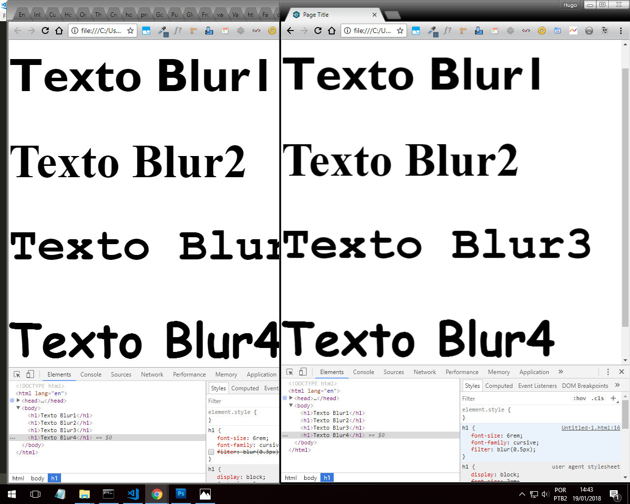
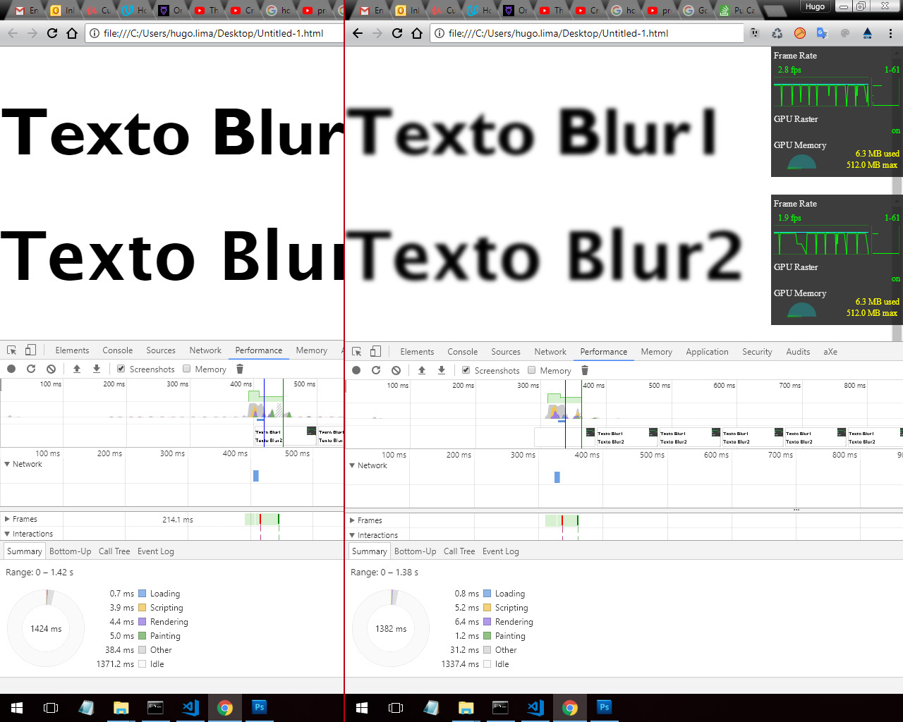
According to the tests for Windows specifically this was the one that had best result, it is necessary to adjust the same color and/or size that the font uses

.examplo {
    text-shadow: 0 0 1px rgba(0,0,0,1);/*a cor deve ser a mesma da fonte, ajuste a opacidade como desejar*/
    font-size: 24pt;
}
<div class="examplo">
 Olá, Mundo! Hello World!
</div>

The group/person who maintains the repository has created an example to facilitate with jQuery, but this will require importing jQuery only for an "effect", of course jQuery is used will be fine, but otherwise it is better to avoid, so I remade in a simple example:

function getStyle(elem, prop)
{
    if (elem.currentStyle) { //IE8
        return elem.currentStyle[prop];
    } else if (window.getComputedStyle) {//Navegadores modernos
        return window.getComputedStyle(elem, null).getPropertyValue(prop);
    }
}

function smoothByShadow(elem)
{
    if (navigator.platform.indexOf('Win') == -1) {
        return;
    }

    var color = getStyle(elem, "color");

    if (color.search('rgb') != -1) {
        var rgba = color.match(/^rgba?\((\d+),\s*(\d+),\s*(\d+)(?:,\s*(\d+))?\)$/);

        elem.style.textShadow = "0 0 1px rgba(" + rgba[1] + "," + rgba[2] + "," + rgba[3] + ",1)";
    }
}

To apply in an element just use, example applied in all subheadings:

var h1 = document.getElementsByTagName("h2");

for (var i = h1.length - 1; i >= 0; i--) {
    smoothByShadow(h1[i]);
}

If it doesn’t have the desired effect you may need to adjust the font size:

function smoothByShadow(elem)
{
    if (navigator.platform.indexOf('Win') == -1) {
        return;
    }

    var color = getStyle(elem, "color"),
        size = getStyle(elem, "font-size");

    if (color.search('rgb') != -1) {
        var rgba = color.match(/^rgba?\((\d+),\s*(\d+),\s*(\d+)(?:,\s*(\d+))?\)$/);

        var fsize = size.match(/(\d+)px/);

        elem.style.textShadow = "0 0 " + (fsize[1] / 15) + "px rgba(" + rgba[1] + "," + rgba[2] + "," + rgba[3] + ",0.3)";
    }
}
  • Unfortunately none of these worked with me, I found a good font and that does not seem to suffer so much with these browser changes, follow the link for anyone in the future https://www.theleagueofmoveabletype.com/ostrich-sans

  • I’m still developing this, give a look how the source is http://www.bluanime.com/v2/browse

  • Yes trying with windows, already tested in 1366 x 768 and 1920 x 1080 ... only in Chrome the source is made fun

  • @Leoletto Chrome 64bit? Please inform if it is LED or LCD or other and inform the monitor size, type 17" (inch).

  • LED, 64bit, 17"

  • In small fonts gives a cool effect, but in larger fonts like the big bold H2 title becomes more visible, advanced Webkit in so many things, and can not render texts right

Show 2 more comments

1

In some cases when this happens, I solve it with this:

   body {   
        /* CSS3*/
        -webkit-text-size-adjust: none;
        -webkit-font-smoothing: antialiased;
    }
  • Another solution would be to add: text-shadow: 0.01em 0.01em black; .

  • I’ll try again from text-shadow, only I have to configure a different value for each size... already the -Webkit-font-Smoothing: already tried, but no difference, I don’t know if Chrome removed this support

1

The truth is the Google people withdrew the support of the -webkit-font-smoothing: antialiased; just to piss off the programmers. =(

They must think this undermines the performance of the browser.

In IE and Firefox fonts look better because they use a font rendering engine "on the outside", while Chrome uses the one provided by Windows, called Cleartype.

The way to do it is to be content with the gambiarras like this:

body { 
  -webkit-text-stroke-color: #333;
  -webkit-text-stroke: 0.2px;
}

But since nothing gets 100%, I prefer to give up and leave the same pattern.

  • 1

    Google will implement Directwrite apparently, which fixes the problem, but I’ve gone through visualization issues on some pages with it enabled, like Facebook, I don’t know if anyone else went through it after activating it on Chrome://flags

  • @braulio_holtz I activated Directwrite here there is a noticeable improvement. Maybe soon we won’t need more gambiarras.

0

You can try some new CSS3 techniques and classes

First I’ll start with the technique of Filter:Blur(), because no one has mentioned it yet. (Doesn’t work on IE just Edge)

Here are the results with the Filter. It seems that some font-familyhas a better or worse result, it is up to you to evaluate whether it is the best technique.

inserir a descrição da imagem aqui

Look at the "and" in the "t" and in the "u" lowercase as the result is clear inserir a descrição da imagem aqui

Another example with and without the filter in a source with poor rendering. The filter is on the limit, there goes the common sense.

inserir a descrição da imagem aqui

Filter styles need to hardware acceleration, but it seems that even with the Blur accentuated consumes very little resource at render time and FPS is almost equal, in Chrome at least...

inserir a descrição da imagem aqui

So you want to run some tests here’s the Snipper from the test I did with filter:blur()

h1 {
    font-size: 4.25rem;
    font-family: cursive;
    filter: blur(0.35px);
}
h1:nth-child(1) {
    font-family: 'Gill Sans', 'Gill Sans MT', Calibri, 'Trebuchet MS', sans-serif;
}
h1:nth-child(2){
    font-family: 'Times New Roman', Times, serif;
}
h1:nth-child(3){
    font-family: Courier New, Courier, monospace;
}
<h1>Texto Blur1</h1>
<h1>Texto Blur2</h1>
<h1>Texto Blur3</h1>
<h1>Texto Blur4</h1>


Techniques already cited and known.

You can put a text-shadow very smooth, just to make a smooth effect on the font. See below in case I put in white color that is the color of your font.

text-shadow: 1px 1px 1px rgba(255,255,255,0.004);

The same principle can be used with -webkit-text-stroke for all Browsers

-webkit-text-stroke: 0.45px rgba(255, 255, 255, 0.1);

Reference source: https://caniuse.com/#search=-Webkit-text-Stroke

You can also use some CSS classes

text-rendering: optimizeLegibility;  /* não funciona no IE e Edge */
-webkit-font-smoothing: antialiased; /* apenas para Mac OS X/macOS */
-moz-osx-font-smoothing: grayscale; /* apenas para Mac OS X/macOS */
font-smooth: always; /* Non-standard */

optimizeLegibility: The browser prioritizes readability over render speed and geometric accuracy. This property enables optional kerning and ligatures.

font-Smoothing (Non-standard): Apply an anti-aliasing to the font border

Source for you to do a search: https://developer.mozilla.org/en-US/docs/Web/CSS/text-rendering

Font-Smoothing: https://developer.mozilla.org/en-US/docs/Web/CSS/font-smooth

Browser other questions tagged

You are not signed in. Login or sign up in order to post.