8
I have a question, as I do to insert images with different sizes inside a div, and if the image is too large vertically, it stays with height:100%, and if it is very large horizontally with width:100%?
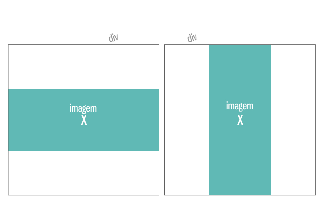
An image as an example:
8
I have a question, as I do to insert images with different sizes inside a div, and if the image is too large vertically, it stays with height:100%, and if it is very large horizontally with width:100%?
An image as an example:
9
Use a combination of background images and behavior settings via CSS.
Explanation:
background-size:contain will force the background image to be contained within the element;background-repeat:no-repeat will cause the image to appear only once;background-position: center center the image on both axes, regardless of size or width..container {
width:200px;
height:200px;
display:inline-block;
background-size:contain;
background-repeat:no-repeat;
background-position: center;
border:1px solid black;
}<div class='container' style='background-image:url(https://upload.wikimedia.org/wikipedia/commons/7/72/Wide_view_over_S%C3%B8rfjorden_from_the_coast_of_Sveingard,_2012_June.jpg)'>
</div>
<div class='container' style='background-image:url(http://wvs.topleftpixel.com/photos/scotia_plaza_tall_stitched.jpg)'>
</div>1
If you’re trying to do that using the tag <img>, you can do that unspecifying one altura or largura for the image, but setting the following values:
max-width:100%;
max-height:100%;
And to center the image to the center:
display: flex;
align-items: center;
justify-content: center;
There are other ways to center elements, but in this case this is the way I used.
Everything together will be something like this example below the Codesnippet:
(You got a EXAMPLE IN JSFIDDLE if you prefer)
img {
    max-width: 100%;
    max-height: 100%;
}

.caixa {
    height: 180px;
    width: 180px;
    background-color: #C8ECFF;
    border:2px solid #717171;
    margin-bottom:15px;

    /* Centralizando imagens */
    display: flex;
    align-items: center;
    justify-content: center;
}
<div class="caixa">
<img src="http://i.stack.imgur.com/CMoaX.jpg">
</div>
<div class="caixa">
<img src="http://i.stack.imgur.com/lIkte.jpg">
</div>0
Fix maximum width and height:
<img src="suaimagem.jpg" style="max_width:123px; max-height=123px"></img>
-1
In your css define the style as follows:
<style>
img{
    width:auto;
    height:auto;
}
</style>
Friend the `auto it will just pick up the image’s own size upada. Example it is 325px450 with auto it will get exactly this same value, the case of it is the following, the image is 400x100 it wants the image to stay for example 100%x40%.
@Renanrodrigues With the 'auto' the image will fit according to the size of the element in which it is. And that’s what he wants, to adjust the image according to the div. Then just see where it fits best. If larger vertically: 'height:auto', if larger horizontally: 'width:auto'
-1
To solve your problem you should take the image size by Javascript and make a comparison between width and heigth. In our example, we will use the tag
First we get the size by the jQuerey:
Largura = $('img#foto').width();
Altura = $('img#foto').height();
2° Make comparison to know which is larger:
if(largura > altura){
   $('foto').css("width","100%");
}else{
   $('foto').css("height","100%");
}
This will probably solve your problem.
Browser other questions tagged html css
You are not signed in. Login or sign up in order to post.
No javascript? I don’t know if it’s possible ein...
– DontVoteMeDown