2
I have the following doubt:
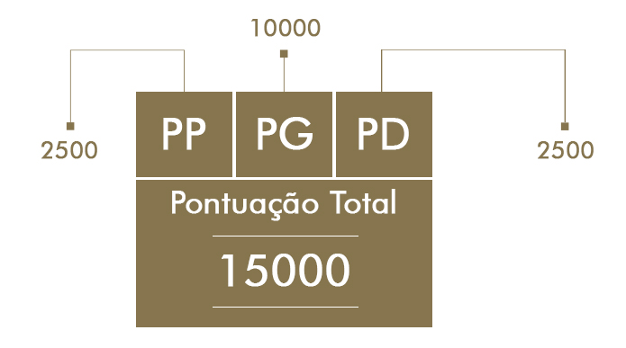
I have the following image in a PSD file.
I’m using Bootstrap to develop the system, but I needed this image to be made with CSS and be responsive.
Any suggestions ?
Thank you!
2
I have the following doubt:
I have the following image in a PSD file.
I’m using Bootstrap to develop the system, but I needed this image to be made with CSS and be responsive.
Any suggestions ?
Thank you!
1
img{
    width: 100%;
    max-width: 300px; /* coloque aqui o tamanho real da imagem em px */
}
So the image will suit your box, but your box should also be 100%.
Example:
<div style="width: 100%">
   <img style="width: 100%; max-width: 300px;" src="imagem.png">
</div>
I made CSS Inline to show you, but it can be the other way.
0
What you can do is define the image with these properties.
img{
width:100%;
height:auto;
}
Thus it will occupy the entire width of the element that contains it. In order to limit this size of the image when on larger or smaller screens you can use grid view. Take a look at : https://www.w3schools.com/css/css_rwd_grid.asp
And as I said, you can also use media queries
Browser other questions tagged css css3 image
You are not signed in. Login or sign up in order to post.
So Diego, it even works! But the texts would be variable, needed the texts to fit as the page was resized.
– Bruno Cesar
Use
media queries, or leave the fountain too with100%.font-size: 100%. You didn’t explain it in your question, you just talked about image...– Diego Souza
hello, you have to do it a la pata...@media screen and (max-width: 640px) { } something of this genre and put this code you want
– usersantos
use of media queries can solve your problem
– DiChrist