Put a background image and make it responsive

Asked

Viewed 127,257 times

13

I’m having a problem putting a background image on my page. I did some tests and it looks like this when I change the window size:

inserir a descrição da imagem aqui

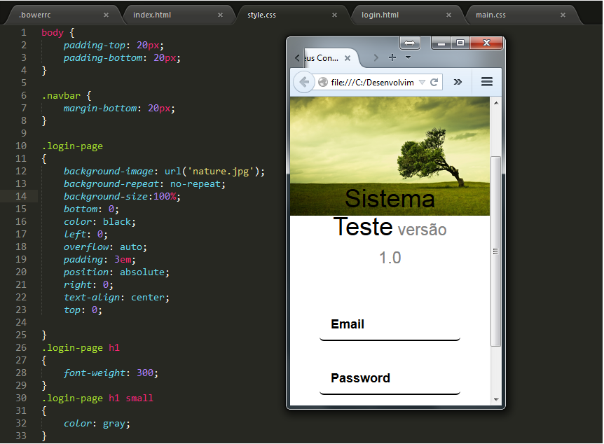
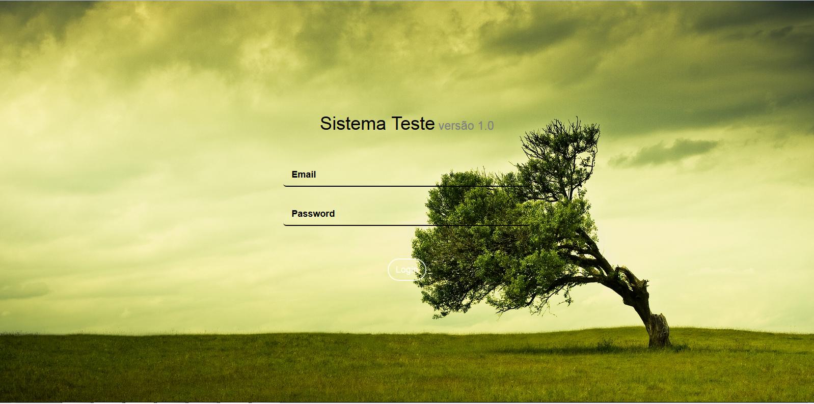
When I maximize it’s right:

inserir a descrição da imagem aqui

How can I adjust this image to get the screen correctly?

CSS:

.login-page
{
    background-image: url('nature.jpg');
    background-repeat: no-repeat;
    background-size:100%;
    bottom: 0;
    color: black;
    left: 0;
    overflow: auto;
    padding: 3em;
    position: absolute;
    right: 0;
    text-align: center;
    top: 0;

}
.login-page h1
{
    font-weight: 300;
}
.login-page h1 small
{
    color: gray;
}
.login-page .form-group
{
    padding: 8px 0;
}
.login-page .form-content
{
    padding: 40px 0;
}

Page:

<html>
<head>
    <meta charset="utf-8">
    <title>Meus Contatos</title>
    <meta name="description" content="">
    <meta name="viewport" content="width=device-width">
    <link rel="stylesheet" href="public/libs/bootstrap/dist/css/bootstrap.css"/>
    <link rel="stylesheet" href="public/styles/style.css"/>

</head>
<body>
    <div class=login-page>

   <div class=row>
      <div class="col-md-4 col-lg-4 col-md-offset-4 col-lg-offset-4">
        </br>
        </br>
        </br>
        </br>
        </br>
        </br>
        </br>
        </br>
         <h1>Sistema Teste<small> versão 1.0</small></h1>
         <form role=form ng-submit=submit()>
            <div class=form-content>
               <div class=form-group> <input type=text class="form-control input-underline input-lg" placeholder=Email> </div>
               <div class=form-group> <input type=password class="form-control input-underline input-lg" placeholder=Password> </div>
            </div>
            <button type=submit class="btn btn-white btn-outline btn-lg btn-rounded">Login</button> 
         </form>
      </div>
   </div>
</div>
</body>
<html>

2 answers

14


You can just add the property background-size: cover; in his css.

Cover: specifies that the background image shall be sized so that it is as small as possible while ensuring that both dimensions are larger than or equal to the corresponding size of the container.

Would that make you css:

    .login-page
{
    background-image: url('nature.jpg');
    background-repeat: no-repeat;
    background-size:100%;
    bottom: 0;
    color: black;
    left: 0;
    overflow: auto;
    padding: 3em;
    position: absolute;
    right: 0;
    text-align: center;
    top: 0;
    background-size: cover;
}

See an example on Jsfiddle.

If you want to know more, see here.

Edit

You can also call the image according to the resolution, using Media Queries. This way, you choose the resolution for the image to be called. Soon, you will need to have an image "treated" for each resolution. An example would be like this:

@media (min-width: 768px) {
    .login-page
{
    background-image: url('img200.jpg');
    background-repeat: no-repeat;
    bottom: 0;
    color: black;
    left: 0;
    overflow: auto;
    padding: 3em;
    position: absolute;
    right: 0;
    text-align: center;
    top: 0;
    background-repeat: no-repeat;
    background-position: center;
    background-size: cover;


}
}

@media (min-width: 992px) {
  .login-page
{
    background-image: url('img600.jpg');
    background-repeat: no-repeat;
    bottom: 0;
    color: black;
    left: 0;
    overflow: auto;
    padding: 3em;
    position: absolute;
    right: 0;
    text-align: center;
    top: 0;
    background-repeat: no-repeat;
    background-position: center;
    background-size: cover;


}
}

@media (min-width: 1200px) {
   .login-page
{
    background-image: url('img1000.jpg');
    background-repeat: no-repeat;
    bottom: 0;
    color: black;
    left: 0;
    overflow: auto;
    padding: 3em;
    position: absolute;
    right: 0;
    text-align: center;
    top: 0;
    background-repeat: no-repeat;
    background-position: center;
    background-size: cover;


}
}

Thus, a device with a lower resolution than 768px will use the img200.jpg, and so on. If you observe, the Bootstrao already possesses media queries, may even customize resolutions.

Note: Instead of decreasing the size of browser, uses the developer tools (F12) and choice the desired apparatus.

  • 1

    Thank you @Randrade

  • 1

    I would like to thank I used the first option above and it worked out more than perfect stayed TOPPPP solved my life ... Thank you very much ... I used this option: . login-page { background-image: url('Nature.jpg'); background-repeat: no-repeat; background-size:100%; bottom: 0; color: black; left: 0; overflow: auto; padding: 3em; position: Absolute; right: 0; text-align: center; top: 0; background-size: cover; }

3

  • I tried the first option, but when I move the page size the image is "bad".

  • I found this site "https://css-tricks.com/perfect-full-page-background-image/" that has a good example, I will edit my comment.

  • so it resizes according to the size of the screen, but cuts a bit horizontally.

  • 1

    It cuts probably by the resolution of the image being proportionally different from the monitor. This code leaves the image 100% off the screen, I think this is as close as you want. But you can also use the media TAG in CSS to adjust the image to the resolution. Reference in W3school: "http://www.w3schools.com/cssref/css3_pr_mediaquery.asp"

  • Got it, thanks for the answer I’ll try to tidy up.

Browser other questions tagged

You are not signed in. Login or sign up in order to post.