2
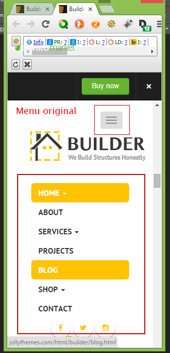
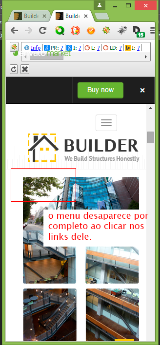
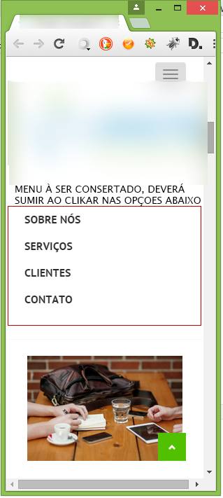
I’m trying to make the mobile responsive menu on a bootstrap site disappear altogether by clicking on its links. The site is one page and the links work via Anchors. The site has been modified into a ready themeforest theme by someone else. I believe that the class - Nav bar toogle Collapse - of bootstrap has to be modified. I tried to look for errors in JS files but could not find them. Follow the link of the theme to responsibly test the code and prints as an example. Thank those who solve the problem, I am waiting. Theme Builder: http://themeforest.net/item/builder-responsive-construction-site-template/full_screen_preview/11062294
<!DOCTYPE html>
<html lang="pt-BR">
<head>
    <meta charset="utf-8">
    <meta http-equiv="X-UA-Compatible" content="IE=edge">
    <meta name="viewport" content="width=device-width, initial-scale=1">
	<meta name="description" content=".">
	<meta name="keywords".">
    <meta name="author" content="https://plus.google.com/103758766556143989736" />
    <link rel="publisher" href="https://plus.google.com/103758766556143989736" />
    <link rel="canonical" href="" />
    <meta name="robots" content="index, follow" />
    <meta name="Googlebot" content="all" />
    <link rel="icon" href="favicon.png" type="image/png">
    <title></title>
    <!-- Bootstrap Core CSS -->
    <link href="css/bootstrap.min.css" rel="stylesheet">
    <link href="css/font-awesome.css" rel="stylesheet">
    <link href="css/owl-carousel.css" rel="stylesheet">
    <link href="style.css" rel="stylesheet">
    <link href='http://fonts.googleapis.com/css?family=PT+Sans:400,400italic,700,700italic' rel='stylesheet' type='text/css'>
    <link href='http://fonts.googleapis.com/css?family=Open+Sans:400,300,400italic,300italic,600,600italic,700,700italic,800,800italic' rel='stylesheet' type='text/css'>
    <link href="css/custom.css" rel="stylesheet">
    <!-- SLIDER REVOLUTION 4.x CSS SETTINGS -->
    <link rel="stylesheet" type="text/css" href="css/extralayers.css" media="screen" />
    <link rel="stylesheet" type="text/css" href="rs-plugin/css/settings.css" media="screen" />
    <!-- HTML5 Shim and Respond.js IE8 support of HTML5 elements and media queries -->
    <!-- WARNING: Respond.js doesn't work if you view the page via file:// -->
    <!--[if lt IE 9]>
        <script src="https://oss.maxcdn.com/libs/html5shiv/3.7.0/html5shiv.js"></script>
        <script src="https://oss.maxcdn.com/libs/respond.js/1.4.2/respond.min.js"></script>
    <![endif]-->
</head>
<body>
    <div id="wrapper">
        <section id="topbar" class="clearfix">
            <div class="container-fluid">
                <div class="row">
                    <div class="col-md-4 col-sm-4 col-xs-12">
                        <p class="center"><i class="fa fa-phone"></i>(11)2887-9388 / (11)97567-7657</p>
                    </div>
                    <div class="col-md-4 col-sm-4 col-xs-12">
                        <p class="center"><i class="fa fa-clock-o"></i>Atendimento - Horário Comercial </p>
                    </div>
                    <div class="col-md-4 col-sm-4 col-xs-12">
                        <p class="center"><i class="fa fa-envelope-o"></i></p>
                    </div>
                </div>
                <!-- end row -->
            </div>
            <!-- end container -->
        </section>
        <!-- end section -->
        <header class="header clearfix">
            <div class="container-fluid">
                <nav id="jtheader" class="navbar navbar-default">
                    <div class="navbar-header">
                        <button type="button" class="navbar-toggle collapsed" data-toggle="collapse" data-target="#navbar" aria-expanded="false" aria-controls="navbar">
                            <span class="sr-only">Toggle navigation</span>
                            <span class="icon-bar"></span>
                            <span class="icon-bar"></span>
                            <span class="icon-bar"></span>
                        </button>
                        <a class="navbar-brand" href="">
                            <img src="png" alt="logo">
                        </a>
                    </div>
                    <div id="navbar" class="navbar-collapse collapse">
                        <ul class="nav navbar-nav navbar-right">
                            <li><a href="#sobre-nos">Sobre nós</a></li>
                            <li><a href="#servicos">Serviços</a></li>
                            <li><a href="#clientes">Clientes</a></li>
                            <li><a href="#contato">Contato</a></li>
                        </ul>
                    </div>
                    <!--/.nav-collapse -->
                </nav>
            </div>
wow, now that I saw that the question is from 2015... but it appeared on the home page :P
– Dudaskank