2
I have doubts about how to build the layout below with HTML/CSS:
I haven’t implemented anything yet, because I have no idea how to do. Any suggestions?
Thank you!
2
I have doubts about how to build the layout below with HTML/CSS:
I haven’t implemented anything yet, because I have no idea how to do. Any suggestions?
Thank you!
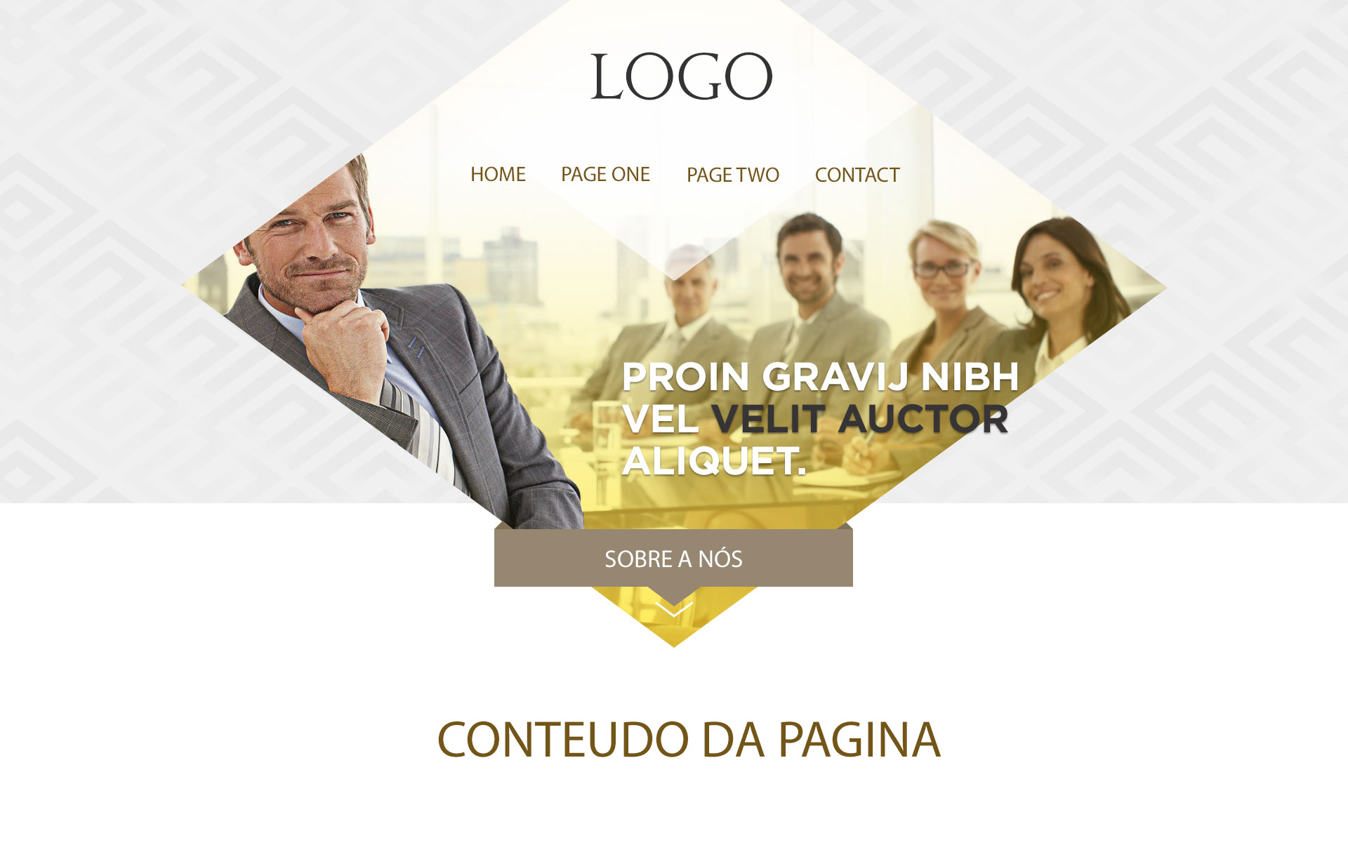
2
Basically this is a div parent square-shaped which is rotated to 45 degrees, and that a new div child, which will contain the image as background-image which will be round to -45 degrees to return again to the initial rotation of 0 degrees, or vice versa.
In other words:
/* Aqui a div pai é rodada a 45 graus */
.quadrado {
    width: 200px;
    height: 200px;
    margin: 50px;
    -ms-transform: rotate(45deg);
    -webkit-transform: rotate(45deg);
    transform: rotate(45deg);
    overflow: hidden;
}

/* E aqui (onde está a imagem como background) volta a ser rodada novamente para a sua posição inicial */
.minhaImagem {
    background: url(http://i.imgur.com/QDJ7Nae.jpg);
    width: 300px;
    height: 300px;
    margin: -50px;
    -ms-transform: rotate(-45deg);
    -webkit-transform: rotate(-45deg);
    transform: rotate(-45deg);
    background-size: cover;
    background-position: 50%;
}
<div class="quadrado">
<div class="minhaImagem"></div>
</div>In the example of the image you added along with your question the image seems to be a bit flattened, I was there playing a little with CSS code and I was able to create the square effect with this rotation as I described above, but I did not try to flatten itI was, but if you waste a little time on that code, I think you can create that same effect. You can also take a look in this article that can help you achieve the desired.
Thanks friend!
Browser other questions tagged jquery html css html5 css3
You are not signed in. Login or sign up in order to post.
What have you tried?
– Caio Felipe Pereira
Got something ready now?
– Sr. André Baill
First: they are not "sliced/cropped" images, they were made using some external software, such as Photoshop or Fireworks. Second: Your question is very vague, I ask you to specify more what you want and put what you already have of code.
– Jonathan Barcela
From the looks of it are Divs with images in the background.
– RFL
I haven’t implemented anything yet and @Jonathanbarcela, yes, this layout is done in PS. I just want an idea of how to do, for example that central div, it is rotated, with skew and inside it has a Background and some elements of text and menu
– Jefferson Alison