Section with display block does not work properly

Asked

Viewed 171 times

1

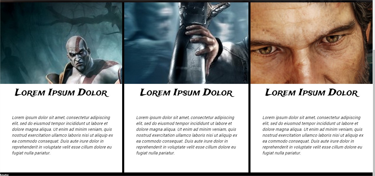
I have the following problem: I opened a topic yesterday regarding some positions that were getting wrong, and that I was able to solve. However, another problem appeared which consists of the following: In this image is the effect that I seek:

inserir a descrição da imagem aqui

And here’s the effect I got with my code:

inserir a descrição da imagem aqui

Until then everything right, however, see what happens when I resize the screen of the site :

inserir a descrição da imagem aqui

Note that on the screen of this site <section> are one at the bottom of the other, with a thin edge separating the two, and the side edges have no, being exactly zeroed.

Now this is my resized screen:

inserir a descrição da imagem aqui

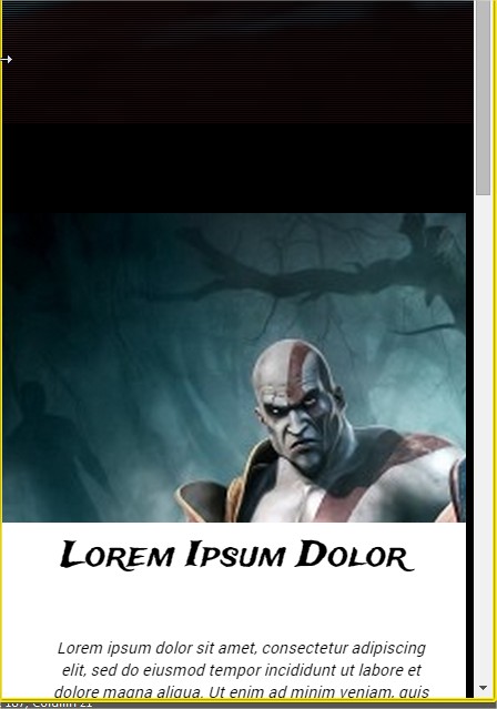
Understand that my <section> who comes after the <header> already takes a distance that could not, besides presenting a border on the left and being half crooked. Well, follow my code for better understanding:

#sessao-1 {
  margin-top: 210px;
}
#img-info {
  margin: 0;
  padding: 0;
}
#img-info li {
  width: 33.333%;
  display: inline-block;
  float: left;
}
.img-1 {
  background-image: url(http://www.kkuodesign.com/wordpress/wp-content/uploads/2009/11/assassins-creed-game-widescreen-wallpaper.png);
  background-size: cover;
  background-repeat: no-repeat;
  padding-top: 59.42%;
  border-right: 7px solid #000;
}
.img-2 {
  background-image: url(http://www.1stwallpaper.com/wp-content/uploads/2015/05/the_last_of_us_video_games_hd_wallpapers-500x300.jpg);
  background-size: cover;
  background-repeat: no-repeat;
  padding-top: 59.42%;
}
.img-3 {
  background-image: url(http://www.1stwallpaper.com/wp-content/uploads/2015/06/Images-bakground-gaming-wallpaper-mortal-kombat-high-quality-hd-wallpapers-500x300.jpg);
  background-size: cover;
  background-repeat: no-repeat;
  padding-top: 59.42%;
  border-left: 7px solid #000;
}
.text {
  background-color: #fff;
  width: 100%;
  height: 300px;
}
.text h1 {
  font-family: 'Trade Winds', cursive;
  font-size: 2em;
  text-align: center;
  padding: 15px;
}
.text p {
  width: 350px;
  max-width: 95%;
  padding: 15px 40px;
  font-family: 'Roboto', sans-serif;
  font-size: .9em;
  font-style: italic;
  line-height: 20px;
}
@media(max-width: 800px) {
  #img-info li {
    display: block;
    float: none;
    width: 100%;
    border: none;
  }
  .text p {
    text-align: center;
    margin: 0 auto;
  }
}
<section id="sessao-1">
  <ul id="img-info">
    <li>
      <div class="img-1">
        <div class="text">
          <h1>Lorem Ipsum Dolor</h1>
          <p>Lorem ipsum dolor sit amet, consectetur adipiscing elit, sed do eiusmod tempor incididunt ut labore et dolore magna aliqua. Ut enim ad minim veniam, quis nostrud exercitation ullamco laboris nisi ut aliquip ex ea commodo consequat. Duis aute
            irure dolor in reprehenderit in voluptate velit esse cillum dolore eu fugiat nulla pariatur.</p>
        </div>
      </div>
    </li>

    <li>
      <div class="img-2">
        <div class="text">
          <h1>Lorem Ipsum Dolor</h1>
          <p>Lorem ipsum dolor sit amet, consectetur adipiscing elit, sed do eiusmod tempor incididunt ut labore et dolore magna aliqua. Ut enim ad minim veniam, quis nostrud exercitation ullamco laboris nisi ut aliquip ex ea commodo consequat. Duis aute
            irure dolor in reprehenderit in voluptate velit esse cillum dolore eu fugiat nulla pariatur.</p>
        </div>
      </div>
    </li>

    <li>
      <div class="img-3">
        <div class="text">
          <h1>Lorem Ipsum Dolor</h1>
          <p>Lorem ipsum dolor sit amet, consectetur adipiscing elit, sed do eiusmod tempor incididunt ut labore et dolore magna aliqua. Ut enim ad minim veniam, quis nostrud exercitation ullamco laboris nisi ut aliquip ex ea commodo consequat. Duis aute
            irure dolor in reprehenderit in voluptate velit esse cillum dolore eu fugiat nulla pariatur.</p>
        </div>
      </div>
    </li>
  </ul>
</section>

Obs: as I decrease the screen my lyrics start to be superimposed by my background-color. I’m pretty sure the way I did mine section is wrong.

  • You are wearing bootstrap?

1 answer

1

Below is your code modified and working. I only made a few modifications, I will list them below and explain:

  • Instead of using border used margin and left the background of black father.
  • When adding the margins I used the selector #img-info li + li that selects the next brother of the li, causing the first to be without margin.
  • The width of li were reduced according to the value of the margin applied.
  • Placed display:table in sessao-1.

* {
  margin: 0;
  padding: 0;
}
#sessao-1 {
  margin-top: 210px;
}
#img-info {
  margin: 0;
  padding: 0;
  background: #000;
  width: 100%;
  display: table;
}
#img-info li {
  width: 32.666666666666666666666666666667%;
  display: inline-block;
  float: left;
  overflow: hidden;
}
#img-info li + li {
  margin-left: 1%;
}
.img-1 {
  background-image: url(http://www.kkuodesign.com/wordpress/wp-content/uploads/2009/11/assassins-creed-game-widescreen-wallpaper.png);
  background-size: cover;
  background-repeat: no-repeat;
  padding-top: 59.42%;
}
.img-2 {
  background-image: url(http://www.1stwallpaper.com/wp-content/uploads/2015/05/the_last_of_us_video_games_hd_wallpapers-500x300.jpg);
  background-size: cover;
  background-repeat: no-repeat;
  padding-top: 59.42%;
}
.img-3 {
  background-image: url(http://www.1stwallpaper.com/wp-content/uploads/2015/06/Images-bakground-gaming-wallpaper-mortal-kombat-high-quality-hd-wallpapers-500x300.jpg);
  background-size: cover;
  background-repeat: no-repeat;
  padding-top: 59.42%;
}
.text {
  background-color: #fff;
  width: 100%;
  height: 300px;
}
.text h1 {
  font-family: 'Trade Winds', cursive;
  font-size: 2em;
  text-align: center;
  padding: 15px;
}
.text p {
  width: 350px;
  max-width: 95%;
  padding: 15px 40px;
  font-family: 'Roboto', sans-serif;
  font-size: .9em;
  font-style: italic;
  line-height: 20px;
}
@media(max-width: 800px) {
  #img-info li {
    display: block;
    float: none;
    width: 100%;
    border: none;
  }
  #img-info li + li {
    margin-top: 5px;
    margin-left: 0;
  }
  .text p {
    text-align: center;
    margin: 0 auto;
  }
}
<section id="sessao-1">
  <ul id="img-info">
    <li>
      <div class="img-1">
        <div class="text">
          <h1>Lorem Ipsum Dolor</h1>
          <p>Lorem ipsum dolor sit amet, consectetur adipiscing elit, sed do eiusmod tempor incididunt ut labore et dolore magna aliqua. Ut enim ad minim veniam, quis nostrud exercitation ullamco laboris nisi ut aliquip ex ea commodo consequat. Duis aute
            irure dolor in reprehenderit in voluptate velit esse cillum dolore eu fugiat nulla pariatur.</p>
        </div>
      </div>
    </li>

    <li>
      <div class="img-2">
        <div class="text">
          <h1>Lorem Ipsum Dolor</h1>
          <p>Lorem ipsum dolor sit amet, consectetur adipiscing elit, sed do eiusmod tempor incididunt ut labore et dolore magna aliqua. Ut enim ad minim veniam, quis nostrud exercitation ullamco laboris nisi ut aliquip ex ea commodo consequat. Duis aute
            irure dolor in reprehenderit in voluptate velit esse cillum dolore eu fugiat nulla pariatur.</p>
        </div>
      </div>
    </li>

    <li>
      <div class="img-3">
        <div class="text">
          <h1>Lorem Ipsum Dolor</h1>
          <p>Lorem ipsum dolor sit amet, consectetur adipiscing elit, sed do eiusmod tempor incididunt ut labore et dolore magna aliqua. Ut enim ad minim veniam, quis nostrud exercitation ullamco laboris nisi ut aliquip ex ea commodo consequat. Duis aute
            irure dolor in reprehenderit in voluptate velit esse cillum dolore eu fugiat nulla pariatur.</p>
        </div>
      </div>
    </li>
  </ul>
</section>

Browser other questions tagged

You are not signed in. Login or sign up in order to post.