Responsive horizontal list that adjusts to 100% of parent div width

Asked

Viewed 2,842 times

1

I created a list with some social media buttons, only the last button is from Whatsapp, and I don’t want it to appear in the version desktop, only in the mobile.

So I created this media query:

@media (max-width: 600px) {
  .socialshare-list-item .socialshare-whatsapp-button {
    display: block;
  }
}
@media (min-width: 601px) {
  .socialshare-list-item .socialshare-whatsapp-button {
    display: none;
  }
}

but when I make the button Whatsapp disappear, the others <li> do not fit the width of the div pai and get a fixed size.

It looks just like in the example of this image below, and does not adjust to the final line.

inserir a descrição da imagem aqui

  • If possible, post the code to jsfiddle.net so we can see how the LI positioning is going.

3 answers

2

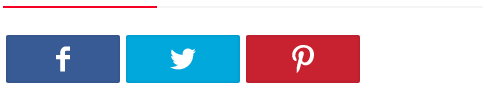
Well, from what I understand the question, what you’re trying to do here is create share buttons for the social networks mentioned in the question, and that these adjust to 100% of the total size of div pai in order to fully occupy the same.

If that’s it, you can do it this way: http://jsfiddle.net/Lhuh8jxx/
(Increase or decrease the jsFiddle result window to see code in action)

<ul id="linksPartilha">
    <li class="redeSocial facebookShare"><a href="#">Facebook</a></li>
    <li class="redeSocial twitterShare"><a href="#">Twitter</a></li>
    <li class="redeSocial pinterestShare"><a href="#">Pinterest</a></li>
    <li class="redeSocial whatsAppShare whatsApp"><a href="#">WhatsApp</a></li>
</ul>
#linksPartilha {
    list-style-type: none;
    margin: 0;
    padding: 0;
    width: 100%;
    display: table;              /* Transforma a div numa tabela */
    table-layout: fixed;         /* Utiliza o algoritmo de uma table fixed */
    border-collapse: separate;   /* Colapsa a tabela para poder adicionar o espaçamento */
    border-spacing: 5px 0px;     /* Adiciona o espaçamento */
}

/* Cria uma lista horizontal com espaçamento */
.redeSocial {
    display: table-cell;
    background: #2f3036;
}

/* Estilo para os links dos botões */
.redeSocial a {
    display:block;
    height: 50px;
    line-height: 50px;
    text-align: center;
    font-family: "Helvetica Neue", Helvetica, Arial, sans-serif;
    color: #fff;
    text-decoration: none;
}

/* Cor para cada botão */
.facebookShare {background-color:#3E5A97;}
.twitterShare {background-color:#2EA7DE;}
.pinterestShare {background-color:#C3292D;}
.whatsAppShare {background-color:#5BBE4A;}

@media (min-width: 600px) {
    .whatsApp {
        display: none;
    }
}

You can read more about the table-layout: fixed; here at this link: CSS table-layout Property

  • 1

    That’s right, thank you very much helped

1

In this case you need to update the width of the other three buttons, because depending on the width that was set, they will not update even. For example, you can leave the width: 25% in the mobile version and 33% in the desktop version.

  • Hi Joel, so the question is, the other Lies don’t fit because the last LI that is the Whatsapp is there it is only hidden, and the others don’t fit, I would need to disappear with the last LI in the mobile version and not simply hide it.

  • But this is it @Marcosmamede , you should update the width of the same after hiding the last LI, even if you use Javascript to delete the LI, it would not help anything.

1

The other <li> do not fit why the last <li> that is the Whatsapp is there, it is only hidden, then the others do not fit, I would need to disappear with the last <li> in the mobile version and not simply hide it.

Browser other questions tagged

You are not signed in. Login or sign up in order to post.