5
Make the bottom of a <img> or <div> is transparent like the iPhone design - blurred, blurred -, but only with CSS.
5
Make the bottom of a <img> or <div> is transparent like the iPhone design - blurred, blurred -, but only with CSS.
11
Pedro, then use with the settings below, and regulate the "blurring" through the property filter: blur, the result will come out like this:

<!-- HTML -->
<div class="content">
</div>
/* CSS */
.content:before {
  content: "";
  position: fixed;
  left: 0;
  right: 0;
  z-index: -1;

  display: block;
  background-image: url('http://www.zeldadungeon.net/wp-content/uploads/2011/07/legend-of-zelda-ocarina-of-time-3d-screenshots.jpg');
  width: 1200px;
  height: 800px;

  -webkit-filter: blur(15px);
  -moz-filter: blur(15px);
  -o-filter: blur(15px);
  -ms-filter: blur(15px);
  filter: blur(15px);
}

.content {
  position: fixed;
  left: 0;
  right: 0;
  z-index: 0;
  margin-left: 20px;
  margin-right: 20px;
}
It is worth remembering that the function filter() is not supported in IE.. http://caniuse.com/#search=filter
8
There is still no CSS specification for the case you describe. However, it can be simulated with a combination.
The image ios-7.jpg is our background. The idea is to position the div which will display the same image inside the container main, and then move the background according to the displacement.
Example:
.bg
{
    background-image:url(http://www.cnetfrance.fr/i/edit/2013/06/39791275/620x465/ios-7.jpg);
    width:620px;
    height:465px;
    position:relative;
}

.fg
{
    width:128px;
    height:128px;
    position:absolute;
    top:154px;
    left:69px;
    border: 4px solid black;
    border-radius:6px;
    overflow:hidden;
}

.fg .conteudo
{
    position:absolute;
    top:0;
    left:0;
}

.fg .bg
{
    position:absolute;
    background-image:url(http://www.cnetfrance.fr/i/edit/2013/06/39791275/620x465/ios-7.jpg);
    top:-154px;
    left:-69px;
    -webkit-filter: blur(10px);
    -moz-filter: blur(10px);
    -o-filter: blur(10px);
    -ms-filter: blur(10px);
    filter: blur(10px);
    display:none;
}

.fg:hover .bg
{
    display:block;
}
<div class='bg'>
<div class='fg'>
<div class='bg'></div>
<div class='conteudo'>
Conteúdo
</div>
</div>
</div>Click on > Execute code snippet and hover over the area with a black border to see the effect in action. Note that neither the text 'Content' nor the border suffer the effect of blurring.
ARE ABSOLUTELY SURE that there is no possibility to create a coverage of the Blur and opacit property with a mask to give this "effect" on a relative image???
@Lollipop no need to rely on my answer - feel free to look for alternative solutions. Blur and Opacity are applied to the element, not to the background (or at least this is the behavior at the time), thus requiring the filter target to be a distinct element.
Exactly. This element (not background) being relative to the target, could not give this effect? Grateful!
3
For modern browsers, use the CSS attribute opacity to see images or other things with transparency:
div {
  opacity: 0.8; //1.0 = totalmente opaco, 0.0 = totalmente transparente
}
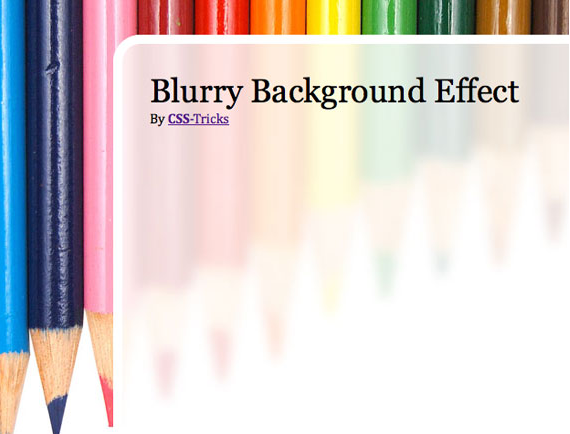
To see a blurred image, have a little use using two images iguas, I found here in CSS Tricks. Use a good and blurry one. Using CSS, you can put one on top of the other, like this:
And the CSS:
body     {
  background: url(images/bg-solid.jpg) no-repeat;
}

#page-wrap {
  background: url(images/bg-blurry.jpg) no-repeat fixed;
  width: 500px; margin: 40px auto;
}
The key being the fixed.
Even though the two images are possible, CSS3 has a middle with the attribute filter.
div {
  -webkit-filter: blur(0px);
  -moz-filter: blur(0px);
  -o-filter: blur(0px);
  -ms-filter: blur(13px);
  filter: blur(0px);
}
Today (2015-07-20), Caniuse.com informs that only IE and Opera Mini do not support this CSS3 attribute.
That I know, I don’t want transparent transparent, I want a transparent blurred. But thanks for trying. ;)
Can post a photo of the desired result?
http://thedesignblitz.com/wp-content/uploads/2013/12/14.jpg On the iPhone screen, but not as blurred as it is on the iPhone screen.
Browser other questions tagged html css
You are not signed in. Login or sign up in order to post.
http://answall.com/help/how-to-ask
– user3603
Pedro, attach a photo of what this effect would be like "like the iPhone design", so I can help you.
– Rafael Kendrik