0
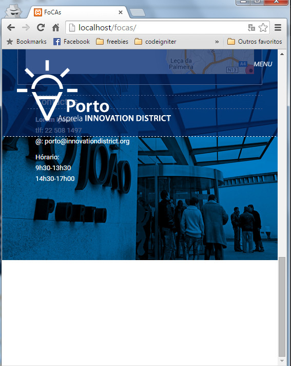
I have the site divided by several sections in which the background is an image with effect Parallax, in full screen the site appears to me right, but if reduce the window appears me a white strip at the bottom of the site, all other sections work except the content, which descends to the later section.
Follow the CSS I’m applying:
body {
background-color: #fff;
font-family: 'Roboto';
line-height: 21px;
font-size: 13px;
color: #fff;
margin:0 auto;
padding: 0;
float: none !important;
overflow-x: hidden;
height: 100%;
width: 100%;
min-height: 100%;
padding-bottom: 0px!important;
}

html {
    width: 100%;
    height: 100%;

}

#home{
background:url('../imagens/background_home.jpg') no-repeat 50% 0 fixed;
background-size: cover;
-moz-background-size: cover;
-o-background-size: cover;
-webkit-background-size: cover;
height: 100%;
width: 100%;
top: 0px;
left: 0px;
display: block;
}
#district{
  background: url('../imagens/background_2.jpg') no-repeat 50% 0 fixed; /*background: url('../imagens/background_2.jpg') no-repeat 50% 50%; */
background-size: cover;
-moz-background-size: cover;
-o-background-size: cover;
-webkit-background-size: cover;
height: 100%;
width: 100%;
top: 100%;
left: 0px;
display: block;
}

#local{
background: url('../imagens/background_3.jpg') no-repeat 50% 0 fixed;
background-size: cover;
height: 100%;
width: 100%;
top: 100%;
left: 0px;
display: block;
}
follows the html:
<!DOCTYPE html>
<meta charset="utf-8">
<meta http-equiv="X-UA-Compatible" content="IE=edge,chrome=1">
<title>FoCAs</title>
<meta name="description" content="foCAs">
<meta name="keywords" content="FEUP">
<meta name="viewport" content="width=device-width, initial-scale=1">
<link href='http://fonts.googleapis.com/css?family=Roboto:500,100,300,700,300italic,400' rel='stylesheet' type='text/css'>
<link rel="stylesheet" href="css/bootstrap.css">
<link rel="stylesheet" href="css/bootstrap-theme.css">
<link rel="stylesheet" href="css/style.css">
</head>
<body data-spy="scroll" id="body" >
<div class="container" id="home" data-speed="6" data-type="background">
<div calss="row logotipo">
<div class="col-md-1"></div>
<div class="col-md-10 logotipo"><img src="./imagens/logo_home.png" class="img-responsive img-center" ></div>
<div class="col-md-1"></div>
</div>
<div class="row">
<div class="col-md-12">
<nav class="navbarhome">
<ul class="menu" id="navbarhome">
<li><a class="page-scroll" href="#district">DISTRICT</a></li>
<li>|</li>
<li><a href="#local" class="page-scroll">LOCAL ECOSSYSTEM</a></li>
<li>|</li>
<li><a href="#" class="page-scroll">LIFE IN DISTRICT</a></li>
<li>|</li>
<li><a href="#" class="page-scroll">AGENDA</a></li>
<li>|</li>
<li><a href="#" class="page-scroll">USEFUL INFORMATION</a></li>
<li>|</li>
<li class="bandeiras"><a href="#"><img src="./imagens/pt_on.jpg" class="img-responsive img-center"></a></li>
<li class="bandeiras"><a href="#"><img src="./imagens/uk_on.jpg" class="img-responsive img-center"></a></li>
</ul>
</nav>
</div>
</div>
</div>
<!-- <div id="log">log</div>
<div id="log2">log2</div> -->
<section id="district" data-speed="6" data-type="background">
<div class="container-fluid">
<div class="row" id="menufixo">
<div class="col-md-12">
<div class="navbar-header menufixo">
<button type="button" class="navbar-toggle" data-toggle="collapse" data-target="#menufixo">
<span class="sr-only">Toggle navigation</span>
<i class="fa fa-bars">MENU</i>
</button>
<div class="col-md-3">
<a class="navbar-brand page-scroll" rel="home" href="#body" title="foCAs">
<img src="./imagens/logo.png" class="img-responsive img-center"/>
</a>
</div>
<div class="col-md-9">
<div class="collapse navbar-collapse" id="#menufixo">
<ul class="nav navbar-nav">
<li><a href="#district" class="page-scroll">DISTRICT</a></li>
<li><a>|</a></li>
<li><a href="#local" class="page-scroll">LOCAL ECOSSYSTEM</a></li>
<li><a>|</a></li>
<li><a href="#" class="page-scroll">LIFE IN DISTRICT</a></li>
<li><a>|</a></li>
<li><a href="#" class="page-scroll">AGENDA</a></li>
<li><a>|</a></li>
<li><a href="#" class="page-scroll">USEFUL INFORMATION</a></li>
<li><a>|</a></li>
<li class="bandeirasF"><a href="#"><img src="./imagens/pt_on.jpg" class="img-responsive img-center"></a></li>
<li class="bandeirasF"><a href="#"><img src="./imagens/uk_on.jpg" class="img-responsive img-center"></a></li>
</ul>
</div>
</div>
</div>
</div>
</div>
<div class="row-fluid conteudo">
<div class="col-md-12">
<div class="col-md-1"></div>
<div class="col-md-8 conteudo-central">
<section>
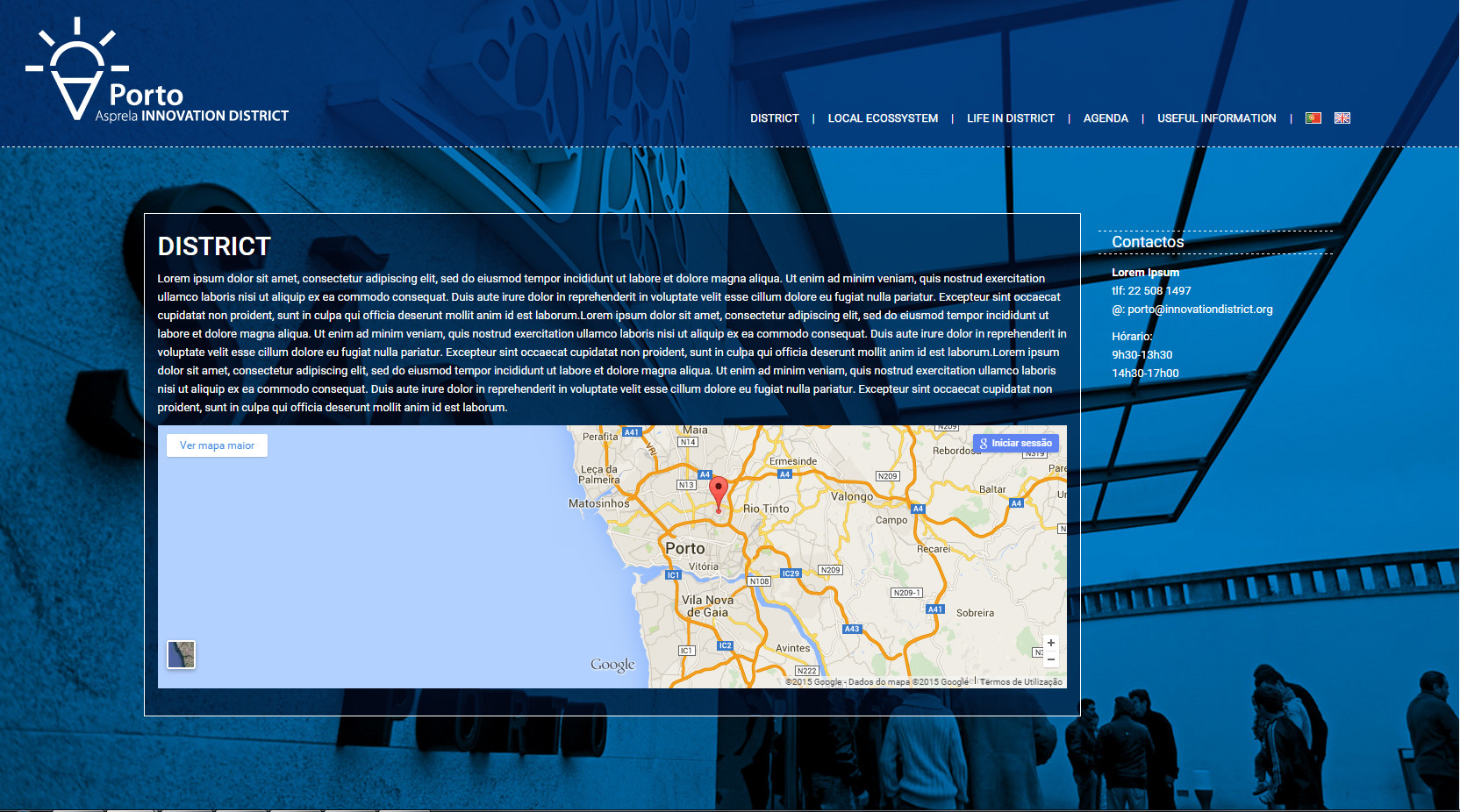
<p><h2>DISTRICT</h2></p>
<p>Lorem ipsum dolor sit amet, consectetur adipiscing elit, sed do eiusmod tempor incididunt ut labore et dolore magna aliqua. Ut enim ad minim veniam, quis nostrud exercitation ullamco laboris nisi ut aliquip ex ea commodo consequat. Duis aute irure dolor in reprehenderit in voluptate velit esse cillum dolore eu fugiat nulla pariatur. Excepteur sint occaecat cupidatat non proident, sunt in culpa qui officia deserunt mollit anim id est laborum.Lorem ipsum dolor sit amet, consectetur adipiscing elit, sed do eiusmod tempor incididunt ut labore et dolore magna aliqua. Ut enim ad minim veniam, quis nostrud exercitation ullamco laboris nisi ut aliquip ex ea commodo consequat. Duis aute irure dolor in reprehenderit in voluptate velit esse cillum dolore eu fugiat nulla pariatur. Excepteur sint occaecat cupidatat non proident, sunt in culpa qui officia deserunt mollit anim id est laborum.Lorem ipsum dolor sit amet, consectetur adipiscing elit, sed do eiusmod tempor incididunt ut labore et dolore magna aliqua. Ut enim ad minim veniam, quis nostrud exercitation ullamco laboris nisi ut aliquip ex ea commodo consequat. Duis aute irure dolor in reprehenderit in voluptate velit esse cillum dolore eu fugiat nulla pariatur. Excepteur sint occaecat cupidatat non proident, sunt in culpa qui officia deserunt mollit anim id est laborum.</p>
<!-- Responsive iFrame -->
<div class="google-maps">
<iframe src="https://www.google.com/maps/embed?pb=!1m18!1m12!1m3!1d14285.097337914034!2d-8.594056737643658!3d41.1766014510367!2m3!1f0!2f0!3f0!3m2!1i1024!2i768!4f13.1!3m3!1m2!1s0x0%3A0x0!2zNDHCsDEwJzQ2LjMiTiA4wrAzNicwOS41Ilc!5e0!3m2!1spt-PT!2spt!4v1437057105263" width="900" height="300" frameborder="0" style="border:0"></iframe>
</div>
<div class="blank"></div>
</section>
</div>
<div class="col-md-2 conteudo-lateral">
<div class="row">
<div class="col-md-12 titulo-lateral">Contactos</div>
<div class="col-md-12">
<p><strong>Lorem Ipsum</strong><br/>
tlf: 22 508 1497<br/>
@: <a href="mailto:[email protected]">[email protected]</a></p>
<p>
Hórario:<br/>
9h30-13h30<br/>
14h30-17h00
</p>
</div>
</div>
</div>
<div class="col-md-1"></div>
</div>
</div>
</div> <!-- ## FIM DO CONTAINER DISTRICT ## -->
</section>
<section id="local" data-speed="6" data-type="background">
<div class="container-fluid">
<div class="row-fluid conteudo">
<div class="col-md-12">
<div class="col-md-1"></div>
<div class="col-md-8 conteudo-central">
<section>
<p><h2>DISTRICT</h2></p>
<p>Lorem ipsum dolor sit amet, consectetur adipiscing elit, sed do eiusmod tempor incididunt ut labore et dolore magna aliqua. Ut enim ad minim veniam, quis nostrud exercitation ullamco laboris nisi ut aliquip ex ea commodo consequat. Duis aute irure dolor in reprehenderit in voluptate velit esse cillum dolore eu fugiat nulla pariatur. Excepteur sint occaecat cupidatat non proident, sunt in culpa qui officia deserunt mollit anim id est laborum.Lorem ipsum dolor sit amet, consectetur adipiscing elit, sed do eiusmod tempor incididunt ut labore et dolore magna aliqua. Ut enim ad minim veniam, quis nostrud exercitation ullamco laboris nisi ut aliquip ex ea commodo consequat. Duis aute irure dolor in reprehenderit in voluptate velit esse cillum dolore eu fugiat nulla pariatur. Excepteur sint occaecat cupidatat non proident, sunt in culpa qui officia deserunt mollit anim id est laborum.Lorem ipsum dolor sit amet, consectetur adipiscing elit, sed do eiusmod tempor incididunt ut labore et dolore magna aliqua. Ut enim ad minim veniam, quis nostrud exercitation ullamco laboris nisi ut aliquip ex ea commodo consequat. Duis aute irure dolor in reprehenderit in voluptate velit esse cillum dolore eu fugiat nulla pariatur. Excepteur sint occaecat cupidatat non proident, sunt in culpa qui officia deserunt mollit anim id est laborum.</p>
<!-- Responsive iFrame -->
<div class="google-maps">
<iframe src="https://www.google.com/maps/embed?pb=!1m18!1m12!1m3!1d14285.097337914034!2d-8.594056737643658!3d41.1766014510367!2m3!1f0!2f0!3f0!3m2!1i1024!2i768!4f13.1!3m3!1m2!1s0x0%3A0x0!2zNDHCsDEwJzQ2LjMiTiA4wrAzNicwOS41Ilc!5e0!3m2!1spt-PT!2spt!4v1437057105263" width="900" height="300" frameborder="0" style="border:0"></iframe>
</div>
<div class="blank"></div>
</section>
</div>
<div class="col-md-2 conteudo-lateral">
<div class="row">
<div class="col-md-12 titulo-lateral">Contactos</div>
<div class="col-md-12">
<p><strong>Lorem Ipsum</strong><br/>
tlf: 22 508 1497<br/>
@: <a href="mailto:[email protected]">[email protected]</a></p>
<p>
Hórario:<br/>
9h30-13h30<br/>
14h30-17h00
</p>
</div>
</div>
</div>
<div class="col-md-1"></div>
</div>
</div>
</div> <!-- ## FIM DO CONTAINER DISTRICT ## -->
</section>
<!-- JS's -->
<scrit scr="https://apis.google.com/js/platform.js"></script>
<script src="js/jquery-1.11.1.js"></script>
<script src="js/bootstrap.min.js"></script>
<script src="js/jquery.easing.min.js"></script>
<script src="js/scrolling-nav.js"></script>
</body>
</html>
The result is this that I present in the following images:
Full screen:
Reduced screen

Here is the image that shows that even without the box, that space appears
Online example: http://paginas.fe.up.pt/~nice
Please present the HTML code you have so we can help you.
– Paulo Roberto Rosa
In the image it may seem that it is due to the box with the map, but even if the smaller dimensions of the box appears this white stripe increasing and decreasing depending on the window size :/
– Laranja Mecânica
This is because the document size has increased, but the background image has a fixed size, and does not cover the entire area.
– KaduAmaral
but if it were so the same would not happen in fullscreen? if it is so as you say, you have some hint to solve?
– Laranja Mecânica
@Orange, try to get your code working here in the OS by clicking on the snippet
<>or in the Jsfiddle, so it’s easier for those who help you.– KaduAmaral
it didn’t turn out very well, I never used jsfidle, but here’s the link https://jsfiddle.net/3y5p51p4/
– Laranja Mecânica