Buttons made with images

Asked

Viewed 96 times

0

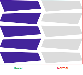
I have a question. I recently joined on that website here and I realized that right at the beginning there were some buttons with different format I took a look and I realized that they were images and that it had an effect :hover.

I found it very interesting, I gave an inspected and still did not understand how it was made, so I wonder if someone can explain to me how it was made because in an image file has several buttons.

If you give an inspect element you will see this, but do not understand how you managed, for example, to leave the button under each other, outside the :hover I don’t even know how they did it

2 answers

3


The effect does not use any CSS3 or HTML5 features, but I will show you how the effect works.

a{
    background-image: url(http://levelupgames.uol.com.br/elsword/era-dos-herois/img/menu-vertical.png);
    background-repeat: no-repeat;
    background-position: -168px 0;
    display: block;
    color: #000;
    width: 168px;
    height: 48px;
    font-family: 'carter_oneregular';
    font-size: 15px;
    text-transform: uppercase;
    text-align: center;
    line-height: 43px;
}
a:hover{
    background-position: 0 0;
}
a:active{
    background-position: 0 -48px;
}
a.efeito{
    -webkit-transition: background-position 1s; /* Safari */
    transition: background-position 1s;
}
<a>Normal</a>
<hr>
<a class="efeito">"Câmera Lenta"</a>

The effect is to reposition the background image.

Imagem do Background

In element the background-position of it is defined as -168px which is half the width of the image, where the gray frames begin and in the rule :hover he arrow like background-position: 0 0; which is at the beginning of the image.

An important point is the width and height, which should be the size of the frame used, in this case width: 168px; height:48px;.

This technique is known as Sprites, widely used in 2D game development, but also applied on the web.

You can read more about this Posting from the Tableless.

  • thank you simply fantastic your explanation and resolution simple and fast thank you even

2

First you create an image with two transitions according to the example below:

 _______________
|+++++++++++++++|
|++++ligado+++++|
|_______________|
|---------------|
|---desligado---|
|_______________|

Let’s imagine that this image has: 90px x 120px, that is, half of it in the horizontal equivalent to 60px.

<style> 
#elemento a {
   background: url('url_da_imagem.jpg') top left no-repeat;
   width: 90px;
   height: 60px;
   display:block;
   border: 1px solid #000;
}
#elemento a:hover {
   background: url('url_da_imagem.jpg') bottom left no-repeat;
}
#elemento span {
 display:none;
}
</style>

Note that the image has been repositioned in css, from [top] to [bottom] respecting the area of half the image size:

<div id="elemento">
   <a href="#"><span>ligado | desligado</span></a>
</div>

You can also instead of using top, and bottom, use a number relative to size, type: from [0px] to [-60px].

Browser other questions tagged

You are not signed in. Login or sign up in order to post.