2
I have a problem in a section because the text of one of them is overlapping the other when the page is redeemed and I don’t know what else to try so that it doesn’t happen follows the code :
/**********************************************************************************

								Section-2

***********************************************************************************/

.sessao-2 {
  height: 450px;
  border-bottom: 5px solid #fff;
}
.bg-sessao2 {
  background-image: url(https://clicksem.net/images/background_electronica.jpg);
  background-size: 100% 100%;
  height: 100%;
  width: 100%;
  margin-top: 5%;
  background-repeat: no-repeat;
  z-index: -2;
}
#bg-section {
  background-image: url(../images/overlay.png);
  position: absolute;
  width: 100%;
  height: 450px;
  z-index: 1;
}
.texto-sessao2 {
  text-align: left;
  color: #fff;
  font-family: Gabriola;
  z-index: 2;
  margin-left: 5%;
  margin-top: 10%;
}
.texto-sessao2 h1 {
  font-size: 3.5em;
}
.texto-sessao2 p {
  /*width: 40%;*/
  width: 500px;
  font-size: 1.2em;
  margin-top: -3%;
}
#btn-sessao2 li {
  display: inline;
}
#btn-sessao2 li a {
  margin: 20px;
  color: #fff;
  border: 2px solid #fff;
  -webkit-border-radius: 5px;
  -o-border-radius: 5px;
  -moz-border-radius: 5px;
  -ms-border-radius: 5px;
  border-radius: 5px;
  font-family: Gabriola;
  font-size: 1.2em;
  padding: 10px 15px;
}
#btn-sessao2 li a:hover {
  background-color: #fff;
  color: #222;
}
/**********************************************************************************

								Section-3

***********************************************************************************/

.sessao-3 {
  height: 450px;
}
.bg-sessao3 {
  height: auto;
  width: 100%;
  background-repeat: no-repeat;
  z-index: -2;
}
#web-design {
  width: 550px;
  margin-top: 2%;
  float: left;
}
.texto-sessao-3 {
  font-family: Gabriola;
  text-align: left;
  float: right;
}
.texto-sessao-3 h1 {
  font-size: 3.5em;
  margin-left: -10%;
}
.texto-sessao-3 p {
  font-size: 1.2em;
  width: 500px;
  margin-top: -3%;
  margin-left: -10%;
}
#contato {
  color: #222;
  border: 2px solid #222;
  -webkit-border-radius: 5px;
  -o-border-radius: 5px;
  -moz-border-radius: 5px;
  -ms-border-radius: 5px;
  border-radius: 5px;
  font-family: Gabriola;
  font-size: 1.2em;
  padding: 10px 25px;
  clear: both;
  margin-left: -10%;
}
#contato:hover {
  background-color: #222;
  color: #fff;
}
/**********************************************************************************

								Section-4

***********************************************************************************/

.sessao-4 {
  height: 450px;
  margin-top: -50px;
}
.bg-sessao-4 {
  background-image: url(https://clicksem.net/images/background_electronica.jpg);
  background-size: 100% 100%;
  height: 100%;
  width: 100%;
  margin-top: 5%;
  background-repeat: no-repeat;
  z-index: -2;
}
#bg-section-4 {
  background-image: url(../images/overlay.png);
  position: absolute;
  width: 100%;
  height: 450px;
  z-index: 1;
}
.texto-sessao-4 {
  color: #fff;
  font-family: gabriola;
  z-index: 2;
  text-align: left;
  margin-left: 5%;
  margin-top: 7%;
}
.texto-sessao-4 h1 {
  font-size: 3.5em;
}
.texto-sessao-4 p {
  font-size: 1.2em;
  width: 500px;
  margin-top: -3%;
}
#sobre {
  border: 2px solid #fff;
  color: #fff;
  font-size: 1.3em;
  -webkit-border-radius: 5px;
  -o-border-radius: 5px;
  -moz-border-radius: 5px;
  -ms-border-radius: 5px;
  border-radius: 5px;
  padding: 10px 20px;
}
#sobre:hover {
  background-color: #fff;
  color: #222;
}
<section class="sessao-2">
<div id="bg-section">
<div class="texto-sessao2">
<h1>Um mundo de posibilidades</h1>
<p>Lorem ipsum dolor sit amet, consectetur adipiscing elit, sed do eiusmod tempor incididunt ut labore et dolore magna aliqua. Ut enim ad minim veniam, quis nostrud exercitation ullamco laboris nisi ut aliquip ex ea commodo consequat.consectetur adipiscing
elit, sed do eiusmod tempor incididunt ut labore et dolore magna aliqua.nostrud exercitation ullamco laboris nisi ut aliquip ex ea commodo .</p>
</div>
<br/>
<ul id="btn-sessao2">
<li><a href="#">Conheça nossos serviços</a>
</li>
</ul>
</div>
<div class="bg-sessao2"></div>
</section>
<section class="sessao-3">
<div class="bg-sessao3">
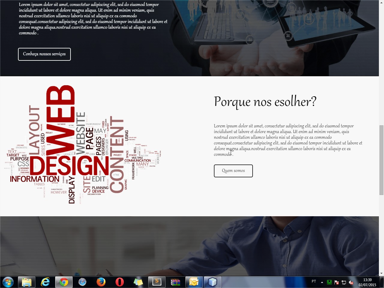
<img src="http://blog.dudamobile.com/wp-content/uploads/2014/02/Viewing-platforms.png" alt="web-design" id="web-design" />
<section class="section--blue wow fadeInRight" data-wow-offset="300">
<div class="texto-sessao-3">
<h1>Porque nos esolher?</h1>
<p>Lorem ipsum dolor sit amet, consectetur adipiscing elit, sed do eiusmod tempor incididunt ut labore et dolore magna aliqua. Ut enim ad minim veniam, quis nostrud exercitation ullamco laboris nisi ut aliquip ex ea commodo consequat.consectetur
adipiscing elit, sed do eiusmod tempor incididunt ut labore et dolore magna aliqua.nostrud exercitation ullamco laboris nisi ut aliquip ex ea commodo .</p>
<br/>
<a href="#" id="contato">Quem somos</a>
</div>
</section>
</div>
</div>
</section>
<section class="sessao-4">
<div id="bg-section-4">
<div class="texto-sessao-4">
<h1>Pode contar conosco sempre</h1>
<p>Lorem ipsum dolor sit amet, consectetur adipiscing elit, sed do eiusmod tempor incididunt ut labore et dolore magna aliqua. Ut enim ad minim veniam, quis nostrud exercitation ullamco laboris nisi ut aliquip ex ea commodo consequat.consectetur adipiscing
elit, sed do eiusmod tempor incididunt ut labore et dolore magna aliqua.nostrud exercitation ullamco laboris nisi ut aliquip ex ea commodo .</p>
<br/>
<a href="#" id="sobre">sobre a web sky's</a>
</div>
</div>
<div class="bg-sessao-4"></div>
</section>the part that is in trouble would be the one that is in the middle where is the title why choose us to redeem the screen you will see that section superimpose the bottom one I’m doing wrong follows an image to be able to visualize how it looks on the screen:
and when I redeem the screen it looks like this :

gave right friend thanks for the help
– Felipe Henrique