0
I have a set of links (which have a stylization that makes them look like buttons) on my site, they work properly when on a computer browser or tablet but when on smartphones would like to transform these links (botões) in Slide Down Responsive how this layout change is made (so html)?
HTML code:
<header>
            <div class="container">
                <div class="row">
                    <div id="profile_information" class="col-md-8 col-md-offset-2">
                        <img id="profile_image" src="assets/images/misc/Tio-Sam.png">
                        <div id="profile_content">
                            <h1 class="nome"><strong>Nome</strong></h1>
                            <h2 class="desc">Descrição</h2>
                            <a href="#" class="social" id="email" target="_blank"></a>
                            <a href="#" class="social" id="linkedin" target="_blank"></a>
                            <a href="#" class="social" id="curriculum" target="_blank"></a>
                            <a href="#" class="social" id="github" target="_blank"></a>
                            <a href="#" class="social" id="sopt" target="_blank"></a>
                        </div>
                        <img id="claws" src="assets/images/misc/Claws.png">
                        <div id="menu">
                            <a class="btn btn-xs btn-info gray" href="index.html">Sobre mim</a>
                            <a class="btn btn-xs btn-info gray" href="conhecimentos.html">Conhecimentos</a>
                            <a class="btn btn-xs btn-info gray" href="#">Aprender e Atualizar</a>
                            <a class="btn btn-xs btn-info gray" href="contato.html">Contato</a>
                            <a class="btn btn-xs btn-info gray" href="experiencia.html">Experiência</a>
                            <a class="btn btn-xs btn-info gray" href="portfolio.html">Portfólio</a>
                        </div>
                    </div>
                </div>
            </div>
        </header>
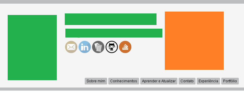
Picture of how this on the computer:
Screenshot of how this is in the browser (Portrait):
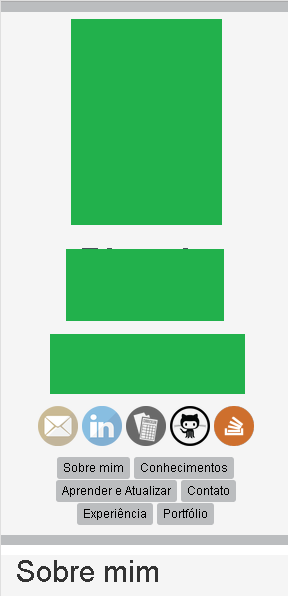
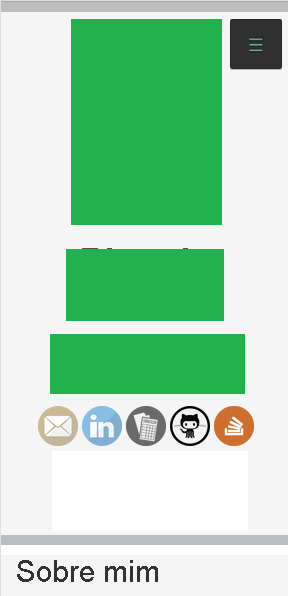
Image of how it should look (Portrait):
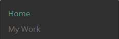
Open slide down:
If I understand what you want, you will need it http://www.w3schools.com/cssref/css3_pr_mediaquery.asp When x resolution is displayed one way and by default another
– Maicon Carraro
Ta using Bootstrap? Can you set it to emulate there?
– KaduAmaral
@Yes I’m wearing bootstrap.
– Ricardo
@Maiconcarraro I’ve seen this
@mediabut the problem is not restricted to this aloneslide down menu responsivethat I built had a different html structure and were not composed of buttons.– Ricardo
@Ricardohenrique I say when your resolution is x you hide your buttons div and display the div
slide downand when it passes the resolution the reverse.– Maicon Carraro
I understand more so the html would get kind of big correct.
– Ricardo
@bfavaretto would like you to give me feedback on the tag wiki that I propose some are accepted and some are not, there are few but I would like to know why I can improve.
– Ricardo