How to make a column occupy the rest of the available space?

Asked

Viewed 13,657 times

13

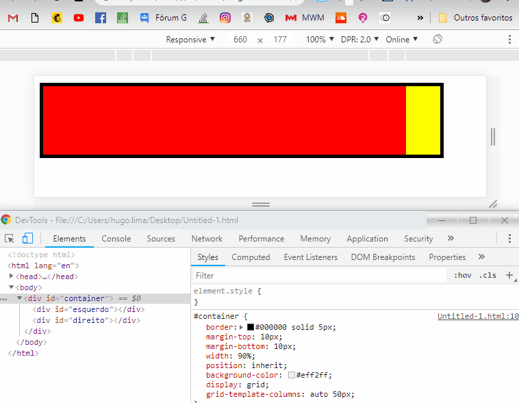
I would like to put two blocks inside a div of parallel size, one with fixed size, and the other that fits exactly in the remaining space.

For example :

div#container {
  width: 50%; /* este tamanho se altera */
  height: 100px;
}

#esquerdo {
  width: 100%
  height: 100px;
}
#direito {
  width: 40px;
  height: 100px;
}

I want the blocks #left and #right side by side filling the container. see here : http://jsfiddle.net/nmqhyuz3/

What should I do?

3 answers

11


You can do this with Flexbox:

  1. Make the #container have flex layout:

    div#container {
        display: flex;
    
  2. The element on the left, whose size should occupy as much of the available space, you establish that it grows freely:

    #esquerdo {
        /*width: 100%*/
        flex-grow: 1;
    
  3. The one on the right is unchanged - the default value for flex-grow is zero, so it will not grow beyond the given width.

Example in jsFiddle.

  • That "layout" killed me...

  • @Jorgeb Some people think it’s ugly (a lot of people), but I like it, and at least in pt_BR is correct. layout is also correct, of course, and "kills" a lot less people... : P

  • I know it’s correct in pt_BR. But I think it’s a crime someone remembers to create the Portuguese word with the English sound. But it was worth doing with all of them so at least they could speak English :P

  • 1

    I was floating without understanding the word "layout" until the @Jorge B.. rsrsrsrsr comment

  • 1

    @Jorgeb. What if I told you that some Brazilian politicians wanted us to change the spelling from "pizza" to "fife"? Sad, but true. I’m glad you didn’t pick up.

  • @bfavaretto that’s accent. Here if we change depending on the accent we were lost. Here we say "pidza"

  • Who learns layout before layout really has a certain difficulty. The same occurs with container and container, and many others (I’ve seen even "mause"). There is no right... but rather the appropriate. In my opinion any of these words is appropriate in the SOPT.

  • @Miguelangelo I don’t think it’s right to choose English. Any day you only say "Ai lâve Iu" in comes of "I love you"

  • Well, the display: flex; the #container does not allow me to add another block inside the container, which breaks, the blocks are always side by side, no matter what I do! is there any way ?? Thank you!!!

  • 1

    @Danilloeder flex-wrap: wrap; in your container, and create new divs at the points where you want a break to occur; these divonly need to have flex-basis: 100%, and nothing else. Example.

  • Man, you’re too much dough bro! Thank you so much! God bless you!!! vlw

Show 6 more comments

5

It is possible to do this with float, simply change the order of the elements in the HTML... the direito should come first and the esquerdo afterward:

/* ESTILOS IMPORTANTES PARA A RESPOSTA */
#esquerdo {
    height: 100px;
    overflow: hidden;
}
#direito {
    width: 50px;
    height: 100px;
    float: right;
}


/* ESTILOS AUXILIARES */
#container {
    border: #000000 solid 5px;
    margin-top: 10px;
    margin-bottom: 10px;
    width: 90%;
}
#esquerdo {
    background-color: red;
    overflow: hidden;
    border: 2px solid darkred;
    box-sizing: border-box;
}
#direito {
    background-color: yellow;
    border: 2px solid darkolivegreen;
    box-sizing: border-box;
}
<div id="container">
    <div id="direito">direito</div>
    <div id="esquerdo">esquerdo</div>
    container
</div>

1

I’ll give you one more option using, using display:grid and how grid-template-columns: auto 50px; I leave the left column wide auto, 100% of the available space, and the right column has value fixo de 50px.

inserir a descrição da imagem aqui

Code referring to image above

#container {
    border: #000000 solid 5px;
    margin-top: 10px;
    margin-bottom: 10px;
    width: 90%;
    position: inherit;
    background-color: #eff2ff;
    display: grid;
    /* aqui eu defino que o Grid tem Duas colunas uma com width:auto e outra com 50px */
    grid-template-columns: auto 50px; 
}
#esquerdo {
    vertical-align: top;
    height: 100px;
    background-color: red;
    display: inline-block;
}
#direito {
    vertical-align: top;
    height: 100px;
    background-color: yellow;
    display: inline-block;
}

    
<div id="container">
    <div id="esquerdo"></div>
    <div id="direito"></div>
</div>

Browser other questions tagged

You are not signed in. Login or sign up in order to post.