Well, since you didn’t post any code and commented on using Bootstrap, I will pass some references of their own site. The Bootstrap has this answer, which would be the use of 'Affix'.
It creates an element and causes it to be fixed after a particular scroll. All the documentation you can follow on this link: http://getbootstrap.com/javascript/#affix
In addition to css you will also need the javascript package from bootstrap, that can be customized in the download area: http://getbootstrap.com/customize/
For the matter of Responsive, it goes a lot of the layout you have. Usually on mobile, you don’t use this, because it gets ugly, tight, polluted. It is best that you remove this option on mobile. The bootstrap itself has this, with 'hidden-xs' or 'hidden-md', read more here: http://getbootstrap.com/css/#Responsive-Utilities
Or like your example, if the header is this fixed sidebar, you just need to use a css to fix it. Example: 'position:fixed; top:0;' or an own CSS font for this option: http://getbootstrap.com/components/#navbar-Fixed-top
Any questions you have regarding Bootstrap, take a look at their website, there is a very complete documentation with many options.
I hope I’ve helped
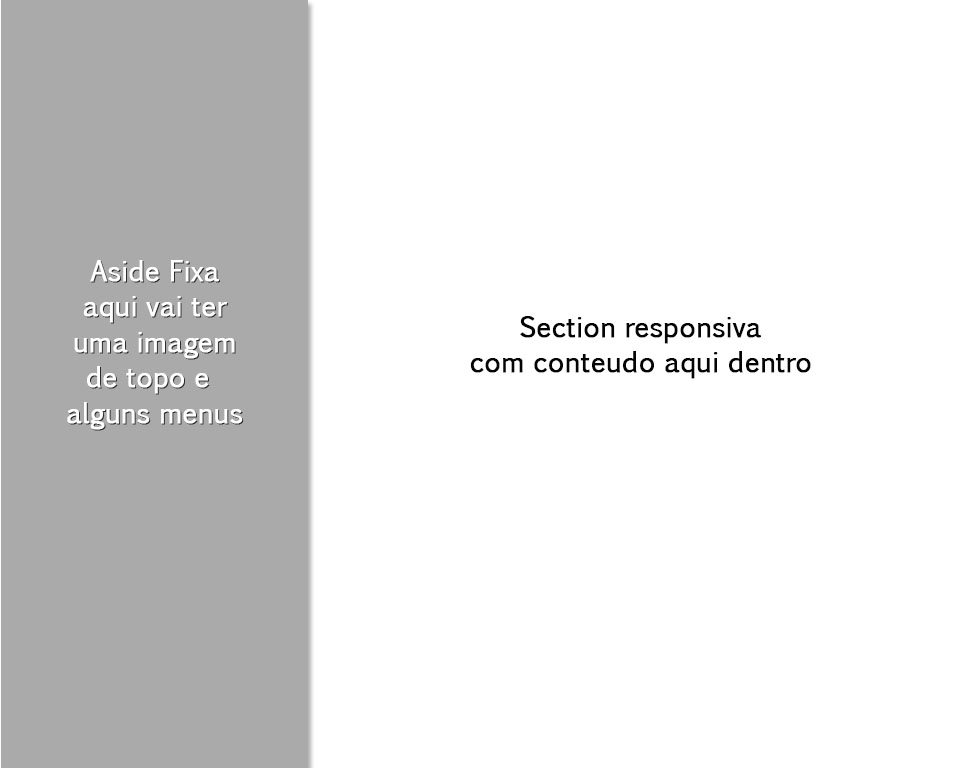
Ever tried to put a 'position:Fixed' on the div sidebar ?
– Claudia Mardegan
In the official documentation have some examples similar to what you want, already tried a look at this?: http://getbootstrap.com/examples/dashboard/
– dHEKU