1
I’m doing a study on the CSS grid and came across a problem.
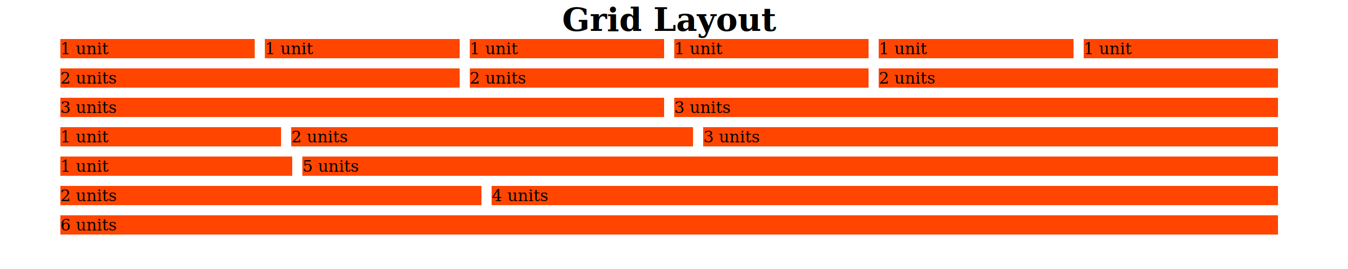
I created a grid with six columns and am using helpers to determine how many columns I will merge. I am confused by the fact that the 3-unit column in the third row is different from the 3-unit column in the fourth row. The reason why they are different I have an idea, but I wonder if it is possible to tidy up or if you have any tricks to make these two columns equal in width.
Below is the CSS code.
* {
    margin: 0;
    padding: 0;
    box-sizing: border-box;
}

:root {
    --max-width: 1200px;
    --gutter-horizontal: 10px;
    --gutter-vertical: 10px;
    --direction: row;
}

.grid {
    display: grid;
    margin: 0 auto;
    max-width: var(--max-width);

    row-gap: var(--gutter-vertical);
}

.row {
    display: grid;
    grid-template-columns: repeat(6, auto);

    column-gap: var(--gutter-horizontal);
    row-gap: var(--gutter-vertical);
}

.col {
    background-color: orangered;
}

.col-1 { grid-column-end: span 1; }
.col-2 { grid-column-end: span 2; }
.col-3 { grid-column-end: span 3; }
.col-4 { grid-column-end: span 4; }
.col-5 { grid-column-end: span 5; }
.col-6 { grid-column-end: span 6; }
And here the HTML
<!DOCTYPE html>
<html lang="en">
<head>
    <meta charset="utf-8">
    <title>Grid Layout</title>

    <link rel="stylesheet" href="grid-layout.css">
</head>
<body>
    <h1 style="text-align: center;">Grid Layout</h1>

    <div class="grid">

        <div class="row">
            <div class="col col-1">1 unit</div>
            <div class="col col-1">1 unit</div>
            <div class="col col-1">1 unit</div>
            <div class="col col-1">1 unit</div>
            <div class="col col-1">1 unit</div>
            <div class="col col-1">1 unit</div>
        </div>

        <div class="row">
            <div class="col col-2">2 units</div>
            <div class="col col-2">2 units</div>
            <div class="col col-2">2 units</div>
        </div>

        <div class="row">
            <div class="col col-3">3 units</div>
            <div class="col col-3">3 units</div>
        </div>

        <div class="row">
            <div class="col col-1">1 unit</div>
            <div class="col col-2">2 units</div>
            <div class="col col-3">3 units</div>
        </div>

        <div class="row">
            <div class="col col-1">1 unit</div>
            <div class="col col-5">5 units</div>
        </div>

        <div class="row">
            <div class="col col-2">2 units</div>
            <div class="col col-4">4 units</div>
        </div>

        <div class="row">
            <div class="col col-6">6 units</div>
        </div>
    </div>
</body>
</html>
Wow, so simple!? Still ended up clarifying the doubt about this unit of measure. I had not understood why to use the fr. Thank you!
– Gabriel Morikawa
When applying the unit
autocolumn size is being considered the size of the child element belonging to column. I just can’t say why thespanapplied on the propertygrid-column-endwas having a different size at some point.– Victor Carnaval
I don’t really have a concrete answer. But I believe that the reason for the difference in sizes is as follows: all columns are proportional in size to the columns belonging to the same row. So far ok, but why is the column of 3 units of the third row (ratio of 1/2) different from the 3 units of the fourth column (also of 1/2)? The space between columns is not being taken into account in the calculation. In the third row there are fewer spaces between columns, so more space is available for them to occupy. Already in the fourth line to an extra space, limiting a little the available space.
– Gabriel Morikawa
Top! That’s what I was trying to understand :) Boa @Gabrielmorikawa
– Victor Carnaval