3
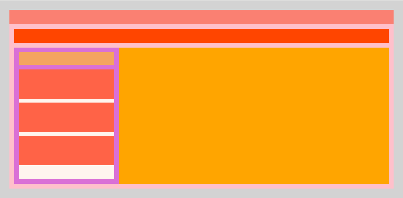
Guys, I’ve been trying to apply an HTML layout for a while but I’m having trouble keeping Divs responsive. Basically the layout I want is this one.
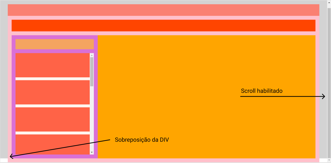
However when adding more color Divs Tomato the layout is overlapped and I end up getting this result.
I would like to solve this problem but I could not find any solution.
Follow my HTML and CSS codes to analyze.
*,
*::before,
*::after {
    padding: 0;
    margin: 0;
    box-sizing: border-box;
}

html,
body {
    height: 100%;
}

.container {
    height: 100%;
    width: 100%;
    padding: 32px;
    background-color: lightgray;
}

.panel {
    height: 100%;
    width: 100%;
    background-color: #fff;
}

.tab {
    display: flex;
    flex-direction: column;
    height: 100%;
    width: 100%;
}

.tab-header {
    min-height: 48px;
    background-color: salmon;
}

.tab-content {
    display: flex;
    flex-direction: column;
    height: 100%;
    background-color: pink;
    padding: 16px;
}

.card-actions {
    min-height: 48px;
    background-color: orangered;
}

.card-groups {
    display: flex;
    width: 100%;
    height: 100%;
    margin-top: 16px;
    background-color: orange;
    overflow: auto;
}

.card-group {
    display: flex;
    flex-direction: column;
    min-width: 355px;
    height: 100%;
    background-color: orchid;
    margin-right: 16px;
    padding: 16px;
}

.title {
    background-color: sandybrown;
    height: 48px;
    margin-bottom: 16px;
}

.card-list {
    background-color: seashell;
    height: 100%;
    overflow: auto;
}

.card {
    height: 100px;
    background-color: tomato;
    margin-bottom: 12px;
}
<div class="container">
<div class="panel">
<div class="tab">
<div class="tab-header">
</div>
<div class="tab-content">
<div class="card-actions"></div>
<div class="card-groups">
<div class="card-group">
<div class="title">
</div>
<div class="card-list">
<div class="card"></div>
<div class="card"></div>
<div class="card"></div>
<div class="card"></div>
<div class="card"></div>
<div class="card"></div>
<div class="card"></div>
<div class="card"></div>
<div class="card"></div>
<div class="card"></div>
<div class="card"></div>
<div class="card"></div>
</div>
</div>
</div>
</div>
</div>
</div>
</div>
Dude the problem is that you went out putting 100% height on everything... Some elements, even interns are picking up 100% of Body’s height and not Dad’s... In fact the son takes 100% of the height of the father, which is 100% of the height of Body, then the son does not fit in the father, since there are other children with fixed height in px.
– hugocsl
So more in case I want all the content to be inside the page without the scroll side where only the card-list is scrolled, I could not visualize a form of content occupy the entire screen without using the 100%.
– Joao Victor de Paula Ramos