11
How can I play the image below using HTML, CSS and JS (maybe images)? The "floor" numbers are unpredictable and each "floor" should be "clickable", a <a href="#"></a>, or something like that.
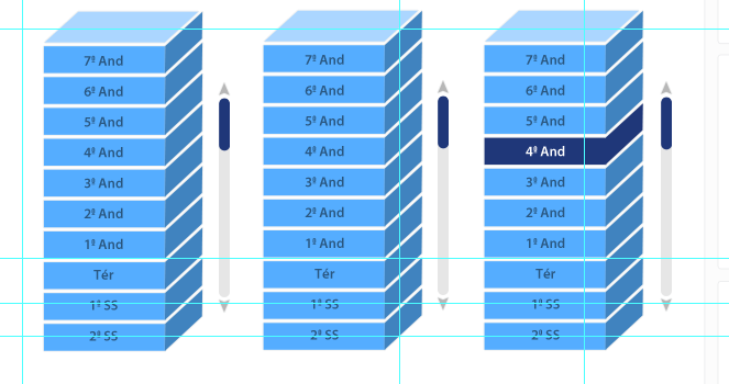
It is possible to do?
11
How can I play the image below using HTML, CSS and JS (maybe images)? The "floor" numbers are unpredictable and each "floor" should be "clickable", a <a href="#"></a>, or something like that.
It is possible to do?
17
One can do what you want using only HTML and CSS3 transformations. That tool serves as a starting point, for you to experiment with the options available, but for greater control it is better to do manually. The way to use is:
transform, followed by one or more processing operations;skewtranslate the displacement; both operations occur horizontally;
skewX and skewY, tranlateX and translateY, etc.. rotate rotate the element; any subsequent operation already takes into account the rotated element, so that if you want to move an element vertically, for example, rotate it 90 degrees, move it, and rotate it 90 degrees again (if applicable).scale increases/decreases the element in scale.These are some simple operations. For a more complete list, see that documentation on the MDN. Note that not all of them can be supported by all browsers, and some of them require a prefix (-webkit-, -moz-, -o-, -ms-) before transform, since this property has not yet been fully standardized.
Below is a pretty crude example of what can be done. It tilts the top; shifts the front; shifts, rotates, climbs, tilts, and shifts the sides again, so as to place them in the proper place. The elements are common HTML, so you can put whatever you want there. Both the front and the side is clickable, and also put an effect hover to change the color of the walk under the mouse.
#topo {
  background-color: blue;
  width: 102px;
  height: 30px;
  transform: skewX(-45deg);
  -webkit-transform: skewX(-45deg);
  -moz-transform: skewX(-45deg);
  -o-transform: skewX(-45deg);
  -ms-transform: skewX(-45deg);
  margin: 20px;
}

#andares {
  list-style-type: none;
  margin: 20px;
}

#andares .frente {
  background-color: red;
  width: 100px;
  height: 30px;
  transform: translate(-54px);
  -webkit-transform: translate(-54px);
  -moz-transform: translate(-54px);
  -o-transform: translate(-54px);
  -ms-transform: translate(-54px);
  margin-top: -18px;
}

#andares li:hover .frente {
  background-color: yellow;
}

#andares .lado {
  background-color: green;
  width: 20px;
  height: 20px;
  margin: 1px;
  transform: translate(52px) rotate(90deg) scale(1.5) skewX(45deg) translate(-27px);
  -webkit-transform: translate(52px) rotate(90deg) scale(1.5) skewX(45deg) translate(-27px);
  -moz-transform: translate(52px) rotate(90deg) scale(1.5) skewX(45deg) translate(-27px);
  -o-transform: translate(52px) rotate(90deg) scale(1.5) skewX(45deg) translate(-27px);
  -ms-transform: translate(52px) rotate(90deg) scale(1.5) skewX(45deg) translate(-27px);
}

#andares li:hover .lado {
  background-color: cyan;
}
<div id="topo"></div>
<ul id="andares">
<li><a href="http://google.com"><div class="frente">Google</div><div class="lado"></div></a></li>
<li><a href="http://facebook.com"><div class="frente">Facebook</div><div class="lado"></div></a></li>
<li><a href="http://twitter.com"><div class="frente">Twitter</div><div class="lado"></div></a></li>
</ul>Jeez, you really did it, and no svg, was cool (compared to mine), and great explanation. + 1
Browser other questions tagged javascript html css
You are not signed in. Login or sign up in order to post.
Possible even would be, perhaps using a Canvas, or SVG, with the help of some library (perhaps D3.js), but I believe it would be some complicated and laborious well, there is real need for 3D?
– Fernando Leal
I put the 3D in quotes for this. I just need this 3D printing, with this fold on one of the vertices. Canvas and SVG probably won’t be supported on IE9, but I’ll search. Thanks, @Fernando
– erickalves05
The front facade is trivial (since it is rectangular), but the side ones would require some adjustment (perhaps a CSS3 transformation would be sufficient, it would not need canvas). What do you want to put in this space? Custom images/HTML, or every floor is the same, only changes the text?
– mgibsonbr
@erickalves05, the most I could get, using only html and css3, was here. But more for a menu than building. Hehe. Maybe SVG, with CSS3 is the best way.
– Fernando Leal
@mgibsonbr would only change the same text.
– erickalves05
@Fernando, thank you for your help. It has led me to know more about canvas and SVG. I will continue to deepen myself.
– erickalves05