0
I’m trying to center both horizontally and vertically this H3 but it’s bigger than the image, so when it changes the size of the device being seen it ends up leaving the center:
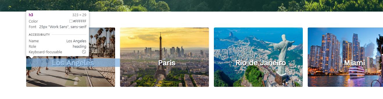
The images have a min-width: 285px; and a max-width: 368px; and I would like the width of H3 to go with that to be centered both horizontally and vertically, how can I do that? I tried to put this on H3 but it didn’t work as I expected
@import url('https://fonts.googleapis.com/css2?family=Raleway:ital,wght@1,500&display=swap');
@import url('https://fonts.googleapis.com/css2?family=Raleway:ital,wght@1,500&family=Work+Sans&display=swap');

* {
    padding: 0;
    margin: 0;
}

header {
    background-image: linear-gradient(rgba(0,0,0,0.45),rgba(13, 224, 207, 0.15)),url(1.jpg);
    width: 100%;
    height: 95vh;
    background-size: cover;
    background-position: center;
}

html, body {
    overflow-x:hidden
}

body {
    overflow-x: hidden;
    width: 100%;
    height: 100%;
}

.logo {
    font-size: 25px;
    margin-top: 25px;
    cursor: pointer;
    font-family: 'Work Sans', sans-serif;
}

nav {
    display: flex;
    justify-content: space-around;
    align-items: center;
}

ul li a {
    text-decoration: none;
    color: #fff;
    font-family: 'Raleway', sans-serif;
    transition: 0.3s;
}

a{
    text-decoration: none;
}

ul li a:hover {
    opacity: 0.7;
}

.nav-list ul li {
    list-style: none;
    display: inline-block;
    margin: 25px 32px 0 0;
    letter-spacing: 2px;
}

.info-1 {
    width: 100%;
    position: absolute;
    top: 35%;
    color: #fff;
    margin-left: 5%;


}

.info-btn {
    border-radius: 5px;
    background-color: white;
    border: none;
    margin-top: 25px;
    padding: 10px 10px;
    font-family: 'Raleway', sans-serif;
}

.info-2 {
    width: 100%;
    position: absolute;
    top: 15%;
    left: 50%;
}

.info-img {
    width: 1100px;
}

.info-1 h1 {
    font-size: 3em;
}

.info-1 p {
    font-family: 'Raleway', sans-serif;
    letter-spacing: 1px;
    margin-top: 17px;
}

.imgs-travel {
    width: 60%;
    min-width: 1292px;
    margin: 55px auto 55px;
    display: flex;
    justify-content: space-between;
}

.imgs-travel h3 {
    text-align: center;
    font-family: 'Work Sans', sans-serif;
    font-size: 25px;
    text-shadow: 1px 2px black;
    color: #fff;
    position: relative;
    top: -50%;
}

.img1 .la {
    width: 95%;
    min-width: 285px;
    max-width: 368px;
    height: 205px;
    border-radius: 4px;

}

.img2 .paris {
    width: 95%;
    min-width: 285px;
    max-width: 368px;
    height: 205px;
    border-radius: 4px;
    padding: 0 ;
}
.img3 .rj {
    width: 95%;
    min-width: 285px;
    max-width: 368px;
    height: 205px;
    border-radius: 4px;
}
.img4 .miami {
    width: 95%;
    min-width: 285px;
    max-width: 368px;
    height: 205px;
    border-radius: 4px;
}

div .img1 {
    width: 95%;
    min-width: 285px;
    max-width: 368px;
    width: 349px;
    height: 205px;
}

div .img2 {
    width: 95%;
    min-width: 285px;
    max-width: 368px;
    width: 349px;
    height: 205px;
}

div .img3 {
    width: 95%;
    min-width: 285px;
    max-width: 368px;
    width: 349px;
    height: 205px;
}

div .img4 {
    width: 95%;
    min-width: 285px;
    max-width: 368px;
    width: 349px;
    height: 205px;
}

.search-div {
    background: linear-gradient(rgba(108, 190, 180, 0.349),rgba(0,0,0,0.50)),url(search.jpg);
    width: 100%;
    height: 45vh;
    background-position: center;
    background-size: cover;
    flex-direction: column;
    justify-content: center;
    align-items: center;
    display: flex;
}


.search-div h1 {
    color: #fff;
    text-align: center;
    padding-top: auto;
    font-family: 'Work Sans', sans-serif;
}

.search-div input {
    margin: 25px 0 0 0;
    display: block;
    margin-left: auto;
    margin-right: auto;
    width: 400px;
    height: 30px;
    border-radius: 7px;
    border: none;
    outline: none;
}
.search-div a button {
    display: block;
    margin-left: auto;
    margin-right: auto;
    margin-top: 35px;
    width: 100px;
    height: 35px;
    border-radius: 5px;
    border: none;
    outline: none;
    transition: 0.4s;
    background-color: rgb(43, 187, 223);
    color: #fff;
}

.search-div a button:hover {
    background-color: rgb(0, 208, 255);
}

@media (max-width: 1105px) {
    .info-img {
        display: none;
    }
}
<!DOCTYPE html>
<html lang="pt-BR">
<head>
<meta charset="UTF-8">
<meta http-equiv="X-UA-Compatible" content="IE=edge">
<meta name="viewport" content="width=device-width, initial-scale=1.0">
<title>SITE VIAGEM</title>
<link rel="stylesheet" href="style.css">
</head>
<body>
<header>
<nav class="nav-list">
<a class="logo">TravelWorld</a>
<ul>
<li><a href="#">Início</a></li>
<li><a href="#">Sobre nós</a></li>
<li><a href="#">Pacotes</a></li>
<li><a href="#">Contato</a></li>
</ul>
</nav>
</header>
<div class="info-2">
<img src="2.png" class="info-img">
</div>
<div class="info-1">
<h1>As melhores viagens estão aqui</h1>
<p>O melhor preço e os melhores pacotes, TravelWorld sempre fazendo o melhor para você!</p>
<a href="#"><button class="info-btn">Saiba Mais</button></a>
</div>
<div class="imgs-travel">
<div class="img1">
<img src="losangeles.jpg" class="la">
<h3>Los Angeles</h3>
</div>
<div class="img2">
<img src="paris.jpg" class="paris">
<h3>Paris</h3>
</div>
<div class="img3">
<img src="rj.jpg" class="rj">
<h3>Rio de Janeiro</h3>
</div>
<div class="img4">
<img src="miami.jpg" class="miami">
<h3>Miami</h3>
</div>
</div>
<div class="search-div">
<h1 class="search-h1">Escolha seu destino e planeje sua viagem!</h1>
<input type="text" placeholder=" Digite o país, estado ou cidade..." class="search">
<a href="#"><button>Buscar</button></a>
</div>
<br>
<br>
<br>
<br>
<br>
<br>
</body>
</html>
Thank you very much! You could just explain to me why I was used the top -60% instead of the -50% please?
– pedrolgr
@pedrolgr I tried several percentages and this was the one I found more centralized... There must be other ways to align vertically, but through your code I changed what I found easier, and that I know, so I said.
– Jocowski