0
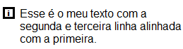
I have a <div> which holds an image and a <span>, and my goal is that the image is aligned vertically to the <span> in the first line and the next lines of the <span> start at the same "left" position of the first line. To make it easier to understand, the end result should be this:
Currently my code is this:
.row {
  width: 300px;
    display: flex;
    justify-content: space-between;
}

.row img {
    margin-right: 5px;
    vertical-align: middle;
}
<div class="row">
<div>
<img src="images/icon/image.png"/>
<span>Esse daqui é o meu texto, e como podem perceber, a segunda e terceira linha não estão alinhadas com a primeira linha
</span>
</div>
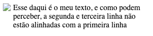
</div>As you can see, the next lines are not aligned. Analyzing the element in devtools, we can also see that the width of the element increases to cover the image. And probably, that’s the problem with the lines in the text not being aligned.
I also tried to use the element <p> passing a margin-left image size. In this case, the text is aligned as I want but it is not next to the image.
That said, how can I make the image stand next to a text in the first line and keep the horizontal alignment in the next lines?
You put Flex display on the Row, but it has to be on the div inside the Row, like. Row div { display: flex}
– hugocsl
@hugocsl It didn’t make any difference. And I use in
rowbecause in some parts of my page, the content ofroware 2<span>that need to be left and right.– JeanExtreme002