4
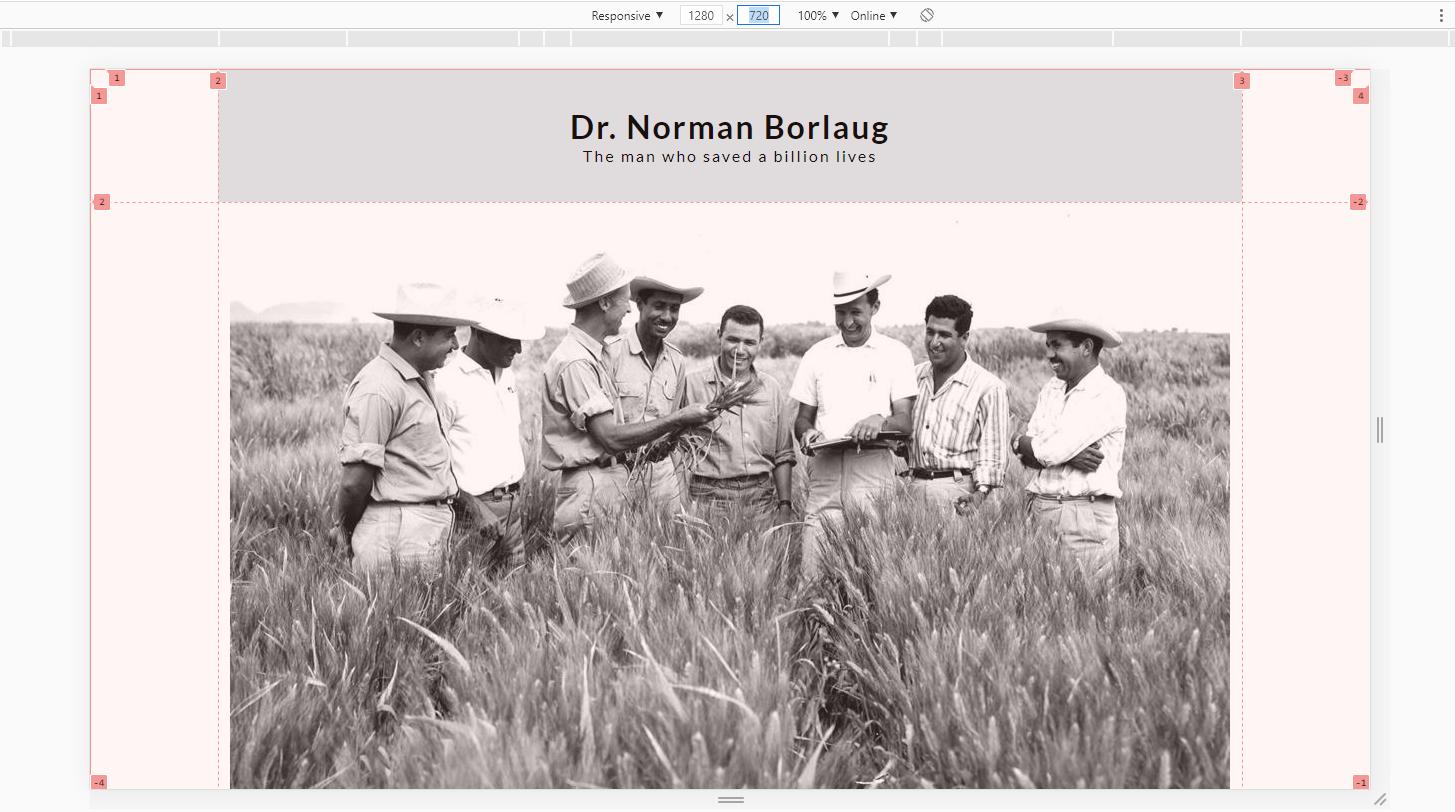
Good night. I recently started to study CSS, but when I was doing an exercise I came across an unusual situation, I am using CSS Grid along with Flexbox, when I review my site in the browsers Opera and Chrome the layout is presented correctly as in the image below:
But when I re-screen the same site in Firefox/Developer and Microsoft Edge browsers, the result is this:
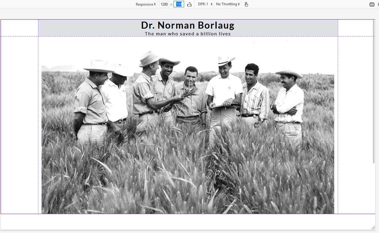
For some reason I don’t know it seems that the browsers Firefox and Edge ignore the value of the first line of the grid-template-Row (correct me if I’m wrong), while in the other browsers it considers the value of the grid normally. Someone would know to tell me the reason of this occur, I have searched in several places and I did not find a answer, I will be making available my code right below, already thank very much who can help me.
  *{
    margin:0px;
    padding: 0px;
}
body{
    display: grid;
    grid-template: 20% 1fr / 10% 80% 10%;
    font-family: 'Lato';
    letter-spacing: 2px;

}
header{
    display: flex;
    flex-direction: row;
    background-color: rgb(222, 226, 228);
    justify-content: center;
    align-items: center;
    text-align: center;
    grid-column-start: 2;
    grid-column-end: 3;
}
main{
    display: flex;
    flex-direction: row;
    justify-content: center;
    grid-column-start: 2;
    grid-column-end: 3;
}
.flex-content{
    display: flex;

    background-color: lightblue;

}
.flex-content img{
    width: 100%;
}
<!DOCTYPE html>
<html lang="en">
<head>
<meta charset="UTF-8">
<meta http-equiv="X-UA-Compatible" content="IE=8;FF=3;OtherUA=4" />
<link rel="stylesheet" type="text/css" href="tributePage.css" />
<link rel="preconnect" href="https://fonts.gstatic.com">
<link href="https://fonts.googleapis.com/css2?family=Lato:wght@bold&display=swap" rel="stylesheet">
<title>Tribute Page</title>
<style>
</style>
</head>
<body>
  <header>
    <div class="div-header">
      <h1 class="title">Dr. Norman Borlaug</h1>
      <p class="subtitle">The man who saved a billion lives</p>
    </div>
  </header>
  <main>
    <div class="flex-content">
      <img src="https://images.squarespace-cdn.com/content/v1/5256f6e4e4b086e2b62842e2/1421589861526-NLMVFC4TD9JMJI8CMFQ7/ke17ZwdGBToddI8pDm48kEyC40P1F2hXYCxhbEKOdLd7gQa3H78H3Y0txjaiv_0fDoOvxcdMmMKkDsyUqMSsMWxHk725yiiHCCLfrh8O1z5QPOohDIaIeljMHgDF5CVlOqpeNLcJ80NK65_fV7S1UdyvV08SFYj9gwm3wBWj1Zi2Od6C6Yx-I5pWLrMUTvnOxrxjPk_CVDSDL5ouV0jMuQ/image-asset.jpeg" />
    </div>
  </main>
</body>
</html>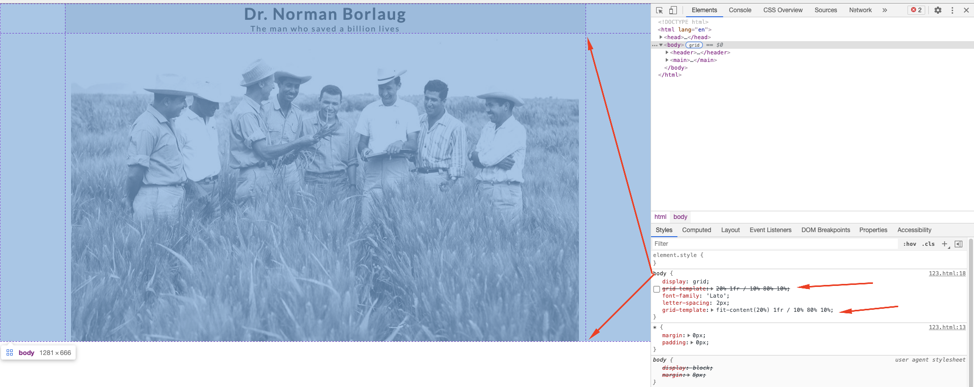
browsers can render things differently. In your case looking at the layout, Chrome seems to apply a padding to the "header" element, which makes the "div-header" more "centered" vertically. As there is no
paddingnorheightin the "header" it is rendering this at will. Put aheight: 70px;in the header and see with renderiza in all browsers for example– Ricardo Pontual
Hello, thank you so much for the answer! I managed to solve the problem using height, all browsers render in the same way. I just found it strange that Firefox does not consider in any way grid-template-Row when using percentage, I did some tests using the fr and pixel units and managed to standardize the display in the browsers.
– laura-2035