Div losing size fixed when have another div with 100% width on its side

Asked

Viewed 25 times

1

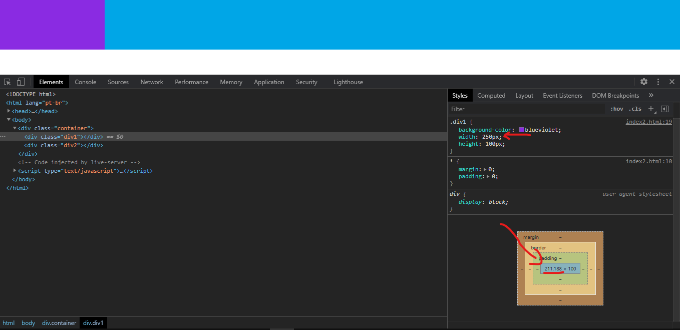
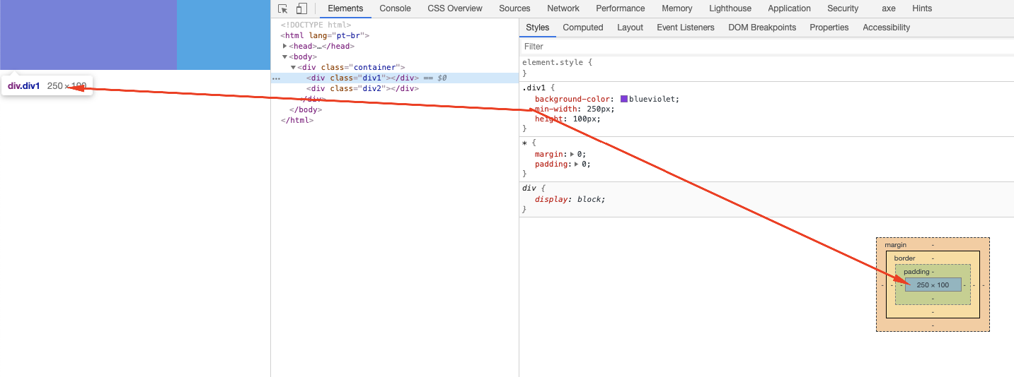
I have two horizontally linear div using display:flex. When applying a width of 250px on one and 100% on the other 250px loses the size of 250px always getting a few pixels less.

If I switch to 300px, 100px, 550px, it does not matter, it is always missing a few pixels difference of the indicated size and the amount of pixel missing always varies, it is not a fixed amount.

I’ve taken the margin, padding, top everything and applied the box-border too and remains the same.

inserir a descrição da imagem aqui

<!DOCTYPE html>
<html lang="pt-br">

<head>
    <meta charset="UTF-8">
    <meta http-equiv="X-UA-Compatible" content="IE=edge">
    <meta name="viewport" content="width=device-width, initial-scale=1.0">
    <title>Document</title>
    <style>
        * {
            margin: 0;
            padding: 0;
        }

        .container {
            display: flex;
        }

        .div1 {
            background-color: blueviolet;
            width: 250px;
            height: 100px;
        }

        .div2 {
            background-color: rgb(0, 166, 231);
            width: 100%;
            height: 100px;
        }

    </style>
</head>

<body>
    <div class="container">
        <div class="div1"></div>
        <div class="div2"></div>
    </div>
</body>

</html>

2 answers

0


This is a feature of display:flex, one flex container tries to "equalize" the width of the child elements so that they all fit on the same line.

There’s two ways you can fix this, one is by using calc() in div who is with 100% of width, type Calc(100% - 250px), and the other is: changing width for min-width in div purple, like min-width: 250px

With min-width

inserir a descrição da imagem aqui

<!DOCTYPE html>
<html lang="pt-br">

<head>
<meta charset="UTF-8">
<meta http-equiv="X-UA-Compatible" content="IE=edge">
<meta name="viewport" content="width=device-width, initial-scale=1.0">
<title>Document</title>
<style>
  * {
    margin: 0;
    padding: 0;
  }

  .container {
    display: flex;
  }

  .div1 {
    background-color: blueviolet;
    height: 100px;
    
    min-width: 250px;
  }

  .div2 {
    background-color: rgb(0, 166, 231);
    width: 100%;
    height: 100px;
  }
</style>
</head>

<body>
  <div class="container">
    <div class="div1"></div>
    <div class="div2"></div>
  </div>
</body>

</html>


With Calc(100% - 250px)

inserir a descrição da imagem aqui

<!DOCTYPE html>
<html lang="pt-br">

<head>
<meta charset="UTF-8">
<meta http-equiv="X-UA-Compatible" content="IE=edge">
<meta name="viewport" content="width=device-width, initial-scale=1.0">
<title>Document</title>
<style>
  * {
    margin: 0;
    padding: 0;
  }

  .container {
    display: flex;
  }

  .div1 {
    background-color: blueviolet;
    width: 250px;
    height: 100px;
  }

  .div2 {
    background-color: rgb(0, 166, 231);
    width: calc(100% - 250px);
    height: 100px;
  }
</style>
</head>

<body>
  <div class="container">
    <div class="div1"></div>
    <div class="div2"></div>
  </div>
</body>

</html>

  • 1

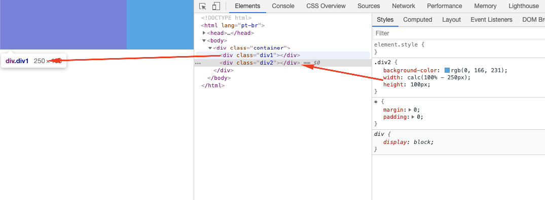
    Thank you very much for the answer, I imagined that a solution would be this of Calc() but I wanted to know exactly what is happening to this problem. Thank you for the reply.

  • @Fernandoamerico if the answer solves the problem remember to mark it as accepted, so your question is not open without accepted answer. Just click on the icon below the little arrows next to the answer ;)

  • 1

    Sure, sure, thanks again.

-1

777- You should use the same measure in width, in div1 you are using a fixed measure (px) and in div2 you are using a relative measure (%), div2 is discounting a few pixels in div1 to complete the 100% width.

  • Thanks for the answer, I managed to solve the problem.

Browser other questions tagged

You are not signed in. Login or sign up in order to post.