-1
Good night!
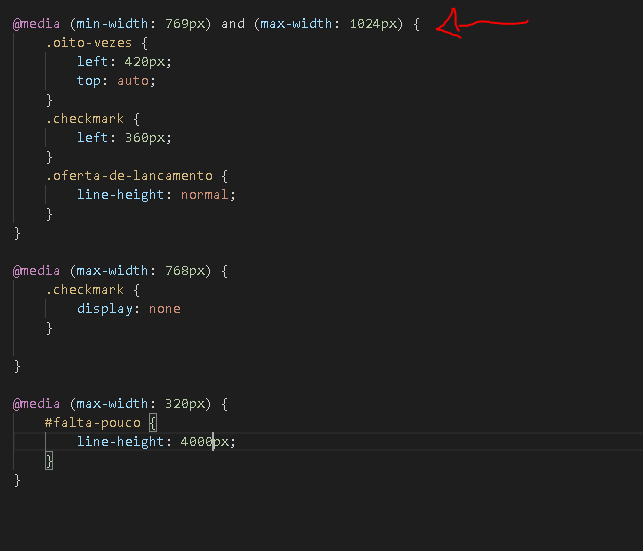
I’m developing the responsiveness of a web page.... but for some reason that I hope you will tell me, only the first @media statement is going correctly in the browser. I’ve tried to check the syntax a million times... I’m missing something?
ps: the statement that is going correctly is highlighted in the image
ps2: I noticed something strange: when the width of the browser is below 1024px all declarations are updated successfully, but when the browser is below 769px as indicated in the image the declarations are not updated in the browser.
UPDATE: I found out that it wasn’t that...it worked out but I don’t know why it worked out kkk
After I put the following line of code in html it worked:
<meta name="viewport" content="width=device-width">
<meta name="HandheldFriendly" content="true" />
I just wanted to know why it worked...
Hello Mario, I had new doubts, are below, I thank you for the first answer!! tmj
– Jonatãn da Fonseca Bossan
@Jonatãndafonsecabossan So, in a simpler way the tag serves to make your page more accessible to different sizes, you can read more about here.
– Maurício Silva