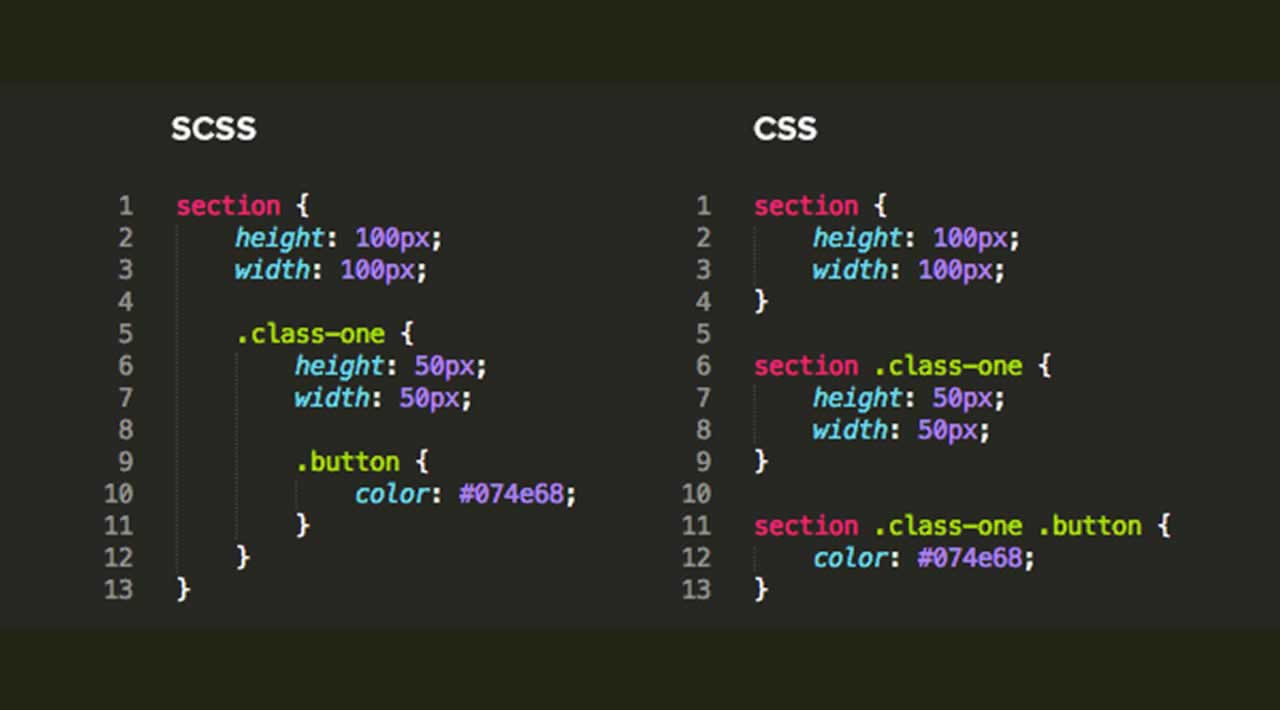
Nesting (nesting) is a specific feature of SASS?

Asked

Viewed 39 times

0

I just finished a Bootstrap course and I had one question: nesting (nesting) is a specific feature of SASS? From what I understand here, yes.

I say that because when using Media Queries in conjunction with Bootstrap I have the possibility to do something of this kind to change elements according to the screen size. In the code below I am saying that the elements will change on screens small.

/*// Small devices (landscape phones, 576px and up)*/
@media (min-width: 576px) and (max-width: 767.98px) {
    h1{
        font-size: 3em;
    }

    .btn-custom{
        margin: 10px 15px;
    }
}

My question is: is this nesting? I’m using SASS?

  • This is not a class nesting, this is a view-port rule

  • Thank you hugocsl! :)

1 answer

0

The @media is both in css and in Sass it serves to give responsiveness to your page. Sass is nothing more than a css pre-processor, it changes the way you write css a little bit (I would say it improves a bit).

inserir a descrição da imagem aqui

Here’s an image of the difference between Sass and css, you’ll notice that the difference is small and also that Sass makes the styling code more organized and you also have the option to reuse code without always typing it.

  • Legal Matheus, so that means that in the Media Queries of the code I posted is not being implemented the nesting, is correct?

  • Nesting is the act of aligning and organizing the code there on your screen, and Sass brings that nesting in order to make it easier for you to see the code. But anyway your code is nested and organized as a good developer should always do. :)

  • I understand Matheus, thank you very much for the explanation.

Browser other questions tagged

You are not signed in. Login or sign up in order to post.