Vertical limitation of the web page

Asked

Viewed 29 times

0

Hello, my first question (I’m a little nervous O.o), I hope I can explain my doubt.

My doubt...

I have a project for college and I’m having difficulty of Front-End, I need to perform a Horizontal scroll (can be with directional click or arrow, < or >), but I have complications to limit the page vertically because when I include a fourth box, instead of going right and staying off the screen, the box goes down, causing the content of the page not to be expected horizontally.

This photo below explains what I mean, but in case it doesn’t need to be mobile.

inserir a descrição da imagem aqui

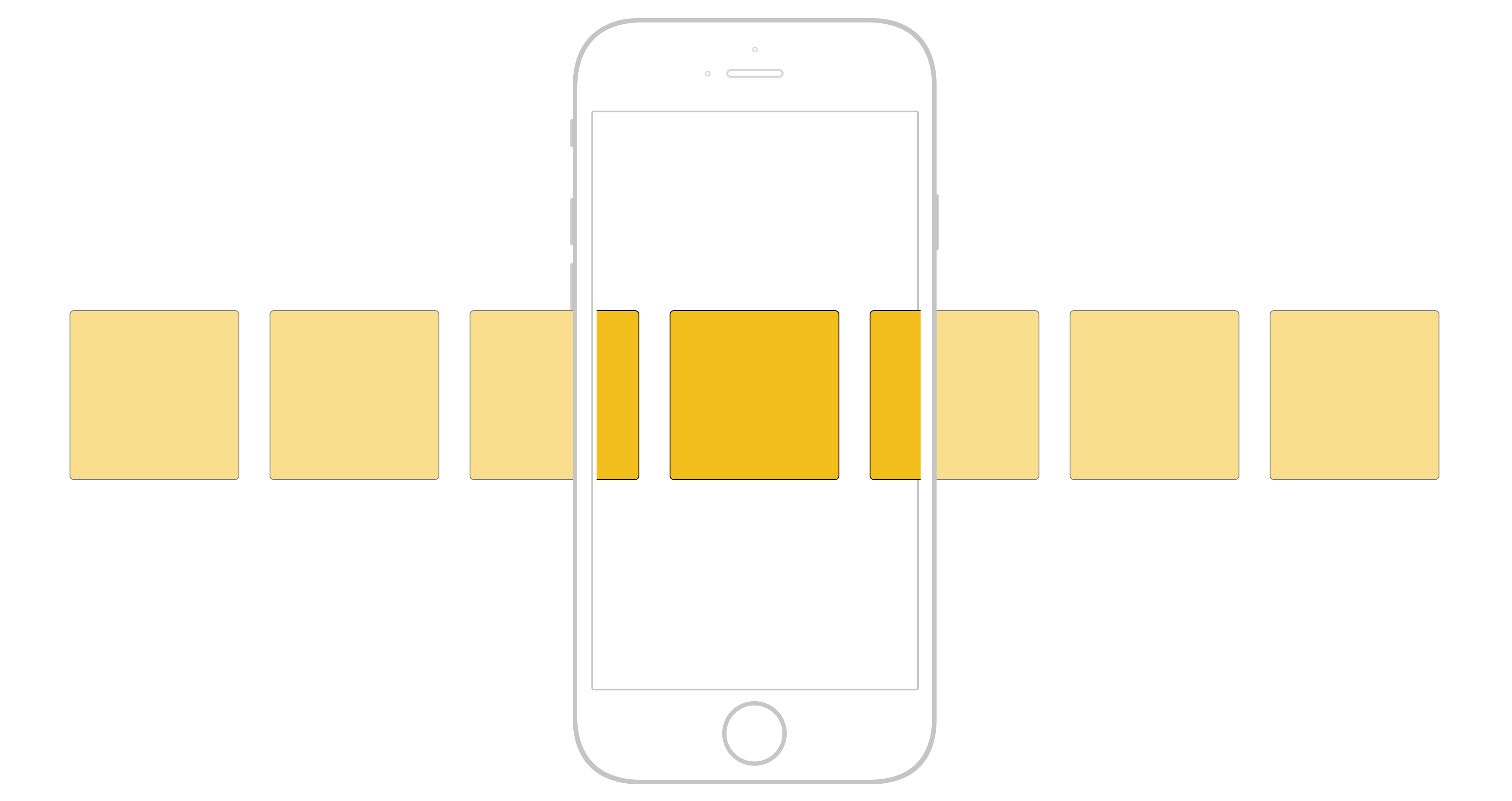
image source: www.codeburst.io

My Html code:

<div class="main-content">
<div class="container-fluid">
<mat-tab-group mat-align-tabs="center">
    <div class="row margem">
        <mat-tab label="Pedidos">
            <div class="margem">
                <div class="col-md-4">
                    <div class="card image">
                        Caixa1 que irá conter uma tabela por exemplo
                    </div>
                </div>
                <div class="col-md-4">
                    <div class="card image">
                        Caixa2 que ira conter outra tabela por exemplo
                    </div>
                </div>
                <div class="col-md-4">
                    <div class="card image">
                        Caixa3 Conter informações de cliente
                    </div>
                </div>
                <div class="col-md-4">
                    <div class="card image">
                        Caixa4 Outras informações por exemplo
                    </div>
                </div>
            </div>
        </mat-tab>

Now the Css:

.margem {
margin: 5px;
width: auto;
height: auto;
border: auto;
white-space: nowrap;
overflow-x: scroll;
glyph-orientation-horizontal: 0deg;
}

.image{
height: auto;
background-image:url('assets/img/imagemBackgroundCard2.jpg');
background-size: 150%;
}

I searched on some sites and even here in Stackoverflow, but I could not apply for my situation, I thought it could be the class "col-Md-X" since it limits and organizes in column, I removed this class, but continued the error, but totally disfigured :

Thanks in advance!!!

[ ]' Hugs! and Happy Holidays!

1 answer

0


Your face div classy margem has to be "merged" with the div class row, and the direct daughters of row has to be the col-X. Then just put one flex-wrap: nowrap in row and will no longer break the line. I still suggest using only col-4 and not col-md-4 and remove the white-space: nowrap;!

<!DOCTYPE html>
<html lang="en">

<head>
<meta charset="utf-8" />
<title>Page Title</title>
<meta name="viewport" content="width=device-width, initial-scale=1">

<link rel="stylesheet" type="text/css" media="screen" href="https://stackpath.bootstrapcdn.com/bootstrap/4.3.1/css/bootstrap.min.css" />
<style>
  .margem {
    margin: 5px;
    width: auto;
    height: auto;
    border: auto;
    overflow-x: scroll;
    glyph-orientation-horizontal: 0deg;

    flex-wrap: nowrap;
  }

  .image {
    height: auto;
    background-image: url('assets/img/imagemBackgroundCard2.jpg');
    background-size: 150%;
  }
</style>
</head>

<body>

  <div class="main-content">
    <div class="container-fluid">
      <mat-tab-group mat-align-tabs="center">
        <mat-tab label="Pedidos">
          <!-- <div class="margem"> -->
          <div class="row margem">
            <div class="col-4">
              <div class="card image">
                Caixa1 que irá conter uma tabela por exemplo
              </div>
            </div>
            <div class="col-4">
              <div class="card image">
                Caixa2 que ira conter outra tabela por exemplo
              </div>
            </div>
            <div class="col-4">
              <div class="card image">
                Caixa3 Conter informações de cliente
              </div>
            </div>
            <div class="col-4">
              <div class="card image">
                Caixa4 Outras informações por exemplo
              </div>
            </div>
            <div class="col-4">
              <div class="card image">
                Quinto Elemento
              </div>
            </div>
          </div>
        </mat-tab>
      </mat-tab-group>
    </div>
  </div>

</body>

</html>

  • Thank you so much for the help, I managed to solve thanks to you!

  • @Wallacecorrêa without problems friend, I am happy to have helped

Browser other questions tagged

You are not signed in. Login or sign up in order to post.