CSS DIV diagonal

Asked

Viewed 24,849 times

8

inserir a descrição da imagem aqui 
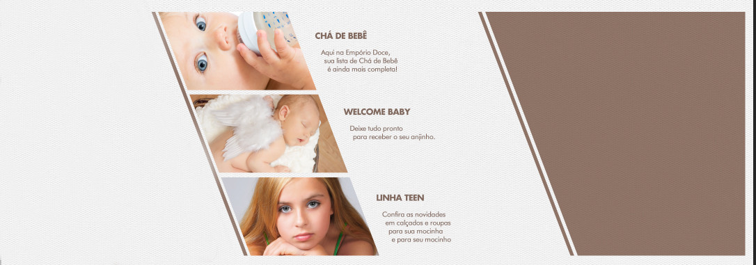
I recently received a layout to develop, in which I have a specific part that I can not do, I need a div that is inclined, as in the example, more than its text flows normally, the text is not turned in case of using Transform.

someone there has some hint, hint of how to do?

thank you

  • 2

    It seems to me more the case of applying a mask in the div to cut the image and use spacer elements in the text than distort everything. The pictures in the example are cut diagonally, and not inclined (which, by the way, would be a bit strange when it comes to babies and human faces).

4 answers

16


You can use the property transform with the value skew which is used to modify the angle of the elements.

inserir a descrição da imagem aqui

Exemplifying:

.skew {
  width: 10px;
  height: 100px;
  background: black;
  -webkit-transform: skew(0deg); /* Chrome, Opera */
      -ms-transform: skew(0deg); /* IE */
          transform: skew(0deg); /* Padrão */
}

.positive {
  -webkit-transform: skew(10deg); /* Chrome, Opera */
      -ms-transform: skew(10deg); /* IE */
          transform: skew(10deg); /* Padrão */
}

.negative {
  -webkit-transform: skew(-10deg); /* Chrome, Opera */
      -ms-transform: skew(-10deg); /* IE */
          transform: skew(-10deg); /* Padrão */
  }
<span>0 DEG</span>
<div class="skew"></div>

<span>10 DEG</span>
<div class="skew positive"></div>

<span>-10 DEG</span>
<div class="skew negative"></div>

OBS: You can see an article with a more detailed explanation regarding all property values transform here.

In your case you can make a positive tilt on a DIV, and your daughter pictures will receive the effect of skew, and inside make use of a paragraph applying the SKEW inversely so that the text is displayed in the normal way.

Exemplifying:

.skew {
  width: 810px;
  margin: 0 auto;
  overflow: hidden;
  background-color: #F26544;
  -webkit-transform: skew(30deg);
      -ms-transform: skew(30deg);
          transform: skew(30deg); /* SKEW da div*/
}

.skew img {
  width: 150px;
  height: 150px;
  margin-right: 25px;
  float: left;
}

.p-skew {
  padding: 10px;
  -webkit-transform: skew(-30deg);
      -ms-transform: skew(-30deg);
          transform: skew(-30deg); /* SKEW inverso para o texto não inclinar */
}
<div class="skew">
  <img src="http://aprenderabrincar.com/wp-content/uploads/2014/05/bebe-ojos-cafes.jpg" alt="Sem Imagem"> 
  
  <p class="p-skew">Lorem ipsum dolor sit amet, consectetur adipisicing elit. Similique aspernatur esse accusantium non ullam suscipit autem ipsum totam labore voluptatibus architecto unde impedit, error quas mollitia cumque animi, cum eligendi. Lorem ipsum dolor sit amet, consectetur adipisicing elit. Similique aspernatur esse accusantium non ullam suscipit autem ipsum totam labore.</p>
</div>

  • 3

    The image and example are cool. Just don’t forget to support other browsers, if I’m not mistaken Chrome needs -webkit-transform.

  • Yes, thank you! I just adjusted, it is the custom to use the codepen with auto-prefixer.

  • 1

    If you can, put a photo like the example in place of the test image so we can see how it looks ;)

  • Thanks for the feedback. I noticed that it distorts a bit, right? But maybe that’s what the Questioner wants.

  • Well, I added the image but it distorts due to "compression" since the image has a much larger dimension. I slightly increased the size of the DIV and image.

  • 2

    @rrnan Starting from version 36 (the current version is 40) the property transform no prefix needed in Chrome.

  • @Kazzkiq thanks for the information, I just saw here. But still necessary the -webkit- on account of Safari.

  • helped me a lot, but in the end I had to do with images, since the client did not want the distorted image

Show 3 more comments

5

Otherwise, in addition to those already presented and explained, also using the property skew but applying the transformation only to two elements (one before and the other after the image), rather than transforming the whole div, thus maintaining the appearance of the image:

image
In the example, two elements (before and after the image) with colors of background different.

Example code (using span):

*{margin:0;padding:0}

.image-wrapper {
  height: 200px;
  overflow: hidden;
  position: relative;
  width: 300px
}

.image-wrapper > img {
  width: 100%
}

.cut {
  background: #fff; /* A cor dos elementos antes e depois */
  display: block;
  top: 0; bottom: 0;
  position: absolute;
  width: 100px
}

.left {
  -webkit-transform: skew(16deg) translateX(-70px);
      -ms-transform: skew(16deg) translateX(-70px);
          transform: skew(16deg) translateX(-70px);
  left: 0
}

.right {
  -webkit-transform: skew(16deg) translateX(70px);
      -ms-transform: skew(16deg) translateX(70px);
          transform: skew(16deg) translateX(70px);
  right: 0
}
<div class='image-wrapper'>
  <span class='cut left'></span>
  <img src='http://i.stack.imgur.com/yMfhN.jpg' alt='Chá de Bebê'/>
  <span class='cut right'></span>
</div>

  • very useful, more I needed the transparent background, in the end I did not use on the site

  • @Danilo there are already details that you did not specify in the question :)

  • My own mess, is that it needed to appear the background that was in the whole page, more value the intention

  • @Danilo if possible, answer your question with the solution you found and mark it as correct.

2

Use CSS3 Transform: Skew FIT YOUR NEED.

#square {
    -ms-transform: skew(30deg); /* IE 9 */
    -webkit-transform: skew(30deg); /* Chrome, Safari, Opera */
    transform: skew(30deg); /* Standard syntax */
    transform-origin: bottom left; /* Prevent the bottom from shifting */
}

Example: http://jsfiddle.net/gmrq1ac4/1/

2

Follow what you want! I made a div with the diagonal angle, and left the image inside the div with the opposite settings! that is, the div is diagonal and the photo is normal! understands the logic?

Hugs!

.foto{
margin-top: -4.6em;
margin-left: -5em;
background: #ffffff;
overflow: hidden;
  width: 32em;
 height: 28.1em;
  -webkit-transform: skew(-16deg) translateX(-70px);
      -ms-transform: skew(-16deg) translateX(-70px);
          transform: skew(-16deg) translateX(-70px);
  left: 0;
}

.foto img{
  width: 150%;
margin-left: -10em;
  -webkit-transform: skew(16deg) translateX(140px);
      -ms-transform: skew(16deg) translateX(140px);
          transform: skew(16deg) translateX(140px);
  left: 0
}
<div class='foto'>
  <img src='http://i.stack.imgur.com/yMfhN.jpg' alt='Chá de Bebê'/>
</div>

Browser other questions tagged

You are not signed in. Login or sign up in order to post.