Cara there is more than one way to set up the Grid to have that result, but basically what you’re trying to do is called "Grid Overlap" (and honestly I do not know why they gave -1 in your question... Unfortunately we are living this toxic moment here at Stackoverflow)
Continuing the answer, basically you can do this overlap numbering the columns or using the grid-area like you did, but making a span 1 column inside the other type grid-column: logo / span 5;
Another important thing you need to do and define explicitly that the two cells will occupy the same row, If you don’t do this the bigger column will break to the bottom row, so put grid-row: 1; in divs of grid.
That’s basically it. If you want to test in a different way just comment on the repeated properties and uncomment what I left commented...
* {
box-sizing: border-box;
}
#sobre {
width: 100%;
height: 100vh;
display: grid;
/* distancia entre os elementos do grid e a lateral da página */
padding: 0 10%;
/* grid-template-columns: repeat(10, 1fr); */
/* grid-auto-rows: 1fr; */
grid-template-areas: "logo logo logo logo descricao descricao descricao descricao descricao descricao";
grid-template-rows: 1fr;
gap: 1px 1px;
align-items: center;
}
#sobre .logo {
grid-row: 1;
/* grid-column: 1 / 4; */
grid-column: logo / span 5;
width: 100%;
height: 40%;
background-color: #fff;
border-radius: 20px;
box-shadow: 0 0 20px -10px #000000;
justify-self: end;
z-index: 1;
overflow: hidden;
}
#sobre .descricao {
grid-row: 1;
/* grid-column: 3 / 11; */
grid-area: descricao;
width: 100%;
height: 50%;
background-color: #fff;
border-radius: 20px;
box-shadow: 0 0 20px -10px #000000;
justify-self: start;
padding: 30px;
flex-direction: column;
align-items: flex-start;
}
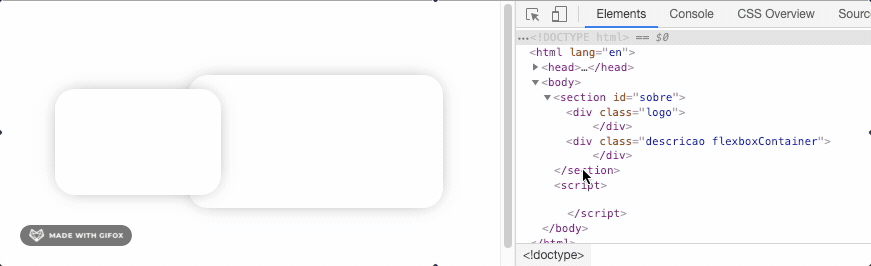
<section id="sobre">
    <div class="logo">
    </div>
    <div class="descricao flexboxContainer">
    </div>
  </section>
This article can help you better understand the technique: https://gridbyexample.com/learn/2016/12/20/learning-grid-day20/


tried to use
position: absolute?– Ricardo Pontual
Ja, but then if I use the div leaves the grid property
– william