How to create an oval shape with pure CSS perspective?

Asked

Viewed 78 times

2

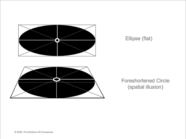
Hello, I’m wanting to create the second figure in the image, the oval shape with perspective, I’ve already made the oval shape, however, with perspective I’m not getting.
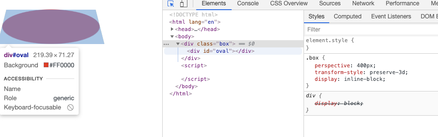
inserir a descrição da imagem aqui

  #oval {
      width: 200px;
      height: 100px;
      background: red;
      border-radius: 100px / 50px;
    }
  
<div id="oval"></div>

How to put perspective into oval shape like CSS ?

1 answer

3


Guy initially you need to put the circle inside a container, and in this container you put the value of perspectiva, which would be the distance between the screen and the user’s eye on eixo Z. Then in the oval element you use a transform rotateX() for it to rotate in the plano X of the axis itself.

inserir a descrição da imagem aqui

Code of the image above

.box{
  perspective: 400px;
  transform-style: preserve-3d;
  display: inline-block;
}
#oval {
    width: 200px;
    height: 100px;
    background-image: linear-gradient(to bottom, #f00 0%, #000 100%);
    border-radius: 100px / 50px;
    transform: rotateX(0deg);
    animation: gira 1s infinite alternate;
}
@keyframes gira {
  to {
    transform: rotateX(45deg);
  }
}
<div class="box">
  <div id="oval"></div>
</div>

I highly recommend reading this excellent article: https://css-tricks.com/how-css-perspective-works/

  • 1

    Thanks bro, vlw even I will mark the answer obg.

  • @Anotherbrink was worth the force, if you score I thank you, be sure to take a look at the link, it is well didactic with examples and everything for you work other perspectives :D

  • I marked already, the link I had read more had not understood, because I read over I’m rereading. obg.

Browser other questions tagged

You are not signed in. Login or sign up in order to post.