1
I am having difficulties in a certain responsive point of the site I am creating. I need a north.
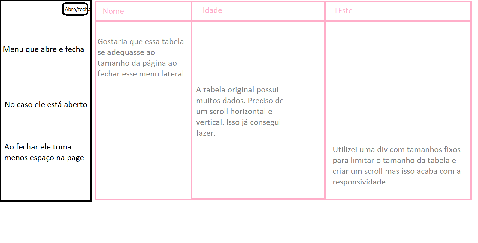
In this image the side menu is closed, occupying less space. As my div has fixed size it remains the size.
- If I put a width 100% in the div the table loses the internal scroll, because the dice will make it stretch until it’s gigantic and the page on itself wins a side scroll making something unviable
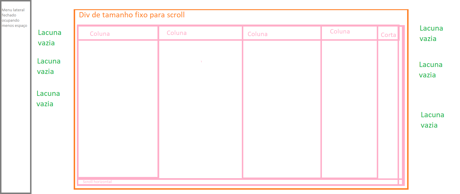
- If I put a class of responsive columns the text will compress too much getting something unreadable due to numerous number of columns
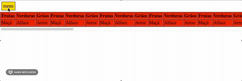
.ScrollDiv {
  width: 500px;
  overflow: auto;
  height: 200px;
  margin-left: auto;
  margin-right: auto;
}

table {
  width: 100%;
  position: relative !important;

}
<!DOCTYPE html>
<html lang="pt-br">
<head>
<link rel="stylesheet" href="https://stackpath.bootstrapcdn.com/bootstrap/4.5.2/css/bootstrap.min.css" integrity="sha384-JcKb8q3iqJ61gNV9KGb8thSsNjpSL0n8PARn9HuZOnIxN0hoP+VmmDGMN5t9UJ0Z" crossorigin="anonymous">
<title>Título da página</title>
<meta charset="utf-8">
</head>
<body>
<div class="ScrollDiv">
<table border="1">
<thead>
<tr>
<th>Frutas</th>
<th>Verduras</th>
<th>Grãos</th>
<th>Frutas</th>
<th>Verduras</th>
<th>Grãos</th>
<th>Frutas</th>
<th>Verduras</th>
<th>Grãos</th>
<th>Frutas</th>
<th>Verduras</th>
<th>Grãos</th>
</tr>
</thead>
<tbody>
<tr>
<td>Maçã</td>
<td>Alface</td>
<td>Arroz</td>
<td>Maçã</td>
<td>Alface</td>
<td>Arroz</td>
<td>Maçã</td>
<td>Alface</td>
<td>Arroz</td>
<td>Maçã</td>
<td>Alface</td>
<td>Arroz</td>
</tr>
<tr>
<td>Laranja</td>
<td>Beterraba</td>
<td>Trigo</td>
<td>Laranja</td>
<td>Beterraba</td>
<td>Trigo</td>
<td>Laranja</td>
<td>Beterraba</td>
<td>Trigo</td>
<td>Laranja</td>
<td>Beterraba</td>
<td>Trigo</td>
</tr>
<tr>
<td>Laranja</td>
<td>Beterraba</td>
<td>Trigo</td>
<td>Laranja</td>
<td>Beterraba</td>
<td>Trigo</td>
<td>Laranja</td>
<td>Beterraba</td>
<td>Trigo</td>
<td>Laranja</td>
<td>Beterraba</td>
<td>Trigo</td>
</tr>
<tr>
<td>Laranja</td>
<td>Beterraba</td>
<td>Trigo</td>
<td>Laranja</td>
<td>Beterraba</td>
<td>Trigo</td>
<td>Laranja</td>
<td>Beterraba</td>
<td>Trigo</td>
<td>Laranja</td>
<td>Beterraba</td>
<td>Trigo</td>
</tr>
<tr>
<td>Laranja</td>
<td>Beterraba</td>
<td>Trigo</td>
<td>Laranja</td>
<td>Beterraba</td>
<td>Trigo</td>
<td>Laranja</td>
<td>Beterraba</td>
<td>Trigo</td>
<td>Laranja</td>
<td>Beterraba</td>
<td>Trigo</td>
</tr>
</tbody>
</table>
</div>
</body>
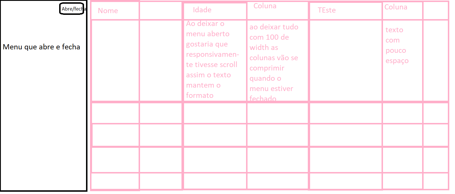
</html>In the snippet I did not put the side menu but it would be side by side with page content in the case a table. Is there a js or css that makes the table fit the screen size? Fixed sizes wouldn’t be interesting because I need a certain responsiveness.
I believe that the solution would be to change the div that houses the table. However I do not know how to make it responsive due to the side menu.
Check out this link: https://codepen.io/AllThingsSmitty/pen/MyqmdM
– Ricardo Passos