-1
I’m creating a site with responsive/liquid layout, but when I turn it down The Navigator menu bar is leaking to the dither (it’s static) follows the print:
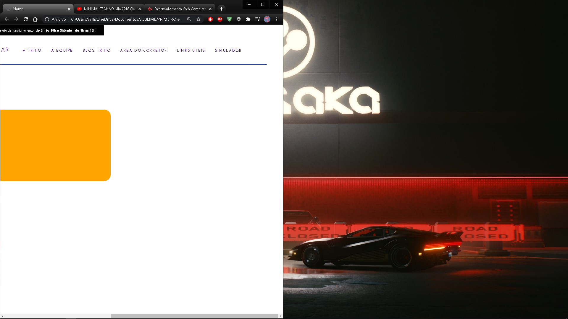
I would like to know how to hide the rest of the menu bar when I decrease the browser tab
CODE:
HTML
<!DOCTYPE html>
<html>
    <head>
        <title>Home</title>
        <meta charset="utf-8">

        <!-- ESTILO CUSTOMIZADO -->
        <link rel="stylesheet" type="text/css" href="css/estilo.css">
    </head>


    <body id="home">

        <div id="container"> <!-- INICIO CONTAINER -->

            <div id="topo"> <!-- TOPO DO SITE -->
                <div id="topo-info">
                    <div id="infos"> <!-- BARRA PRETA -->
                        <div id="tel-hor">
                            <ul>
                                <li id="telefone">

                                    <strong>
                                        <img src="imagens/tel.png" width="9">
                                        <span>(85) 4042-1226</span>
                                    </strong>

                                </li>

                                <li id="hor-fun">

                                    <p>
                                        <img src="imagens/relo.png" width="10">
                                        Horário de funcionamento: <strong> de 8h às 18h e Sábado - de 9h às 13h</strong>
                                    </p>
                                </li>
                            </ul>
                        </div>

                        <div id="loc">

                            <span>
                                 <p>
                                    <img src="imagens/loc-transpa.png" width="7">
                                    Av. Beira Mar, 3960, Sala 9 e 10
                                 </p>
                            </span>

                        </div>
                    </div><!-- FIM BARRA PRETA -->
                </div>


                <div id="inferior-topo">
                    <div id="area-logo">
                            <a href="">Trio</a>
                    </div>

                    <div id="area-menu">

                        <ul id="menu">
                            <li class="maior"><a href="">Serviços</a></li>
                            <li class="maior"><a href="">Comprar</a></li>
                            <li class="maior"><a href="">alugar</a></li>
                            <li><a class="menor" href="">a triiio</a></li>
                            <li><a class="menor" href="">a equipe</a></li>
                            <li><a class="menor" href="">blog triiio</a></li>
                            <li><a class="menor" href="">area do corretor</a></li>
                            <li><a class="menor" href="">links uteis</a></li>
                            <li><a class="menor" href="">simulador</a></li>

                        </ul>
                    </div>
                </div>
            </div><!-- FIM TOPO DO SITE -->

            <div id="area-slides">
                <div id="area-caixa">
                    <div id="caixa-transparente">
                        Conteudo 1
                        <div id="barra-pesquisa">
                        </div>

                        <div id="opcoes">
                        </div>
                    </div>
                </div>
            </div>


        </div><!-- FIM CONTAINER -->
    </body>
</html>
CSS
*{
    margin: 0;
    padding: 0;
}

@font-face{
    font-family: Fina;
    src: url(../imagens/JosefinSans-Thin.woff);
}

body{
    font-family: "Trbuchet MS", Helvetica, sans-serif;
}

/*CONTAINER DE TODA PAG*/

#container{
    width: 100%;/*1278px*/
    margin: 0 ;
    min-width: 1370px;
}

/********************************** TOPO SITE ***********************************/

#topo-info{

    position: absolute;
    min-width: 100%;
    height: 3.4em;
    font-size: 0.6em;

}

/*$$$$$$$$$$$$$$$$$$$$$$ BARRA SUPERIOR PRETA $$$$$$$$$$$$$$$$$$$$$$*/

#infos{
    height: 3.4em;
    background: #000;
    color: white;

}


/*#### LOCALIZAÇÃO ####*/

#loc{
    margin-top: -27px;
    width: 25%;
    float: left;
    line-height: 3em;
    height: 25px;

}

#loc p{
    padding-left: 35px;
    padding-top: -20px;
    letter-spacing: 0.01em;
    height: 20px;

}

#loc p img{
    position: relative;
    top: 2px;
}


/*@@@@@@@@ TELEFONE E HORARIO FUNCIONAMENTO @@@@@@@@*/


#tel-hor {
    width: 81.25%;
    float: right;
    line-height: 2.5em;

}

/*#### TELEFONE ####*/


#telefone{
    width: 28% ;
    margin-left: 8%;
    float: left;
    height: 30px;
}


#telefone strong{
    float: right;
    padding-right: 28px;
    padding-top: 4.5px;
}


#telefone strong span {
    padding-left: 11.5px;

}


#telefone img{

    padding-left: -5px;
    padding-top: 8px;
    position: absolute;
}


/*#### HORARIO FUNCIONAMENTO ####*/


#hor-fun{
    width: 60%;
    float: right;
    height: 25px;

}


#hor-fun p{
    padding-top: 5px;
    padding-right: 25px;
    float: right;
    letter-spacing: 0.01em;
}

#hor-fun p img{

    position: relative;
    padding-right: 2px;
    top: 2px;
}


/*$$$$$$$$$$$$$$$$$$$$$$ LOGO E MENU $$$$$$$$$$$$$$$$$$$$$$*/


/*%%%%% LOGO %%%%%*/

#inferior-topo{

    height: 120px;
    width: 100%;
    font-family: Fina;
    border-bottom: #2D4489 solid 3px;

}

#area-logo{
    float: left;
    text-transform: uppercase;
    letter-spacing: 5px;
    width: 12%;
    height: 120px;


}

#area-logo a{

    position: absolute;
    top: 38px;
    width: 166px;
    height: 85px;
    background: url(../imagens/logo.png) no-repeat center top;
    background-size: 165px 75px;
    text-indent: -3000px;
}


/*%%%%% MENU %%%%%*/


#area-menu{

    width: 87.5%;
    height: 100%;
    font-size: 1.09em;
    float: right;

}

#menu{

    float: right;
}

#menu li{

    position: relative;
    display: inline;
    line-height: 9.1em;
    margin-right: 24px;

}


#menu li.maior{

    position: relative;
    line-height: 5.2em;
    margin-right: 35px;
}


#menu li a{

    text-decoration: none;
    text-transform: uppercase;
    letter-spacing: 2px;
    font-weight: 400;
}

#menu li a:hover{
    text-decoration: underline;
}

.menor {
    font-size: 0.64em;

}

/********************************** SLIDES ***********************************/

#area-slides{

    width: 100%;
    height: 33em;
}

#caixa-transparente{


    border-radius: 20px;
    position: relative;
    top: 138px;
    margin: 0 auto;
    width: 800px;
    height: 220px;
    background-color: orange;
    margin-right: 480px;

}


/********************************** DEMAIS FORMATAÇÕES ***********************************/


ul{
    text-decoration: none;
    list-style: none;
}


a{
    text-decoration: none;
}

#rodape {
    clear: both;
    background: #c4c4c4;
}
Hi, first wanted to leave a Disclaimer, my experience with HTML and CSS does not contain enough firmament to mount a consolidated opinion. That said, I think it is not recommended to use height and width on an interactive site, as these elements are of static origin. I hope I have helped, if I will not continue to work so that I can help you in the near future.
– Nathan Mancini