Container problem in html and css

Asked

Viewed 90 times

0

I don’t have much knowledge in html or css.

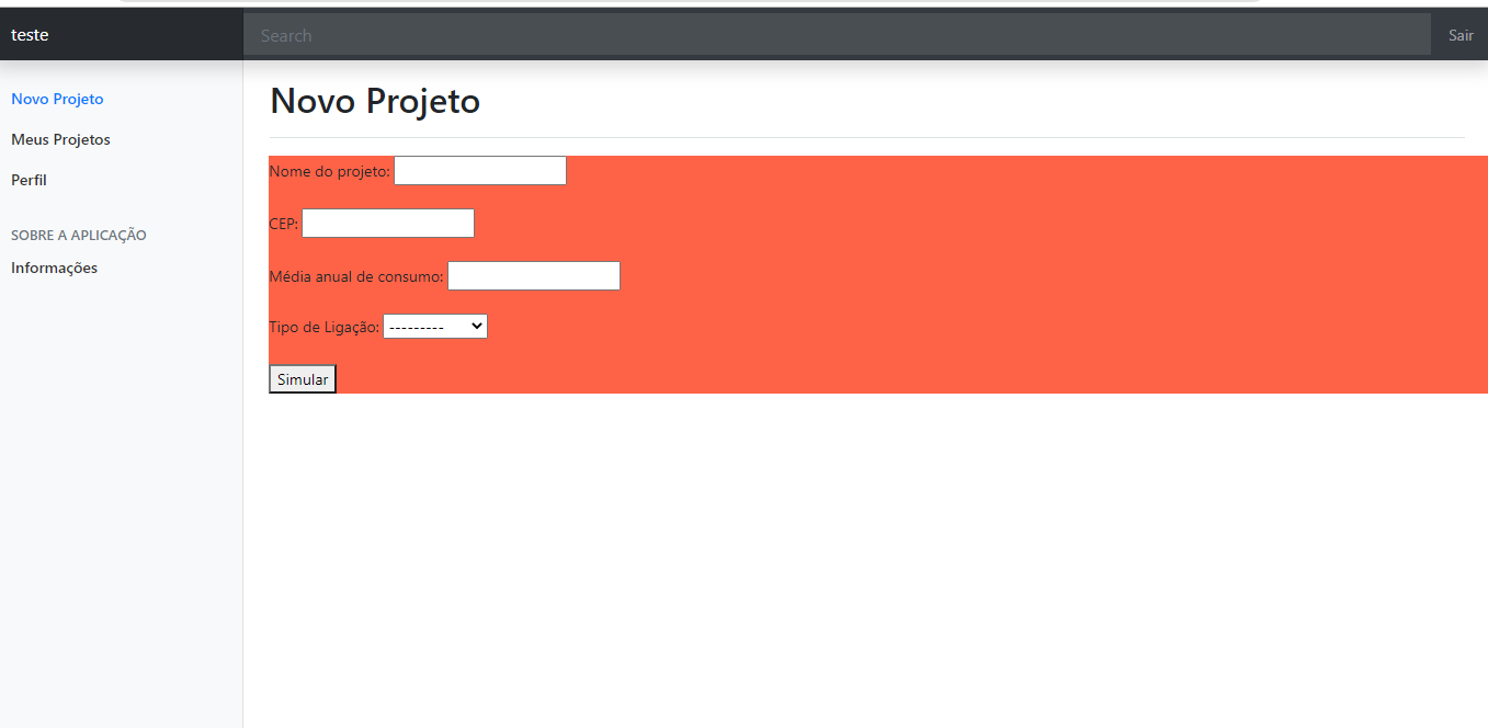
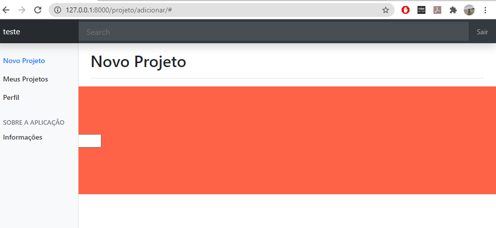
When I minimize the screen or change the resolution, the container does not follow the same pattern. As follows:

Maximized: inserir a descrição da imagem aqui

Minimized:

inserir a descrição da imagem aqui

Why is this happening and what is the best way to correct it? Thanks for your attention.

follows how it is in css:

#containerForm{
  float: right;     
  width: 1050px;  
  background: tomato;
}

I put this red background just to enhance the visualization

Html snippet:

    <div id="containerForm">     
        <form action="." method="POST">            
            {% csrf_token %}
            {{ form.as_p }}
            <button type="submit">Simular</button>
        </form>
    </div>
  • When I do this the container is no longer aligned, it throws everything to the right corner of the screen

  • Yes, I used the float because it was the only way I could get it aligned. What other way could I put it? I don’t know much about html or css

  • 2

    This problem is happening because of the absolute width, the correct is you put the side menu and this div with relative widths (%). And in case they get below each other, correct with float:left; and display:inline-block;.

  • Thanks! I put width: 82% and if minimize or change the screen resolution the container remains the same

1 answer

1


My opinion

The problem

you are using fixed measures , then whenever the screen change it will still occupy the position that was etabelecida

How to solve?

My advice is to use flex-box plus relative measures(%) Changes the percentage value of width until

Code

CSS

#containerForm{
  float: right;     
  width: 60%;  
  display: flex;
  justify-content: flex-start;
  align-items: flex-start;
  background: tomato;
}

If you don’t solve your problem feel free to share your static version of the code on https://jsfiddle.net/ so I can help in real time.

  • 1

    It got even better, thank you very much!! I’m starting to learn it now.

  • 1

    This is normal, I strongly recommend taking this course. is the best flex-box course I have ever seen in English https://www.youtube.com/playlist?list=PLwXQLZ3FdTVGjLmjwfRc0Q9TA5U-PCWp4

  • 1

    And to make things even better you can see the full course of responsive design: https://www.youtube.com/playlist?list=PLwXQLZ3FdTVi6oHo_K4IYDcwCU5-f1x5

  • Show!!! I’ll start watching! Thank you so much for the tip

Browser other questions tagged

You are not signed in. Login or sign up in order to post.