0
Good evening, I’m new to programming and I’m doing a simple project (to get a sense of the elements), but I’m having a hard time, come on:
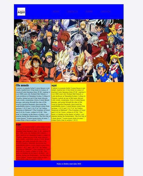
I have problem in the footer, where I do the responsive test, and the body background exceeds the footer, in short, after the content of the site, has the footer, and below this item, continues the background, when the footer should be the last item of the page. Have a picture of the error, the footer was to stay there at the end, not in the position it appears.
Don’t mind the project, it’s all colorful so I can find myself easily.
Thank you very much!
HTML
<!DOCTYPE html>
<html>
<head>
    <title>Speed Box</title>
    <link rel="stylesheet" href="css/style.css">
    <meta charset="utf-8"/>
</head>
<body>

<section class="cabecalho">
<div class="logo">
    <img src="image/logo.png">
</div><!--logo-->

    <nav class="desktop-menu">
        <ul>
            <li><a href="">Home</a></li>
            <li><a href="">Serviços</a></li>
            <li><a href="">Sobre</a></li>
            <li><a href="">Contato</a></li>
        </ul>
    </nav>

</section><!--cabecalho-->

<div class="background">
<div class="artigo2">
    <img src="image/banner.jpg">
</div>


<section class="servicos">
<div class="center">
<div class="w33 left box1">
<h2 class="titulo">Ola mundo</h2>
<p>Contrary to popular belief, Lorem Ipsum is not simply random text. It has roots in a piece of classical Latin literature from 45 BC, making it over 2000 years old. Richard McClintock, a Latin professor at Hampden-Sydney College in Virginia, looked up one of the more obscure Latin words, consectetur, from a Lorem Ipsum passage, and going through the cites of the word in classical literature, discovered the undoubtable source. Lorem Ipsum comes from sections 1.10.32 and 1.10.33 of "de Finibus Bonorum et Malorum" (The Extremes of Good and Evil) by Cicero, written in 45 BC. This book is a treatise on the theory of ethics, very popular during the Renaissance. The first line of Lorem Ipsum, "Lorem ipsum dolor sit amet..", comes from a line in section 1.10.32.</p>
</div>
<div class="w33 left box2">
<h2 class="titulo">aqui</h2>
<p>Contrary to popular belief, Lorem Ipsum is not simply random text. It has roots in a piece of classical Latin literature from 45 BC, making it over 2000 years old. Richard McClintock, a Latin professor at Hampden-Sydney College in Virginia, looked up one of the more obscure Latin words, consectetur, from a Lorem Ipsum passage, and going through the cites of the word in classical literature, discovered the undoubtable source. Lorem Ipsum comes from sections 1.10.32 and 1.10.33 of "de Finibus Bonorum et Malorum" (The Extremes of Good and Evil) by Cicero, written in 45 BC. This book is a treatise on the theory of ethics, very popular during the Renaissance. The first line of Lorem Ipsum, "Lorem ipsum dolor sit amet..", comes from a line in section 1.10.32.</p>
</div>
<div class="w33 left box3">
<h2 class="titulo">aqui</h2>
<p>Contrary to popular belief, Lorem Ipsum is not simply random text. It has roots in a piece of classical Latin literature from 45 BC, making it over 2000 years old. Richard McClintock, a Latin professor at Hampden-Sydney College in Virginia, looked up one of the more obscure Latin words, consectetur, from a Lorem Ipsum passage, and going through the cites of the word in classical literature, discovered the undoubtable source. Lorem Ipsum comes from sections 1.10.32 and 1.10.33 of "de Finibus Bonorum et Malorum" (The Extremes of Good and Evil) by Cicero, written in 45 BC. This book is a treatise on the theory of ethics, very popular during the Renaissance. The first line of Lorem Ipsum, "Lorem ipsum dolor sit amet..", comes from a line in section 1.10.32.</p>
</div>
</div><!--w33-->
</section>
<div class="clear"></div>
</div><!--background-->

<footer class="rodape">Todos os direitos reservados 2020</footer>
<script src="js/jquery.js"></script>
<script src="js/function.js"></script>
</body>
</html>
CSS
*{
   margin: 0;
   padding: 0;
   box-sizing: border-box;
}

html, body{

   width: 100%;


}

.background{
   background: orange;
   padding-bottom: 100px;
}

.clear{
   clear: both;
}

.w33{

   width: 33%;
   padding: 10px;
}

.left{
   float: left;


}
.right{
   float: right;

}

section.cabecalho{
   width: 100%;
   background: blue;
   padding: 30px;
   float: left;
}

.logo img{

   width: 70px;

}

nav.desktop-menu ul{
   position: relative;
   margin-right: 50px;
   list-style-type: none;
   margin-top: -50px;
   float: right;

   }

nav.desktop-menu li{
   font-weight: 300;
   font-size: 20px;
   padding:0 30px;
   text-transform: uppercase;
   display: inline;
   margin-right: 5px;


}

section.servicos{

   padding: 10px;
   margin: 5px;
}

section.especialidades h2.titulo{
   font-size: 30px;
   font-weight: 400;
   color: green;
   text-align: center;
}

.artigo2 img{

   width: 100%;
   height: 560px;
   max-width: 100%;
   margin: 0 auto;
   display: block;
   position: relative;
   background-size: cover;


}
/*
.artigo2 img{
   width: 100%;
   display: table;
}*/

.box1{

   background: lightblue;
   padding: 2px;
}

.box2{
   margin-right: 5px;
   margin-left: 5px;
   margin-bottom: 10px;
   background: yellow;
   padding: 2px;
}

.box3{

   background: red;
   padding: 2px;
}


footer{
   background: blue;
   padding: 20px 0;
   text-align: center;
   color: white;
   font-weight: 400px;
   width: 100%;

}

@media only screen and (max-width: 768px){

   .w50{
       padding:10px;
       width: 100%;
   }

   .w33{
       width: 100%;
       padding: 20px;
   }

   .box1{
       padding:40px 20px;
       margin: 0;
       display: block;
       margin: auto;
   }
   .box2{
       padding:40px 20px;
       margin: 0;
       display: block;
       margin: auto;
   }
   .box3{
       padding:40px 20px;
       margin: 0;
       display: block;
       margin: auto;

   }
   .left{
       float: none;
   }

   .right{
       float: none;
   }
   img{
       float: none !important;
       display: block;
       margin:0;
   }
   .logo{
       float: left;
   }
   nav.desktop-menu ul{
   position: relative;
   margin-right: 50px;
   list-style-type: none;
   margin-top: 0px;
   float: right;

   }

   nav.desktop-menu li{
   font-weight: 300;
   font-size: 20px;
   padding:0 30px;
   text-transform: uppercase;
   display: inline;
   margin-right: 5px;


}