There’s a way to do it, but to do it with border-radius will give you more trouble, because you’ll have to have one path exclusive within the SVG or use the property rx of rect for, but if you want a simple rectangle this or a simple circle this answer will help you (in the case of the path I recommend that you do it in Figma or other software that automatically manages the SVG code).
Here I basically set a size of dash and a dash-offset, where the dash is the tracinho and the dash-offset is the space between a tracinho and another. Then with a @keyframes I did the animation by changing the offset and giving the impression that it is moving.
As a basis I used these other two answers that I myself had already given here. I recommend that you read!!
Partially paint edge in css
How to make a pure css spinner?
About your answer, see the example (not that extending the CSS but vc can adjust the dash and offset to your liking etc)

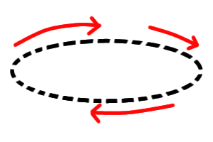
Image code above. Note that in @keyframes the higher the value of offset faster gets the animation
.btn {
  display: flex;
  text-align: center;
  justify-content: center;
  align-items: center;
  width: 100px;
  height: 60px;
  text-transform: uppercase;
  font-family: sans-serif;
  text-decoration: none;
  font-size: 30px;
  transition: 1.5s;
  position: relative;
}
svg,
svg rect,
svg circle{
  position: absolute;
  width: 100%;
  height: 100%;
  top: 0;
  left: 0;
  fill: transparent;
}
a svg rect,
a svg circle {
  stroke: blue;
  stroke-width: 4;
  transition: all 500ms;
  stroke-dasharray: 10;
  animation: dash 2.5s linear infinite;
}


@keyframes dash {
  to {
    /* quanto maior o valor do offset mais rápido fica a animação */
    stroke-dashoffset: 100;
  }
}
<a href="#" class="btn">
  <svg>
    <rect></rect>
  </svg>
  Btn
</a>


<a href="#" class="btn" style="height: 100px">
  <svg>
    <circle cx="50" cy="50" r="40" />
  </svg>
  Btn
</a>
Show what you tried, if possible, add an image of what you want
– Costamilam
Ready is how I hope
– user196053