1
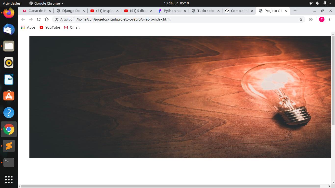
I’m completely new to HTML, and I’m trying to use an image at the top of the site as a sort of header (I want it to occupy the entire screen extension).
Follows my code:
#topo {
  width: 100%;
}

#foto-principal {
  width: 100%;
  height: 500px;
  margin-left: 0px;
}
<figure id="topo">
<img id="foto-principal" src="https://picsum.photos/600/500" />
</figure>
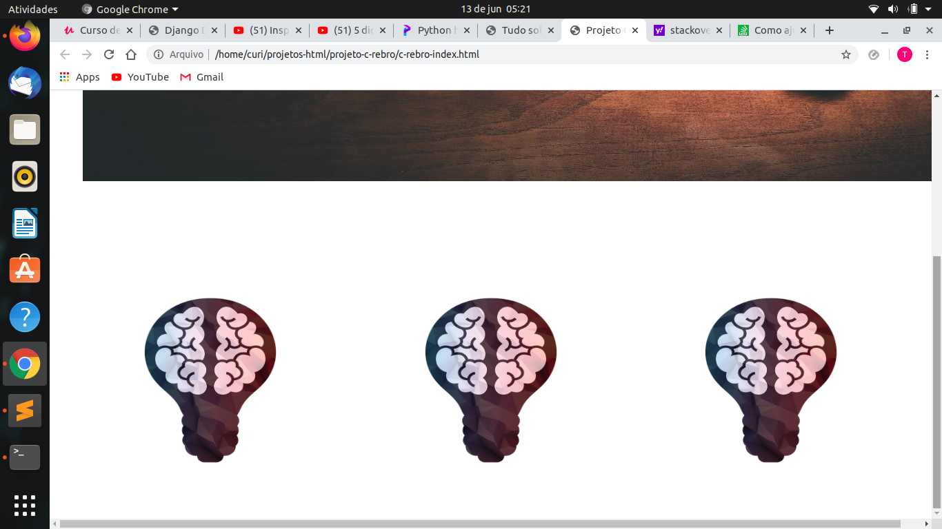
<figure style="text-align: center; margin-top: 100px; padding: 60px">
<img src="https://picsum.photos/250/250" width="250px" height="250px" align="left" />
<img src="https://picsum.photos/250/250" width="250px" height="250px" align="center" />
<img src="https://picsum.photos/250/250" width="250px" height="250px" align="right" />
</figure>The tag figure It works like a container, right? I tell it to occupy 100% of the screen and the image to occupy 100% of the container, does that make sense? The image seems to have a larger margin to the left, and I still need to scroll the bottom bar to the right to see the whole picture, IE, it is not ideally aligned to the screen. How to proceed? (Here is an image also).
Below I have a sequence of 3 photos and this was the basic way I found to organize them in sequence, changing the padding of the container to get them a little closer. There is a more efficient way?
Following image (header and sequence of figures):
https://www.w3schools.com/howto/howto_css_full_page.asp
– user60252