6
Recently I’ve seen some people talk about the function clamp.
What is its real usefulness?
Is there any relation to other functions, such as max or min?
6
Recently I’ve seen some people talk about the function clamp.
What is its real usefulness?
Is there any relation to other functions, such as max or min?
3
The subject is extensive because there can be many variables, like everything in CSS... But it’s not just something for font-size.
The clamp in fact is basically a shorthand for the construction of a "length" value for the font-size, for example, or for the width of a div.
It helps to increase the min() or max() adding a meanwhile between a minimum and a maximum value, that is, an expression such as this width: clamp(200px, 50%, 600px); means that the div will have a maximum of 600px, meanwhile, she cannot be more than 50% of her father’s width, nor less than 200px wide.
See this example also in full screen to see the behavior:
.box {
  background-image: linear-gradient(to right, #f00 0%, #000 100%);
  height: 100px;
  width: clamp(200px, 50%, 600px);
}
<div class="box"></div>
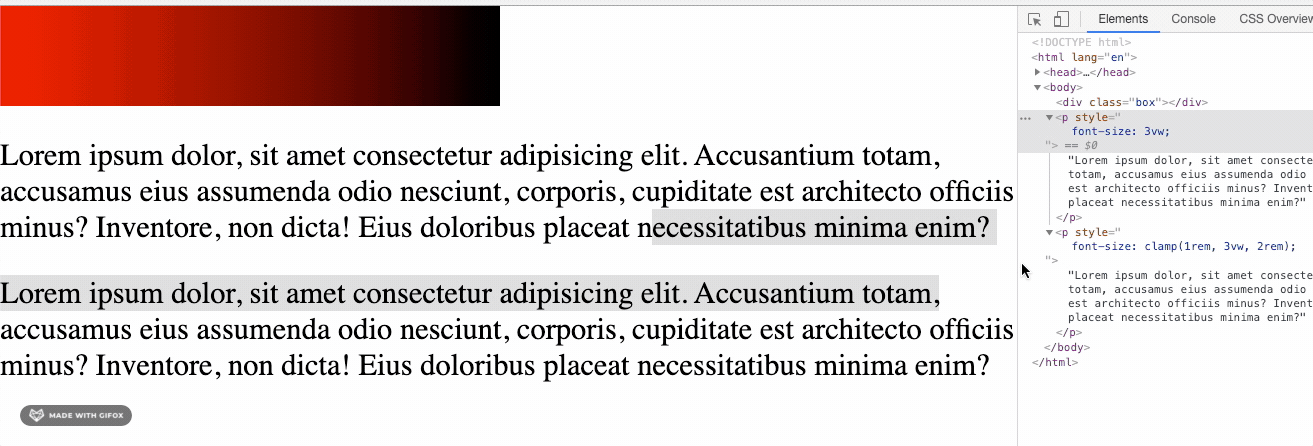
<p>Lorem ipsum dolor, sit amet consectetur adipisicing elit. Accusantium totam, accusamus eius assumenda odio nesciunt, corporis, cupiditate est architecto officiis minus? Inventore, non dicta! Eius doloribus placeat necessitatibus minima enim?</p>Clamp is being widely applied in font-size because it helps to fix the problem of using measures based on view-port in font size, where on very narrow screens, for example, a measure such as font-size: 3vw can make the text illegible (since 3VW on a screen of 320px width corresponds approximately to a font-size of 9px). So with clamp you can make a mix of type font-size: clamp(1.75rem, 3vw, 2.1rem);
Note the values of the sources below and how their responsiveness behaves. The source with clamp will reach a minimum value that still allows reading, even though in VW:
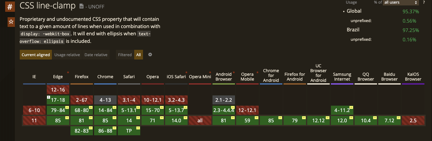
As you can see, the browser support is even relatively good: https://caniuse.com/css-line-clamp
Mozilla documentation on clamp():
https://developer.mozilla.org/en-US/docs/Web/CSS/clamp
Two articles of reference that are worth!
https://css-tricks.com/min-max-and-clamp-are-css-magic/
https://medium.com/@Yuschick/Fluid-typography-with-css-clamp-is-my-new-Favorite-Thing-573d0b8d7bfc
Browser other questions tagged css css3
You are not signed in. Login or sign up in order to post.
clamp() is a recent CSS Feature that allows you to define a mean value, between a minimum and maximum set to a font size, for example. That’s a hand on the wheel for responsive websites. In this article here you can see better how to use the clamp.
– Phelipe Chiarelli