1
I’m making a Bootstrap interface containing in its contents a tag
involving a text and soon noticed that each line break given with enter in the Notepad++ (IDE used) the text rendered in the borwser came out in the same way and when decreasing in size the browser window the text remained statico not fitting the screen below the respective code. Browser tested: Chrome and Firefox (both updated) Code:
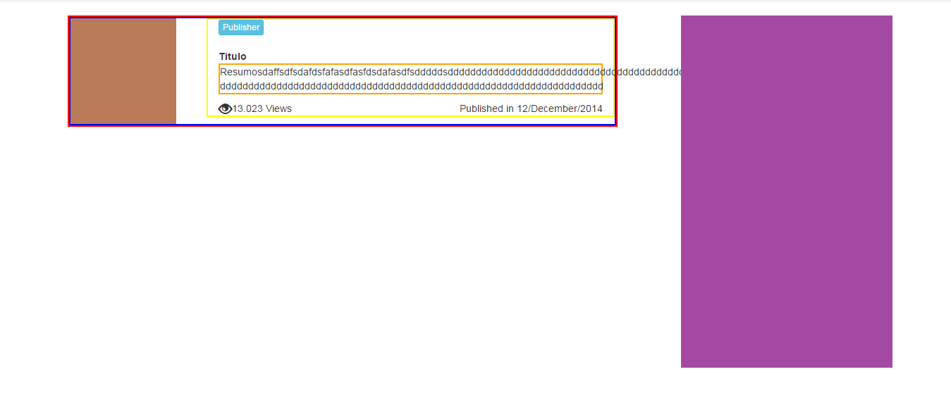
<div class="wrapper" role="main"><!-- START Content -->
        <div class="container"><!--- START Site Content --->
            <div class="row">
                <div id="conteudo" class="col-md-8" style="border:2px solid red"><!-- START News -->
                    <div class="row">
                        <div class="col-md-12" style="border:2px solid blue">
                            <div class="row" style="border:2px solid green">
                                <img src="../../app.images/7.jpg" style="max-width:150px;max-height:150px;"/>
                                <div class="news_conteudo col-md-9 pull-right" style="border:2px solid yellow">
                                    <button class="btn btn-xs btn-info" href="#" type="button">Publisher</button><br /><br />
                                    <span class="title">Titulo</span><br />
                                    <p class="texto" style="border:2px solid orange">Resumosdaffsdfsdafdsfafasdfasfdsdafasdfsdddddsdddddddddddddddddddddddddddddddddddddddddd
                                    dddddddddddddddddddddddddddddddddddddddddddddddddddddddddddddddddddd</p>
                                    <span><span class="glyphicon glyphicon-eye-open pull-left" style="font-size:19px;"></span>
                                    <span class="views pull-left">13.023 Views</span></span>
                                    <span class="pull-right publish_date">Published in 12/December/2014</span>
                                </div>
                            </div>
                        </div>
                    </div>
                </div> <!-- END News -->
                <div id="left-sidebar" class="col-md-4 pull-right"><!-- START Left Sidebar -->
                    <div class="row">
                        <img class="pull-right" src="../../app.images/4.jpg"/>
                        <img class="pull-right" src="../../app.images/4.jpg"/>
                    </div>
                </div><!-- END Left Sidebar -->
            </div>
        </div><!--- END Site Content --->
    </div><!-- END Content -->
The result in the Browser
Just to better understand where the problem is, what is the result you hoped would be the right one?
– Bacco
Look at the text advancing under the purple images, this text should be contained in the colored area by orange and when the browser is resized it is adapatando
– Ricardo
Ententi, I’ll apply and I’ll answer
– Ricardo