-1
I’m trying to get this pink rectangle to occupy the rest of the screen, more specifically... responsive height, tried some shapes, but unsuccessfully. How to proceed?
OBS: I’m using the Styled-Components
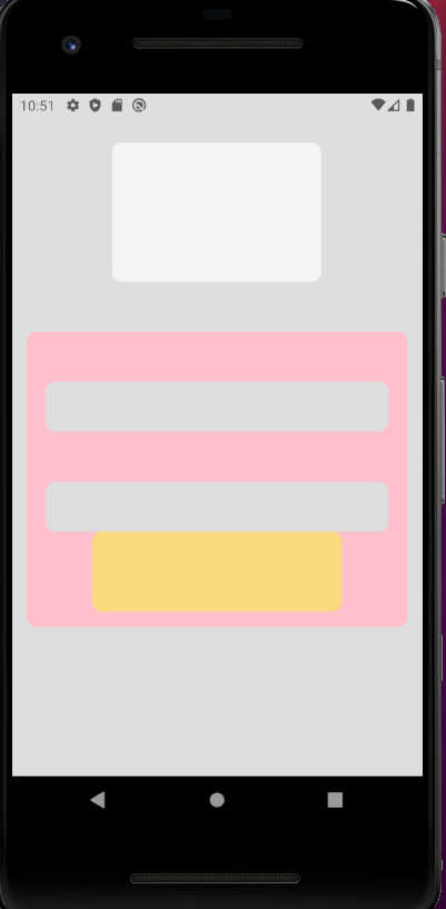
index js.
return(
    <Container showsVerticalScrollIndicator={false}>
      <ContainerValue>

      </ContainerValue>

        <ContainerRun>
          <Output>

          </Output>

          <Output>

          </Output>

          <ContainerButton>
            <ButtonInit>

            </ButtonInit>
          </ContainerButton>

        </ContainerRun>
    </Container>
  );
Styles.js
export const Container = styled.ScrollView`
  flex: 100%;
  background-color: ${colors.greyRegular};
  padding-left: 15px;
  padding-right: 15px;
`;

export const ContainerValue = styled.View`
  width: 55%;
  height: 140px;
  border-radius: 10px;
  align-self: center;
  margin-top: 25px;
  background-color: ${colors.white};
`;

export const ContainerRun = styled.View`
  width: 100%;
  border-radius: 10px;
  align-self: center;
  margin-top: 50px;
  margin-bottom: 15px;
  background-color: pink;
`;

export const Output = styled.View`
  width: 90%;
  height: 50px;
  border-radius: 10px;
  align-self: center;
  margin-top: 50px;
  background-color: ${colors.greyRegular};
`;
export const ContainerButton = styled.View`
  flex: 100%;
  justify-content: flex-end;
`;

export const ButtonInit = styled.TouchableOpacity`
  width: 250px;
  height: 80px;
  border-radius: 10px;
  align-self: center;
  margin-bottom: 15px;
  background-color: ${colors.yellowRegular};

`;
First of all thank you for dedicating a little of your time to answer me, I made the changes and worked in parts, the block is responsive but does not occupy the rest of the screen. =(
– Luh
I found that the problem was in the container base, because I am using Scrollview and it has a different functioning
– Luh
Ah, come on! : ) I don’t know about React, but that part of adjusting the height of a block is a bit boring. You can use vh which corresponds to 1% of the height of the display window. In case the device viewport. This way, you will set a height that will cover the entire available visible area, as used in .container. So you will adjust. These links can help you: https://stackoverflow.com/questions/21224411/css-calc-viewport-units-workaround or https://developer.mozilla.org/en-US/docs/Luilding_blocks/Values_and_units
– Felipe Maia