How to center and change order in flexbox

Asked

Viewed 197 times

0

I need to do something as it is in the image only that I am not able to change the order of the second column and center the text and the title also I am not able to put that gray line.
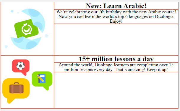
inserir a descrição da imagem aqui inserir a descrição da imagem aqui

body {
  padding: 1rem;
  background-color: rgb(241, 241, 241);
}

tr {
  border-bottom: 1px solid rgb(241, 241, 241);
}

.article {
  background-color: white;
  text-align: center;
  max-width: 600px;
  margin: 0 auto;
  display: flex;
  /* border: 1px solid #000; */
}

.article img {
  width: 30%;
}

.text {
  justify-content: ;
}
<article class="article">

  <img src="https://via.placeholder.com/180x180" alt="">

  <div class="text">

    <h1 class="title">New: Learn Arabic!</h1>

    <p class="description">We´re celebrating our 7th birthday with the new Arabic course! Now you can learn the world´s top 6 languages on Duolingo. Enjoy!</p>

  </div>
</article>
<article class="article">

  <img src="https://via.placeholder.com/180x180" alt="">

  <div class="text1">
    <h1 class="title">15+ million lessons a day</h1>
    <p class="description">Around the world, Duolingo learners are completing over 15 million lessons every day. That´s amazing! Keep it up!</p>


  </div>
</article>

  • The line you can use border-bottom . I don’t understand the problem of centering.

  • here does not appear but the text is too high I go for another image

  • Ah, centralization vertical. I got it, I was imagining it horizontally

  • Friend, I usually work like this, I create the Ivs and leave them with edge to read, then I put the content, I don’t understand the flexbox, are you using flexbox? Jump in here, and first try to do the same division you want, then you put the text on the images and adjust.

2 answers

2


Get to the points.

Centering items

To center the items of tag <article>, just use the property align-items in your CSS, that way you could choose how they will be aligned horizontally, in your case, use the value center.

.article {
  align-items: center;
}

Change order

To change the order of the child elements of a flexbox, just use the property flex-direction with the value row-reverse. This will cause the elements to reverse the position. The one on the right passes to the left and vice versa. In your case, you can use the pseudo-class ::nth-child(even) for this purpose to be applied only to odd elements.

article.article:nth-child(even) {
    flex-direction: row-reverse;
}

Adding edge

There are several modes, I chose to use the pseudo-class ::before. With this, I can add an element to simulate this line.

.article {
  position: relative; /* Evita que o pseudo-elemento ultrapasse a caixa */
}

article.article::before {
    background: red;
    content: ' ';
    display: block;
    width: 100%;
    height: 2px;
    position: absolute;
    bottom: -30px;
    margin-bottom: 20px;
}

Practical example

body {
  padding: 1rem;
  background-color: rgb(241, 241, 241);
}

tr {
  border-bottom: 1px solid rgb(241, 241, 241);
}

.article {
  background-color: white;
  text-align: center;
  max-width: 600px;
  margin: 0 auto 20px auto;
  display: flex;
  align-items: center;
  position: relative;
}

article.article:nth-child(even) {
    flex-direction: row-reverse;
}

article.article::before {
    background: red;
    content: ' ';
    display: block;
    width: 100%;
    height: 2px;
    position: absolute;
    bottom: -30px;
    margin-bottom: 20px;
}

.article img {
  width: 30%;
}

.text {
  justify-content: ;
}
<article class="article">

  <img src="https://via.placeholder.com/180x180" alt="">

  <div class="text">

    <h1 class="title">New: Learn Arabic!</h1>

    <p class="description">We´re celebrating our 7th birthday with the new Arabic course! Now you can learn the world´s top 6 languages on Duolingo. Enjoy!</p>

  </div>
</article>
<article class="article">

  <img src="https://via.placeholder.com/180x180" alt="">

  <div class="text1">
    <h1 class="title">15+ million lessons a day</h1>
    <p class="description">Around the world, Duolingo learners are completing over 15 million lessons every day. That´s amazing! Keep it up!</p>


  </div>
</article>

0

body {
  padding: 1rem;
  background-color: rgb(241, 241, 241);
}

tr {
  border-bottom: 1px solid rgb(241, 241, 241);
}

.article {
  background-color: white;
  text-align: center;
  max-width: 600px;
  margin: 0 auto;
  display: flex;
  /* border: 1px solid #000; */
  
}

img{
  margin: 1rem;
}

.article img {
  width: 30%;
}

.text {
  /*justify-content: ;*/
  margin: 2rem;
}

.titulo{
  text-align: left;
}

.description{
  text-align: justify;
}

hr {
 border: 0;
 border-top: 1px solid #CCC;
}
}
<html>
<head>
  <meta charset="utf-8">
  <meta name="viewport" content="width=device-width">
  <title>JS Bin</title>
</head>
<body>
  <hr>
<article class="article">

  <img src="https://via.placeholder.com/180x180" alt="">

  <div class="text">

    <h1 class="titulo">New: Learn Arabic!</h1>

    <p class="description">We´re celebrating our 7th birthday with the new Arabic course! Now you can learn the world´s top 6 languages on Duolingo. Enjoy!</p>

  </div>
 
</article>
  <hr> 
<article class="article">
 
  <div class="text">
    <h1 class="titulo">15+ million lessons a day</h1>
    <p class="description">Around the world, Duolingo learners are completing over 15 million lessons every day. That´s amazing! Keep it up!</p>

  </div>
   <img src="https://via.placeholder.com/180x180" alt="">

</article>
  <hr>
</body>
</html>

  • I made some changes to your code first you were using a css class with an html tag name the title and this is not recommended on the gray line I added the <hr> tag and in the second column if I got it right first you insert the text and then the image. Regarding the stylization that I did was not identical to the image, it was very close. I hope I helped in your doubt.

Browser other questions tagged

You are not signed in. Login or sign up in order to post.