0
I’m having a problem trying to add a 100% width to my site sessions. The "width: 100%;" command is not working when applied to any content session (Nav, header, Section, div or footer). The rest of the code is working as it should, including "width: 100%;" works when I put in some specific element, such as images and the like.
<!DOCTYPE html>
<head>
    <meta charset="utf-8">
    <meta name="viewport" content="width=device-width, initial-scale=1, shrink-to-fit=no">

    <link rel="stylesheet" href="style.css" media="screen and (color)">
    <link rel="stylesheet" href="bootstrap.min.css">

    <title>Breno Barbosa</title>
</head>

<body>
    <div class="container-fluid">
        <div class="row">

            <div class="carregando" id="carregando"></div>
            <div class="corpo" id="corpo">

                <nav class="navbar navbar-expand-lg navbar-light bg-light">
                    <a class="navbar-brand" href="#">
                        <img src="imagens/site-logo.png" alt="Logo do site na barra de navegação">
                    </a>

                    <button class="navbar-toggler" type="button" data-toggle="collapse" data-target="#navbarNav" aria-controls="navbarNav" aria-expanded="false" aria-label="Toggle navigation">
                      <span class="navbar-toggler-icon"></span>
                    </button>

                    <div class="collapse navbar-collapse" id="navbarNav">
                      <ul class="navbar-nav">
                        <li class="nav-item"><a class="nav-link" href="#">Sobre</a></li>
                        <li class="nav-item"><a class="nav-link" href="#">Habilidades</a></li>
                        <li class="nav-item"><a class="nav-link" href="#">Contatos</a></li>
                      </ul>
                    </div>
                </nav>

                <header>
                    <h1>Breno Barbosa</h1>
                </header>

                <section id="sobre">
                    <p>Teste</p>
                </section>

            </div>
        </div>
    </div>

    <script src="https://code.jquery.com/jquery-3.3.1.slim.min.js" integrity="sha384-q8i/X+965DzO0rT7abK41JStQIAqVgRVzpbzo5smXKp4YfRvH+8abtTE1Pi6jizo" crossorigin="anonymous"></script>
    <script src="https://stackpath.bootstrapcdn.com/bootstrap/4.2.1/js/bootstrap.min.js" integrity="sha384-B0UglyR+jN6CkvvICOB2joaf5I4l3gm9GU6Hc1og6Ls7i6U/mkkaduKaBhlAXv9k" crossorigin="anonymous"></script>

    <script>
        $(window).on('load', function (){
            document.getElementById("carregando"). style.display="none";
            document.getElementById("corpo"). style.display="block";
        });
    </script>

</body>
@media screen and (min-width: 1500px){
*{
    box-sizing: border-box;
    margin: 0px;
    padding: 0px;
    scroll-behavior: smooth;
    -webkit-user-drag: none;
}

body{
    margin: 0;
    padding: 0;
    background-attachment: fixed;
    background-size: cover;
    background-image: url(imagens/code-animation.gif);
}

.corpo{
    display: none;
}

.carregando{
    position: fixed;
    left: 0;
    top: 0;
    width: 100%;
    height: 100%;
    background: url(imagens/load.gif) 50% 50% no-repeat;
    background-color: #000000;
}

nav{
    width: 100%;
    top: 0;
    left: 0;
    position: fixed;
    background-color: rgba(0, 0, 0, 0.7) !important;
    z-index: 9999;
}

.navbar-brand img{
    max-width: 100%;
    width: 150px;
    margin-left: -15%;
}

.navbar-nav{
    margin-left: 70%;
}

header{
    width: 100%;
}
}
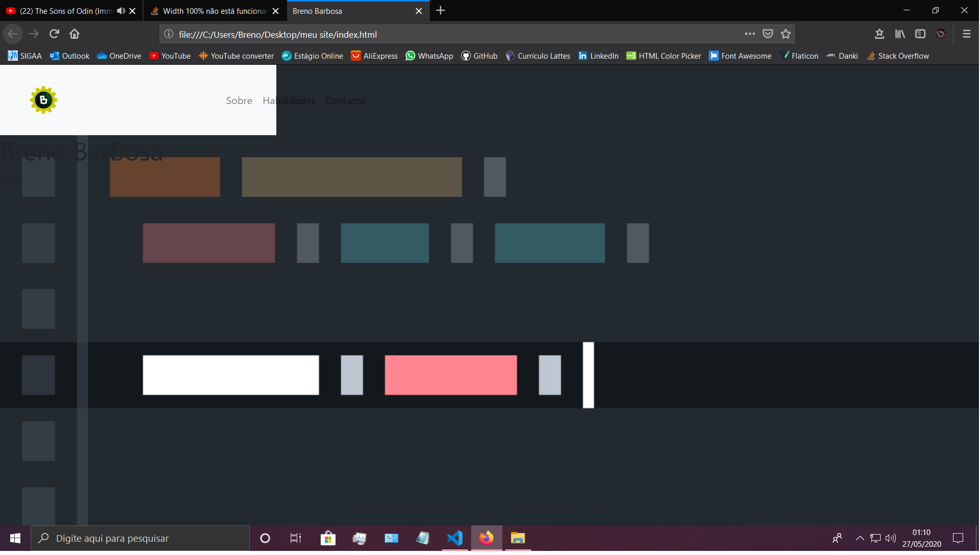
Thanks, it worked here!
– Breno Barbosa