-1
I am developing a site for a friend and I am not able to create the mobile version of it.
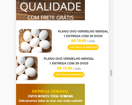
When I try to check the mobile version of the site with the help of the tool to inspect google Chrome it is completely misaligned despite having already configured the widht with 100%. Follow the image.
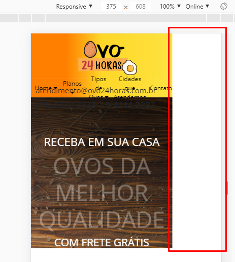
Even FLEXBOX gets bugged, but she was supposed to follow the page layout.
 I’ll send the code down without the images:
@import url('https://fonts.googleapis.com/css?family=Open+Sans:300,400,700&display=swap');

/* Resetando configurações do Navegador Padrão */

* {
  margin: 0;
  padding: 0;
}

body {
  font-family: 'Open Sans', sans-serif;
  background-color: white;
  width: 100%;
}

.whatsapp {
  position: fixed;
  top: 82%;
  left: 1%;
  padding: 10px;
  z-index: 1;
  width: 110px;
}


/* INICIO DO CABEÇALHO */

#cabecalho {
  height: 120px;
  width: 100%;
  background-image: linear-gradient(to right, #ff7f00, #ff7f00, #fed728, #fedd34, #fee23f);
  display: flex;
  justify-content: space-around;
  flex-wrap: wrap;
}

#logotipo {
  height: 90px;
  width: 156px;
  margin-top: 20px;
  margin-left: 30px;
  background: url(../img/logo.png);
  background-size: cover;
}

#content_cabecalho {
  position: relative;
  height: 60px;
  width: 350px;
  font-size: 23px;
  margin-top: 30px;
  overflow: hidden;
  font-weight: bold;
}

#main_menu {
  width: 100%;
  height: 30px;
  background-image: linear-gradient(to right, #ff7f00, #ff7f00, #fed728, #fedd34, #fee23f);
  display: flex;
  flex-direction: row;
  justify-content: center;
  align-items: center;
}

.menuitem {
  text-align: center;
  margin-left: 10px;
  width: 200px;
}

.menuitem a {
  color: black;
  text-decoration: none;
}


/* FIM DO CABEÇALHO */

#content {
  height: 150px;
  width: 100%;
  display: flex;
  justify-content: space-around;
  flex-wrap: wrap;
}

.item {
  height: 150px;
  width: 500px;
  margin: 0 0 0 0;
}

.item img {
  border-radius: 17px;
}

.tituloproduto {
  margin: -130px 10px -10px 10px;
  font-size: 17px;
  width: 280px;
  position: relative;
  left: 200px;
  font-weight: bold;
  text-align: center;
}

.descricaoproduto {
  margin: 10px;
  text-align: center;
  position: relative;
  left: 200px;
  width: 280px;
}

.botaocomprar {
  margin: -5px 0 0 0;
  text-align: center;
  width: 280px;
  position: relative;
  left: 210px;
}

.botaocomprar button {
  color: white;
  background-color: #ffcc00;
  width: 170px;
  height: 30px;
  border-radius: 20px;
  border-color: #ffcc00;
  font-size: 12px;
}

.botaocomprar button:hover {
  background-color: #c72c2c;
  border: 1px solid #c72c2c;
  transition: background-color .5s;
}


/* Menu 2 */

#main_plans {
  background-image: linear-gradient(rgba(0, 0, 0, 0.3), rgba(0, 0, 0, 0.2)), linear-gradient(to right, #ff7f00, #ff7f00, #fed728, #fedd34, #fee23f);
  height: 200px;
  width: 100%;
  text-align: center;
  padding-top: 20px;
  font-family: Arial, Helvetica, sans-serif;
  display: flex;
  justify-content: space-around;
  flex-wrap: wrap;
}

#content_plans {
  min-height: 20px;
}

.botaocategorias {
  text-align: center;
  margin: 10px;
}

.botaocategorias button {
  color: white;
  background-color: #ffcc00;
  width: 170px;
  height: 30px;
  border-radius: 20px;
  border-color: #ffcc00;
  font-size: 12px;
}

#fundoimagem1 {
  background: linear-gradient(rgba(0, 0, 0, 0.8), rgba(0, 0, 0, 0.2)), url(../img/21.jpg);
  background-size: cover;
  height: 400px;
  width: 100%;
}

#fundoimagem1 h1 {
  color: white;
  padding-top: 100px;
  font-size: 30px;
}

#fundoimagem1 h2 {
  color: white;
  padding-top: 0px;
  font-size: 60px;
  animation: blinker 2s linear infinite;
}

@keyframes blinker {
  50% {
    opacity: 0;
  }
}


/* FIM DO MENU 2*/

#frasedeentrada {
  position: relative;
  color: white;
  margin-top: 70px;
  left: 100px;
  background-color: pink;
  overflow: hidden;
  font-size: 41px;
  text-align: center;
  text-shadow: 6px 4px 6px rgba(0, 0, 0, 0.3);
}

#frasedeentrada i {
  position: relative;
  left: 250px;
  top: 120px;
  animation: blinker 1s linear infinite;
}

@keyframes blinker {
  50% {
    opacity: 0;
  }
}

#imagemx i {
  font-size: 40px;
  color: white;
  text-shadow: 6px 4px 6px rgba(0, 0, 0, 0.3);
}


/* Fim do Menu 2 */


/* Banner e Botões */

#botaodiario {
  width: 130px;
  height: 130px;
  cursor: pointer;
  text-align: center;
  border-radius: 170px;
  background-color: #ffcc00;
  -webkit-text-stroke-color: #000;
  font-size: 25px;
  color: #000000;
  padding-top: -20px;
  border-bottom: 0px;
}

#botaodiario:hover {
  background-color: rgb(255, 233, 36);
  border-color: rgb(241, 230, 123);
  transition: background-color .5s;
}

#botaosemanal {
  width: 130px;
  height: 130px;
  cursor: pointer;
  border-radius: 170px;
  font-size: 30px;
  background-color: #ffcc00;
  -webkit-text-stroke-color: #000;
  font-size: 25px;
  color: #000000;
  border-bottom: 0px;
}

#botaosemanal:hover {
  background-color: rgb(241, 230, 123);
  border-color: rgb(241, 230, 123);
  color: black;
  transition: background-color .5s;
}

#botaomensal {
  width: 130px;
  height: 130px;
  cursor: pointer;
  border-radius: 170px;
  font-size: 30px;
  background-color: #ffcc00;
  -webkit-text-stroke-color: #000;
  font-size: 25px;
  color: #000000;
  border-bottom: 0px;
}

#botaomensal:hover {
  background-color: rgb(241, 230, 123);
  border-color: rgb(241, 230, 123);
  color: black;
  transition: background-color .5s;
}


/* Fim do Banner e Botões */

#comocomprar {
  font-size: 19px;
}


/* INICIO DOS PRODUTOS */

#background1 {
  background-color: #ffcc00;
}

#produtos_ovo {
  font-size: 13px;
}

#zoomprodutos {
  overflow: hidden;
}

#zoomprodutos a {
  color: black;
}

#zoomprodutos a:hover {
  text-decoration: none;
}

#zoomprodutos img {
  max-width: 100%;
  -moz-transition: all 0.3s;
  -webkit-transition: all 0.3s;
  transition: all 0.3s;
}

#zoomprodutos:hover img {
  -moz-transform: scale(1.1);
  -webkit-transform: scale(1.1);
  transform: scale(1.1);
  cursor: pointer;
}


/* FIM DOS PRODUTOS */

footer {
  font-size: 13px;
  padding-top: 50px;
}

#colunafinal {
  background-color: #333333;
  color: #fff;
  font-size: 12px;
  text-align: center;
}

.dark-line {
  font-size: 11px;
  background-color: rgb(59, 59, 59);
  text-align: center;
  color: #ffffff;
  padding: 10px 0 10px;
  margin: 0;
}

@media (max-width: 1200px) {
  #content {
    height: 300px;
  }
  #main_menu {
    height: 50px;
  }
}

@media (max-width: 1087px) {
  #main_plans {
    flex-direction: column;
    height: 450px;
  }
}
<!DOCTYPE html>
<html lang="pt-br">
<head>
<meta charset="UTF-8">
<meta http-equiv="X-UA-Compatible" content="IE=edge">
<meta name="viewport" content="width=device-width, initial-scale=1.0">
<title>Ovos 24 Horas | Compre Online</title>
<!-- jQuery first, then Popper.js, then Bootstrap JS -->
<link rel="stylesheet" href="https://stackpath.bootstrapcdn.com/bootstrap/4.1.3/css/bootstrap.min.css" integrity="sha384-MCw98/SFnGE8fJT3GXwEOngsV7Zt27NXFoaoApmYm81iuXoPkFOJwJ8ERdknLPMO" crossorigin="anonymous">
<script src="https://code.jquery.com/jquery-3.4.1.slim.min.js" integrity="sha384-J6qa4849blE2+poT4WnyKhv5vZF5SrPo0iEjwBvKU7imGFAV0wwj1yYfoRSJoZ+n" crossorigin="anonymous"></script>
<script src="https://cdn.jsdelivr.net/npm/[email protected]/dist/umd/popper.min.js" integrity="sha384-Q6E9RHvbIyZFJoft+2mJbHaEWldlvI9IOYy5n3zV9zzTtmI3UksdQRVvoxMfooAo" crossorigin="anonymous"></script>
<script src="https://stackpath.bootstrapcdn.com/bootstrap/4.4.1/js/bootstrap.min.js" integrity="sha384-wfSDF2E50Y2D1uUdj0O3uMBJnjuUD4Ih7YwaYd1iqfktj0Uod8GCExl3Og8ifwB6" crossorigin="anonymous"></script>
<link href="https://fonts.googleapis.com/css?family=Open+Sans:300,400,700" rel="stylesheet">
<link href="https://fonts.googleapis.com/css?family=Poppins&display=swap" rel="stylesheet">
<link href="https://fonts.googleapis.com/css?family=Rubik&display=swap" rel="stylesheet">
<script src="https://kit.fontawesome.com/6e07d76513.js" crossorigin="anonymous"></script>
<link rel="stylesheet" href="css/style.css">
<link href="https://fonts.googleapis.com/css2?family=Indie+Flower&display=swap" rel="stylesheet">
<link rel="shortcut icon" href="./img/android-chrome-512x512.png">
</head>
<body>
<header>
<div id="cabecalho">
<div id="logotipo">
</div>
<div id="content_cabecalho">
<h5>[email protected]<br/></h5>
(11) 2222-3333 | 9.4444-2222
</div>
</div>
</header>
<nav id="main_menu">
<div class="menuitem"><a href="index.php"> Home <i class="fas fa-caret-down"></i></a></div>
<div class="menuitem"><a href="#">Planos <i class="fas fa-caret-down"></i> </a></div>
<div class="menuitem"><a href="tiposdeovos.php">Tipos de Ovos <i class="fas fa-caret-down"></i></a></div>
<div class="menuitem"><a href="cidades.php">Cidades que Atendemos</a></div>
<div class="menuitem"><a href="faleconosco.php">Contato</a></div>
</nav>
<div id="fundoimagem1">
<div class="container">
<h1 class="text-center">RECEBA EM SUA CASA</h1>
<h2 class="text-center">OVOS DA MELHOR QUALIDADE</h2>
<h3 class="text-center" style="color: white">COM FRETE GRÁTIS</h3>
</div>
</div>
<!-- Inicio dos Produtos --><br/>
<br/>
<div class="container">
<section id="content">
<article class="item">
<img src="./img/ovosbranco.jpg" height="130px" width="180px">
<div class="tituloproduto">
PLANO OVO VERMELHO MENSAL <br/> 1 ENTREGA COM 30 OVOS
</div>
<div class="descricaoproduto">
<span style="font-weight: bold; font-size: 20px; color: #ffcc00;"> R$ 19,99 </span> / ciclo
</div>
<div class="botaocomprar">
<button type="submit" class="btn">VER TODOS OS PRODUTOS</button>
</div>
</article>
</section>
</div>
<!-- FIM DOS PRODUTOS -->
<div id="main_plans">
<div class="content_plans">
<span style="color: #ffcc00; font-size: 20px; font-weight: bold">ENTREGA SEMANAL</span></br>
<span style="color: white; font-size: 17px; font-weight: bold">OVOS NOVOS TODA SEMANA</span><br/>
<span style="color: white;">Selecionamos todos os ovos com muito cuidado!<br/></span>
<div class="botaocategorias">
<button type="submit" class="btn">EU QUERO!</button>
</div>
</div>
<div class="content_plans">
<span style="color: #ffcc00; font-size: 20px; font-weight: bold"> ENTREGA QUINZENAL<br/></span>
<span style="color: white; font-size: 17px; font-weight: bold">UMA ENTREGA A CADA 15 DIAS<br/></span>
<span style="color: white;">Tudo acontece automaticamente, nem se preocupe!<br/></span>
<div class="botaocategorias">
<button type="submit" class="btn">EU QUERO!</button>
</div>
</div>
<div class="content_plans">
<span style="color: #ffcc00; font-size: 20px; font-weight: bold">ENTREGA MENSAL<br/></span>
<span style="color: white; font-size: 17px; font-weight: bold">RECEBA UMA ENTREGA POR MÊS</span><br/>
<span style="color: white;">Você ainda pode alterar seu plano quando quiser!</span><br/>
<div class="botaocategorias">
<button type="submit" class="btn">EU QUERO!</button>
</div>
</div>
<br/>
<!-- Texto Index-->
<div class="container">
<div class="row">
<div class="col" id="textoindex">
<h1 class=text-center>Reserve ovos pelo menor preço!</h1> <br/>
<p class="text-center">Faça pacotes semanais, quinzenais ou mensais...</p>
<p class=text-center>Vendemos para micro, média e grande empresas, e você pessoa física também pode adquirir!</p>
<p class=text-center>Não espere o carro do ovo passar na sua rua, trabalahamos com atendimento 24 horas.
</div>
</div>
</div>
<!-- Fim Texto Index -->
<br>
<hr>
<?php
include 'footer.php'; ?>
I appreciate the return, but the above error was related to setting meta tag, already adjusted. When to structure errors I will pay attention. Thanks!!
– Bruno Muniz