-1
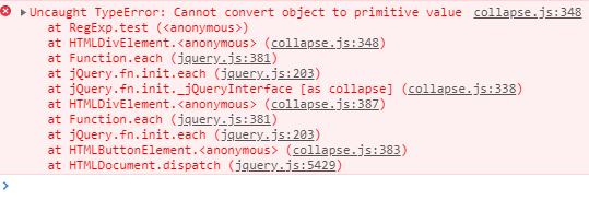
Hello, when I click on the button (which only appears in the resposivity from 768px) the submenu does not open and generates the error below.
<!doctype html>
<!-- Bootstrap CSS -->
<link rel="stylesheet" href=node_modules/bootstrap/compiler/bootstrap.css>

<link rel="stylesheet" href=node_modules/>
<nav class="nav bar navbar-expand-lg navbar-light bg-light">

    <a class="navbar-brand h1" href="#">Curso</a>

    <button class="navbar-toggler" type="button" data-toggle="collapse" data-target="#navbarSite">
        <span class="navbar-toggler-icon"></span>
    </button>

    <div class="collapse navbar-collapse" id="navbarSite">
        <ul class="navbar-nav">
            <li class="nav-item">
                <a class="nav-link" href="#">Início</a>
            </li>
        </ul>
</div>
</nav>
<!-- Optional JavaScript -->
<!-- jQuery first, then Popper.js, then Bootstrap JS -->
<script src="node_modules/jquery/dist/jquery.js"></script>
<script src="node_modules/popper.js/dist/umd/popper.js"></script>
<script src="node_modules/bootstrap/dist/js/bootstrap.js"></script>