0
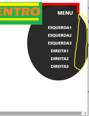
I’m trying to remove the edges of the external right in the mobile menu as shown in the image below, someone knows how to do.
Html Code:
<!DOCTYPE html>
<html lang="en">

<head>
    <meta charset="utf-8">
    <!-- This file has been downloaded from Bootsnipp.com. Enjoy! -->
    <title>scrolling and transparent banner - Bootsnipp.com</title>
    <meta name="viewport" content="width=device-width, initial-scale=1">
    <link href="http://maxcdn.bootstrapcdn.com/bootstrap/4.0.0/css/bootstrap.min.css" rel="stylesheet">
    <link rel="stylesheet" href="style.css">
    <script src="http://code.jquery.com/jquery-1.11.1.min.js"></script>
    <script src="http://maxcdn.bootstrapcdn.com/bootstrap/4.0.0/js/bootstrap.min.js"></script>
    <link rel="stylesheet" href="https://cdnjs.cloudflare.com/ajax/libs/OwlCarousel2/2.3.4/assets/owl.carousel.min.css">
    <link rel="stylesheet" href="https://cdnjs.cloudflare.com/ajax/libs/OwlCarousel2/2.3.4/assets/owl.theme.default.css">
    <script type="text/javascript" src="https://cdnjs.cloudflare.com/ajax/libs/OwlCarousel2/2.3.4/owl.carousel.js"></script>
</head>

<body>
<div class="baixo"></div>
    <!-- <div class="baixo"></div> -->
    <!-- CODIGO DA NAVBAR MENU -->
    <header class="top-line">
        <a href="#" class="logo"><img src="https://i.imgur.com/eH60XtT.png" alt="logo alt"></a>
        <div class="phone"><i class="fa fa-phone"></i>+777 777 77 77</div>

        <div class="mobile-menu-btn"><i class="fa fa-bars"></i> МENU</div>
        <nav class="main-menu top-menu">
            <ul>
                <li class="active"><a href="#">Esquerda1</a></li>
                <li><a href="#">Esquerda2</a></li>
                <li><a href="#">Esquerda3</a></li>
            </ul>
            <ul>
                <li class="active"><a href="#">Direita1</a></li>
                <li><a href="#">Direita2</a></li>
                <li><a href="#">Direita3</a></li>
            </ul>
        </nav>
    </header>
    <!-- FIM DO CODIGO DA NAVBAR MENU -->


    <script type="text/javascript">
        $('.top-line').append('<div class="mobile-menu d-xl-none">');
        $('.top-menu').clone().appendTo('.mobile-menu');
        $('.mobile-menu-btn').click(function() {
            $('.mobile-menu').stop().slideToggle();
        });
    </script>
</body>

</html>
CSS code
/* INICIO NAVBAR MENU */
.top-line {
    background-color: #222;
    position: relative;
    height: 60px;
    outline: 10px solid #ff0000;
    z-index: 1;
}

.top-line .logo {
    display: inline-block;
    line-height: 55px;
    position: absolute;
    top: 50%;
    left: 50%;
    transform: translate(-50%, -50%);
    z-index: 300;
}
.baixo {
margin-top: 71px;
}
.main-menu {
    padding-right: 167px;
    padding-left: 100px;
    width: 100%;
    display: flex;
    justify-content: space-between;
}

.main-menu ul {
    list-style-type: none;
    padding: 0;
    margin: 0;
}

.main-menu ul li {
    display: inline-block;
}

.main-menu ul li.active a {
    color: #fff;
}

.main-menu ul li:hover a {
    color: #22B14C;
}

.main-menu ul li a {
    color: #fff;
    text-decoration: none;
    text-transform: uppercase;
    font-weight: bold;
    padding: 0 15px;
    line-height: 60px;
    display: block;
    transition: color .25s ease, background-color .25s ease;
}

.mobile-menu-btn {
    color: #fff;
    text-align: center;
    line-height: 65px;
    font-weight: bold;
    text-transform: uppercase;
    display: none;
    white-space: nowrap;
    position: relative;
    margin-right: 10px;
    float: right;
}

.mobile-menu {
    display: none;
    background-color: #2a2a2a;
    border-top: #343434;
}

.mobile-menu .top-menu {
    display: block;
}

.mobile-menu .top-menu ul {
    padding: 0;
}

.mobile-menu .top-menu ul li {
    display: block;
    text-align: center;
}

.mobile-menu .top-menu ul li:hover {
    background-color: #3b5998;
}

.mobile-menu .top-menu ul li a {
    padding: 0;
    line-height: 30px;
}

.mobile-menu .top-menu ul li a:hover {
    text-decoration: none;
}

.phone {
    position: absolute;
    padding-right: 25px;
    padding-left: 10px;
    right: 0;
    color: #fff;
    line-height: 55px;
    cursor: pointer;
    transition: color .25s ease;
    font-size: 14px;
}

.phone i {
    padding-right: 10px;
    font-size: 20px;
}

@media (max-width: 575.98px) {
    .top-line .logo {
        padding-left: 5px;
    }
    .top-line .phone {
        display: none;
    }
    .top-line .mobile-menu-btn {
        padding-right: 5px;
        display: block;
        text-align: right;
        font-size: 20px;
        line-height: 55px;
    }
    .main-menu {
        padding: 0 30px;
    }
}

.baixo {
    margin-top: 71px;
}

@media (max-width: 1199.98px) {
    .main-menu {
        display: none;
    }
    .mobile-menu-btn {
        display: block;
        z-index: 999;
    }
    .top-line {
        position: relative;
    }
    .mobile-menu {
        transition: all 0.3s cubic-bezier(0.68, -0.55, 0.265, 1.55);
        top: 0px;
        right: -50px;
        position: absolute;
        padding: 70px 40px 40px 50px;
        border-radius: 50%;
        z-index: 18;
        overflow: hidden;
    }
}


/* FIM DA NAVBAR */
I used the border-Radius property: 50%, but I want to remove this part that is outside the margin of the page.
I tested the problem and that when opening the menu the edge still expands beyond the right margin, it was not eliminated, you know another way?
– user181173