How to padde an <li> item vertically hide 100% of the container?

Asked

Viewed 53 times

-1

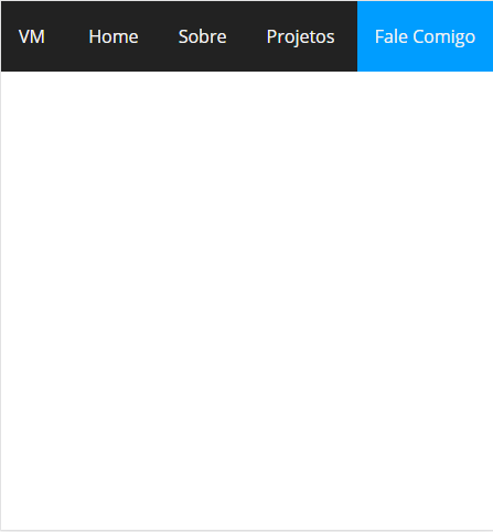
I was able to calculate the exact size of the bar and put the value in the padding, but this causes me problems later, how do I make it look like in the image below?

inserir a descrição da imagem aqui

 <html lang="pt-br">
                <head>
                    <meta charset="UTF-8">
                    <meta name="viewport" content="width=device-width, initial-scale=1.0">
                    <title>Document</title>
        <style>
             * {
                padding: 0;
                margin: 0;
                font-family: 'Open Sans', sans-serif;
                box-sizing: border-box;
            }

            :root {
                --texto-branco: #f2f2f2;
                --fundo-preto:#222;
                --fundo-azul:#009DFF;
            }

            nav {
                background: var(--fundo-preto);
                height: 64px;
                display: flex;
                flex-wrap: wrap;
                justify-content: space-between;
                align-items: center;
            }

            .logo {
                color: var(--texto-branco);
                margin: 16px;
                cursor: pointer;
            }

            ul {
                list-style: none;
            }

            li {
                padding: 0px 16px;
                display: inline-block;
                transition: .3s;
            }

            nav li:hover {
                background: var(--fundo-azul);
            }

            a {
                text-decoration: none;
                color: var(--texto-branco);
            }
                    </style>
                </head>
                <body>
                    <nav>
                        <div class="logo">VM</div>
                        <ul>
                            <li><a href="#">Home</a></li>
                            <li><a href="#">Sobre</a></li>
                            <li><a href="#">Projetos</a></li>
                            <li><a href="#">Fale Comigo</a></li>
                        </ul>
                    </nav>
                </body>
            </html>

1 answer

1


Place display: flex in everything: nav, ul, li and a (it is good to create classes for these elements, otherwise it will affect the whole site). Use the property align-self: stretch; in ul. This property will cause the element to occupy the entire height of the nav. And with align-items: center you center vertically the elements:

* {
    padding: 0;
    margin: 0;
    font-family: 'Open Sans', sans-serif;
    box-sizing: border-box;
}

:root {
    --texto-branco: #f2f2f2;
    --fundo-preto:#222;
    --fundo-azul:#009DFF;
}

nav {
    background: var(--fundo-preto);
    height: 64px;
    display: flex;
    flex-wrap: wrap;
    justify-content: space-between;
    align-items: center;

}

.logo {
    color: var(--texto-branco);
    margin: 0 16px;
    cursor: pointer;
}

ul {
    list-style: none;
    display: flex;
    align-self: stretch;
}

li {
    display: flex;
    transition: .3s;
}

nav li:hover {
    background: var(--fundo-azul);
}

a {
    text-decoration: none;
    color: var(--texto-branco);
    padding: 0px 16px;
    display: flex;
    align-items: center;
}
<nav>
   <div class="logo">VM</div>
   <ul>
       <li><a href="#">Home</a></li>
       <li><a href="#">Sobre</a></li>
       <li><a href="#">Projetos</a></li>
       <li><a href="#">Fale Comigo</a></li>
   </ul>
</nav>

Now, the padding: 0px 16px should be placed in the a and not in the li, otherwise the link a will not occupy the entire area of li where is.

And soon you can use only margin: 0 16px;, because it will be automatically centered in the flexbox.

  • For a simple website which would be the most suitable, calculate the size of the padding or do this way?

  • Calculate padding is gambiarra. It is right to use this way because everything is automatic.

Browser other questions tagged

You are not signed in. Login or sign up in order to post.