Difficulties with flex-box, align the menu icon on the right

Asked

Viewed 274 times

-1

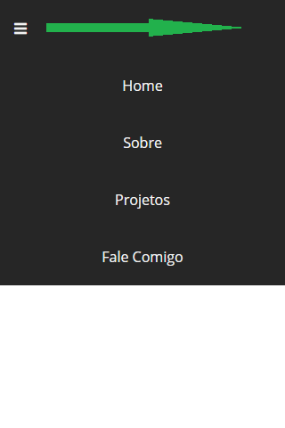
I had to use flexbox to leave the class logo and class menu vertically aligned in the center of the tag nav because font-awesome icons were not working with line-height, however this is causing me problems to build the open menu, need the icone menu stay on the right side and not on the left side.

inserir a descrição da imagem aqui

HTML

<html lang="pt-br">
  <head>
      <meta charset="UTF-8">
      <meta name="viewport" content="width=device-width, initial-scale=1.0">
      <link rel="stylesheet" href="style.css">
      <script src="https://kit.fontawesome.com/a3703589d3.js" crossorigin="anonymous"></script>
      <title>VM Design</title>
  </head>
  <body>
      <nav>
          <a class="logo" href="#">VM</a>
          <ul>
              <li><a href="#">Home</a></li>
              <li><a href="#">Sobre</a></li>
              <li><a href="#">Projetos</a></li>
              <li><a href="#">Fale Comigo</a></li>
          </ul>
          <div class="menu"><i class="fas fa-bars"></i></div>
      </nav>
  </body>
</html>

CSS:

* {
    padding: 0;
    margin: 0;
    font-family: 'Open Sans', sans-serif;
}

:root {
    --texto-branco: #f2f2f2;
    --fundo-preto:#262626;
    --fundo-azul:#009DFF;
}

nav {
    position: absolute;
    top: 0;
    left: 0;
    height: 64px;
    width: 100%;
    display: flex;
    justify-content: space-between;
    align-items: center;
    background-color: var(--fundo-preto);
    box-sizing: border-box;
}

.logo {
    margin: 16px;
}
.menu {
    margin: 16px;
    display: none;
    cursor: pointer;
    color: var(--texto-branco);
}

ul {
    display: flex;
} 


li {
    padding: 0 16px;
    transition: 0.3s;
    text-align: center;
}
li:hover {
    background-color: var(--fundo-azul);
}

a {
    text-decoration: none;
    color: var(--texto-branco);
}

@media  (max-width: 480px) {
    .menu {
        display: block;
        justify-self: right;
    }
    /* ---MENU FECHADO--- */
    /*li:not(:last-child) {
        display: none;
    }*/

    /* ---MENU ABERTO--- */
   .logo {
       display: none;
   }

    ul {
        margin-top: 160px;
        position: absolute;
        width: 100%;
        display: block;

    }

    ul li{
        background-color: var(--fundo-preto);
    }

} 

1 answer

2

Just give margin-left: auto in div.menu, so it creates a left margin (left), which will "push" the menu to the right.

The estate justify-self: right; doesn’t work that way unless you’re using grid

<!DOCTYPE html>
<html lang="en">

<head>
<meta charset="utf-8" />
<meta http-equiv="X-UA-Compatible" content="IE=edge">
<title>Page Title</title>
<meta name="viewport" content="width=device-width, initial-scale=1">
  <script src="https://kit.fontawesome.com/a3703589d3.js" crossorigin="anonymous"></script>

<style>
  * {
    padding: 0;
    margin: 0;
    font-family: 'Open Sans', sans-serif;
  }

  :root {
    --texto-branco: #f2f2f2;
    --fundo-preto: #262626;
    --fundo-azul: #009DFF;
  }

  nav {
    position: absolute;
    top: 0;
    left: 0;
    height: 64px;
    width: 100%;
    display: flex;
    justify-content: space-between;
    align-items: center;
    background-color: var(--fundo-preto);
    box-sizing: border-box;
  }

  .logo {
    margin: 16px;
  }

  .menu {
    margin: 16px;
    display: none;
    cursor: pointer;
    color: var(--texto-branco);
  }

  ul {
    display: flex;
  }


  li {
    padding: 0 16px;
    transition: 0.3s;
    text-align: center;
  }

  li:hover {
    background-color: var(--fundo-azul);
  }

  a {
    text-decoration: none;
    color: var(--texto-branco);
  }

  @media (max-width: 480px) {
    .menu {
      display: block;
      margin-left: auto;
    }

    /* ---MENU FECHADO--- */
    /*li:not(:last-child) {
        display: none;
    }*/

    /* ---MENU ABERTO--- */
    .logo {
      display: none;
    }

    ul {
      margin-top: 160px;
      position: absolute;
      width: 100%;
      display: block;

    }

    ul li {
      background-color: var(--fundo-preto);
    }

  }
</style>
</head>

<body>

  <nav>
    <a class="logo" href="#">VM</a>
    <ul>
      <li><a href="#">Home</a></li>
      <li><a href="#">Sobre</a></li>
      <li><a href="#">Projetos</a></li>
      <li><a href="#">Fale Comigo</a></li>
    </ul>
    <div class="menu"><i class="fas fa-bars"></i></div>
  </nav>


</body>

</html>

Browser other questions tagged

You are not signed in. Login or sign up in order to post.