Place elements side by side using HTML and CSS

Asked

Viewed 6,721 times

0

inserir a descrição da imagem aqui

I need to place the centered menu horizontally on the logo side, help!!!

Code so far: HTML:

<!DOCTYPE html>
<html lang="pt-BR">
<head>
    <meta charset="UTF-8">
    <meta name="viewport" content="width=device-width, initial-scale=1.0">
    <title>Gabriel Morais</title>
    <link rel="stylesheet" href="css/style.css">
</head>
<body>
    <div id="1">
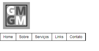
        <figure class="header"><img alt="Logo" src="img\logo.png" width="90px" height="90px"></figure>
    </div>

    <div id="2">
        <nav id="header">
            <ul class="menu">
                <li><a href="#">Home</a></li>
                <li><a href="#">Sobre</a></li>
                    <li><a href="#">Serviços</a>
                        <ul>
                              <li><a href="#">Web Design</a></li>
                            <li><a href="#">Design Gráfico</a></li>                    
                        </ul>
                    </li>
                <li><a href="#">Links</a></li>
                <li><a href="#">Contato</a></li>  
            </ul>
        </nav>
    </div>
    <script src="js\script.js"></script>
</body>
</html>

CSS:

*{margin: 0; padding: 0;}

body {
    font-family: arial,Arial, Helvetica, sans-serif;
    font-size: 12px;
}

.menu {
    list-style: none;
    border: 1px solid black;
    float: left;

}

.menu li {
    position: relative;
    float: left;
    border-right: 1px solid black;
}

.menu li a {color: black; text-decoration: none; padding: 5px 10px; display: block;}


.menu li a:hover{
    background:#333; 
    color:#fff; 
    -moz-box-shadow:0 3px 10px 0 #CCC; 
    -webkit-box-shadow:0 3px 10px 0 #ccc; 
    text-shadow:0px 0px 5px #fff; 
}

.menu li  ul{
    position:absolute; 
    top:25px; 
    left:0;
    background-color:#fff; 
    display:none;
}  

.menu li:hover ul, .menu li.over ul{display:block;}

.menu li ul li{
    border:1px solid #c0c0c0; 
    display:block; 
    width:150px;
    }

.header {
    margin: 10px;
}

div#1{
    display: inline-block;
}

div#2{
    display: inline-block;
}

2 answers

1

This can be done easily using the property flexbox of the CSS.

For this, I made a small modification in your HTML, placing the image inside your navigation bar, thus staying:

    <nav id="header">
        <figure class="header">
            <img alt="Logo" src="img\logo.png" width="90px" height="90px">
        </figure>

        <ul class="menu">
            <li><a href="#">Home</a></li>
            <li><a href="#">Sobre</a></li>
                <li><a href="#">Serviços</a>
                    <ul>
                            <li><a href="#">Web Design</a></li>
                        <li><a href="#">Design Gráfico</a></li>                    
                    </ul>
                </li>
            <li><a href="#">Links</a></li>
            <li><a href="#">Contato</a></li>  
        </ul>
    </nav>

And it’s in CSS that the magic happens! I’ll select the navigation bar and assign the property display: flex so that the elements are aligned side by side.

nav {
   display: flex;
}

Ready! This already leaves both side by side. I’ll leave a link also in English talking a little more about the CSS Flexbox, follows: https://origamid.com/projetos/flexbox-guia-completo/

Just one more remark, be careful with the names you give to your ID’s and classes, this can cause a lot of headache for you in the future, because I noticed the name of id of his nav is header, which is the same name as the class of figure in which your logo is inside.

I hope it helped, hugs!

1


I don’t think you need those records id="1" and id="2". You can make it simpler in this structure:

<header>
   <figure>LOGO</figure>
   <nav>MENU</nav>
</header>

Use flexbox to align elements and forget float: left. In the example below I changed id’s and class names not to confuse things:

*{margin: 0; padding: 0;}

body {
    font-family: arial,Arial, Helvetica, sans-serif;
    font-size: 12px;
}

#menu ul {
    list-style: none;
    border: 1px solid black;
}

#menu li {
    position: relative;
    border-right: 1px solid black;
}

#menu li a {color: black; text-decoration: none; padding: 5px 10px; display: block;}


#menu li a:hover{
    background:#333; 
    color:#fff; 
    -moz-box-shadow:0 3px 10px 0 #CCC; 
    -webkit-box-shadow:0 3px 10px 0 #ccc; 
    text-shadow:0px 0px 5px #fff; 
}

#menu li  ul{
    position:absolute; 
    top:25px; 
    left:0;
    background-color:#fff; 
    display:none;
}  

#menu li:hover ul, #menu li.over ul{display:block;}

#menu li ul li{
    border:1px solid #c0c0c0; 
    width:150px;
    }

.logo {
    margin: 10px;
}

header, #menu, #menu ul{
   display: flex;
}

#menu{
   flex: 1; /* isto é para a nav ocupar a largura toda menos a logo */
   justify-content: center; /* alinha horizontalmente */
   align-items: center; /* alinha verticalmente */
}
<header>
    <figure class="logo"><img alt="Logo" src="https://www.cleverfiles.com/howto/wp-content/uploads/2016/08/mini.jpg" width="90px" height="90px"></figure>

     <nav id="menu">
         <ul>
             <li><a href="#">Home</a></li>
             <li><a href="#">Sobre</a></li>
                 <li><a href="#">Serviços</a>
                     <ul>
                           <li><a href="#">Web Design</a></li>
                         <li><a href="#">Design Gráfico</a></li>                    
                     </ul>
                 </li>
             <li><a href="#">Links</a></li>
             <li><a href="#">Contato</a></li>  
         </ul>
     </nav>
</header>

Browser other questions tagged

You are not signed in. Login or sign up in order to post.